 alphagov
Error summary
It would be good to have a consistent heading in the summary.
"There is a problem" has tested well with users.
The "Optional description of the errors and how to correct them" does not add any value to the screen. It does not provide context or help describe what has gone wrong. The heading does the first and the error does the second.
Thanks @stevenaproctor The Working Group will be reviewing this change in the next review session (April) because of lack of time (already have 5 contributions to look at on the 22nd)
We used this component as part of the publishing workflow alpha:
- https://github.com/alphagov/whitehall-prototype
- https://whitehall-prototype.herokuapp.com/patterns/flash-notices
We tested it with 5 users and noted that none of them interacted with the red links in the error summary box. This didn't prevent them from reading the message and they were able to find and fix the errors.
This was also true when the error summary was shown on a document summary view, where the errors were in forms on a different page (where we considered the links to be most useful).

cc @BlancaTortajada
We haven't specifically used the "Optional description of the errors and how to correct them" text in our error summary box in the publishing workflow prototype, but whenever there was some guidance text between a heading and an interactive element on another page, the text tended to be overlooked almost every time.
Thanks both. The intension is that the links are primarily for the benefit of people using screen-readers and keyboards, as it gives them a quick way of jumping to the relevant errors, rather than having to navigate through the whole form.
However, I'm not aware that we've validated whether this approach works for these users or not. If you ever do some research with users of assistive tech then this would be something to look out for.
@fofr I think you still need to show the errors at the field level using #47. This will make it easier for them to find the errors on the form.
@BlancaTortajada The "Optional description of the errors and how to correct them" never actually adds anything to the screen. I think we are looking at removing it from the pattern.
@timpaul Thanks Tim! We'll let you know if we find anything about that in our upcoming missions.
@stevenaproctor Yep, we do both. The screenshot is an example of a summary page without any of the fields. Clicking through to the sub-pages shows the relevant error and highlights the field.
Currently:
- the error summary is 100% width. Should we give the component a max width?
- when using the one thing per page pattern whereby the h1 is the label/legend, the error summary's h2 title comes before the h1. We don't want that, nor do we want two h1's. The question is, what do we want? :)
Should we give the component a max width?
I don't think so, all our components fill their parent containers. This consistency means we make no assumptions on the layouts these components will be used in. For example if someone decided to make their own grid layouts they might be forced to override this max-width.
In the most general case we'd want to use the grid layout classes, which will be consistent across our components (or we've talked about having a 'measure' layout wrapper too)
I'd be happy with a measure class (that I could put on a wrapper, or on the error summary container).
On Mon, 2 Jul 2018, 18:09 Nick Colley, [email protected] wrote:
Should we give the component a max width?
I don't think so, all our components fill their parent containers. So we can use the grid system here. (or we've talked about having a 'measure' layout wrapper too)
— You are receiving this because you commented. Reply to this email directly, view it on GitHub https://github.com/alphagov/govuk-design-system-backlog/issues/46#issuecomment-401871827, or mute the thread https://github.com/notifications/unsubscribe-auth/AACRK85Irb8b9aUUdoQy8pFX-C9ixm__ks5uClPSgaJpZM4Rcf5N .
In elements, the error summary was inside a div with a column-two-thirds class. Would it be a good idea to put the examples here inside a div with a govuk-grid-column-two-thirds class?
Yep, so I spoke with Nick about this before. The two-thirds grid acts a little differently to a max-width.
The grid 2/3 means it's always two thirds (except for mobile). But that means it's unnecessarily small (unless at full width).
The measure (max width) version, would mean it's 100% until it hits X pixels. This is the behaviour I want on quite a lot of components.
For me, grid, should only be used when you want things to be next to each other.
Do you have any screenshots for how it would look? For me, the 2/3 grid acts like a measure. When content is outside the measure it can make a screen look disjointed. What do you think?
Note: the width of my prototype is wider than normal.
Using grid (full width viewport)
This is basically fine.
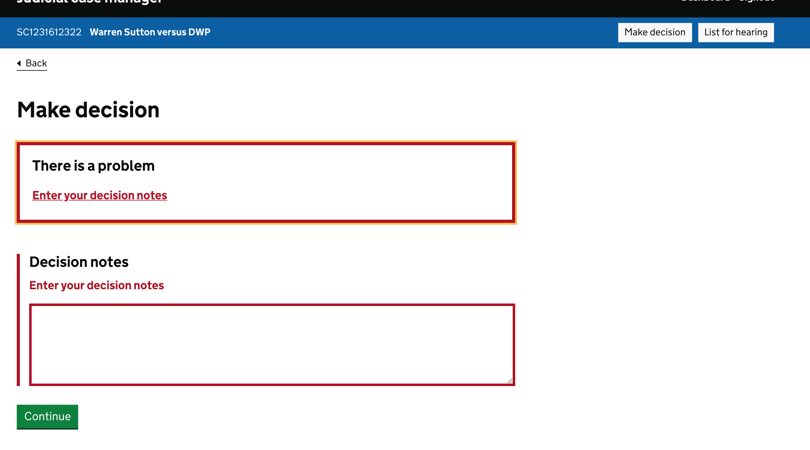
Using grid (half width viewport)
Here the error summary is unnecessarily narrow. Using a max-width approach instead, would make the error summary full width under this scenario.

So the error summary would be as it appears in the first screenshot but the decision notes box would be like the second?
Well, that's another thing. I'd say this max-width thing should be put on the <form> (or similar) too.
Basically, for pages that are single column (that's probably the majority) don't need to use a grid—just need the max-width applied for certain elements.
For other things, such as tables with lots of columns, I'd let them go full width (max width 100%)—so wouldn't need a max width there at all.
I am not a frontend developer so I am not sure the best solution from a CSS point of view. The grid makes sense to me as a container for the content of the page and means I do not need to put a class on every element to control its width. It is a guaranteed way to make sure no line of content is more than 75 characters.
I worked on a service that had full width tables and 2/3 width content. It did not make the screen less usable but it looked disjointed. Because I know this can cause problems for some people I always try to keep content in the 2/3 grid. If a table has lots of columns and does not, it may be better as more than one table especially for people using a mobile.
the error summary is 100% width. Should we give the component a max width?
I do not think it is. Because the examples are snippets, there is no grid. If you look at the examples from elements that show the errors in context, the error summary is in the grid. http://govuk-elements.herokuapp.com/errors/
when using the one thing per page pattern whereby the h1 is the label/legend, the error summary's h2 title comes before the h1. We don't want that, nor do we want two h1's. The question is, what do we want? :)
We used to use 2 h1s but that was changed to a h2 above the h1. You can see the pull request and discussion at https://github.com/alphagov/govuk_elements/pull/510
Hey Steven, reading back I don't think I was very clear.
I think the page should conform to a grid, but I don't think a single column page (like the one I showed above) needs to use the grid classes.
If we were to have say a .govuk-measure-x class then perhaps I'd suggest the max width value would match the 66% (2/3 grid) class used for grids.
That said, I suspect it's not that simple, because a 66-33 grid isn't the only combination. We can use 50-50 etc.
Also, I'd say the max width of the error summary should be the same across all screens, even if it sits above some pages with single column, some with 66-33 and others with 50-50.
Is that a bit clearer?
(Thanks for the note about the h1/h2 thing.)
What would be good practice for an error summary involving a radio button?
For example, if we ask the user "Is this the registered name of your business?" (and show a business name pulled from the backend) and they have a Yes / No radio button option I would have an error message something like "Select if this is the registered name of your business" but I'd struggle a bit with the error summary.
"Select an option" - too generic for an error message (but acceptable for a summary?) "Select if this is the registered name of your business" - same as the message (or is this acceptable?) "Indicate if this is your business name" - using fofr's example above?
Radio buttons seem a bit tricky when it's potentially just Yes / No.
@jonathaninch For your example, I would say 'Select yes if this is the name of your business'. But I would consider adding the name of the business into the H1 and then saying 'Select yes if [name] is the name of your business'.
The guidance in the Design System says "show the same error messages next to the inputs with errors". There is more information about this on the error message guidance. See https://design-system.service.gov.uk/components/error-message/#be-consistent
@stevenaproctor Cheers Steven - that guidance managed to go down the plughole in my brain today, so thanks for pointing it out.
The error summary border is 4px. The error message left border is 5px. Should these both be 4px or 5px?
Hi @stevenaproctor just checked the code - I think that would only happen on mobile, which still seems like it might be a bug
I think it would be helpful to add a bit more guidance on the position of the error summary component. My understanding is that it should come before the page h1, but after things like the beta banner and back link / breadcrumb.
This isn't super obvious at the moment. My team has just implemented this but ended up placing the summary after the h1 - similar to @adamsilver's screenshots above.
The current language 'Use this component at the top of a page to summarise any errors a user has made.' does somewhat cover it, but I feel it could be more specific.
Thanks for the feedback @edwardhorsford – we can add it to our team's backlog if you like, or if you have an idea of the wording, feel free to open a PR proposing the specific change?
Let me know which you'd rather.
Some ideas below - but could do with your love.
I also think it would be helpful for an example to show it in the context of a more complex page - such as one that includes the header and a back link.
I might update this line:
show an error summary at the top of a page
Something like: show an error summary at the top of the page - before the h1, but after breadcrumbs or back links.
Could also mention that it's likely to be positioned at the beginning of the main element.
@edwardhorsford perhaps it can be thought about like 'the first thing within the <main> element', not sure how to communicate that without that technical term.
A community member on X-GOV Slack:
Can anyone advise on how where in the page an https://design-system.service.gov.uk/components/error-summary/ component should be?
The guidance there says
show an error summary at the top of a page. Should I take this to mean:
- below the header
- below the phase banner
- above a breadcrumb
- above a back link
- above the page header
The phase banner component guidance says
"Your banner must be directly under the black GOV.UK header and colour bar."so I'm happy the error summary should be below that.
The back link, however, says
"Always place back links at the top of a page."- it's not clear if that means above the<main>content
A community member on X-GOV Slack:
Can anyone advise on how where in the page an https://design-system.service.gov.uk/components/error-summary/ component should be? The guidance there says
show an error summary at the top of a page. Should I take this to mean:
- below the header
- below the phase banner
- above a breadcrumb
- above a back link
- above the page header
The phase banner component guidance says
"Your banner must be directly under the black GOV.UK header and colour bar."so I'm happy the error summary should be below that. The back link, however, says"Always place back links at the top of a page."- it's not clear if that means above the<main>content
@nickcolley I've always put mine below the 'Back' link, this mirrors what I've seen on live - for example, on "Check if a vehicle is taxed and has an MOT"
