govuk-design-system-backlog
 govuk-design-system-backlog copied to clipboard
 alphagov
Icons
What
A set of icons with guidance on how and when to use them.
Why
Services that use icons:
Anything else
- See issue on the Home Office design system github (https://github.com/UKHomeOffice/design-system/issues/39)
- Home Office have a version of this in the Home Office design system
Discuss
If you've used icons on your service and seen them tested with users, please add your experiences in the comments below
We use icons (or symbols) in data tables on our service to indicate the reason for missing or suppressed data. A key is provided beneath the table. Here's an example:
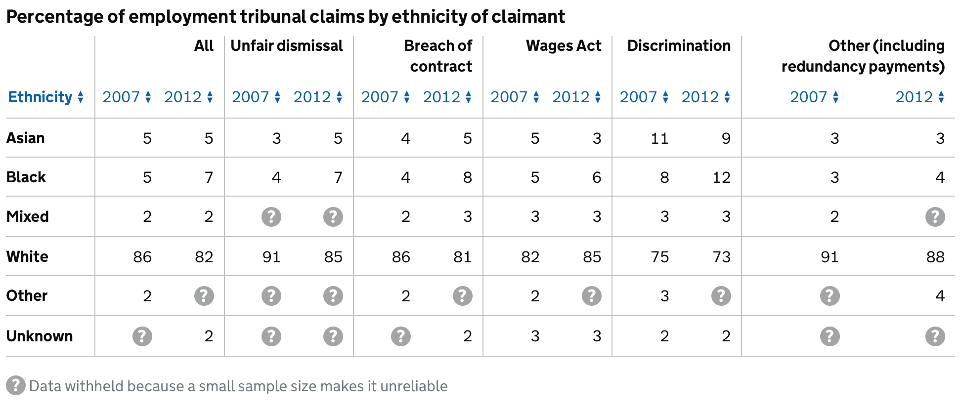
The rationale for these is that there isn't space to write in words within the table why the data is missing, and that even if there was, the repeated text would be distracting.
We tested these, and they worked well, with most users spotting the explanation quickly.
We use three different symbols, although it's rare that more than one is used in the same table (and I don't think we have any tables that use all three yet):
A short visually-hidden textual explanation is added next to each of the symbols for screen readers. We've not (yet) tested this.
Some templates on GOV.UK (new stories, press releases, consultations...) include social media icons for use as share links:

These are placed before the name of the social media platform (eg "Twitter"), with visually-hidden "Share on" text in-between.
See https://insidegovuk.blog.gov.uk/2013/12/02/a-time-for-sharing-government-content-on-facebook-and-twitter/ and https://insidegovuk.blog.gov.uk/2013/12/02/a-time-for-sharing-government-content-on-facebook-and-twitter/
@stevenaproctor do you know of any specific examples of services that use them?
@joelanman A lot of services use the important icon and I have seen the information icon too but less often. There are all the icons on GOV.UK that are used in various places.
Just seen this icon being used on GOVUK
Might argue that this use of icon isn't appropriate – given that the only method of receiving updates is email whether that icon is more appropriate, or in fact no icon.

Hi there,
I am wondering if anyone has a 'View charts' icon that they have used before that has been approved by GDS? Am thinking of using one like this

Thanks! Sarah
@SarahFluentInteraction sorry for the delay, no we don't have an official icon for that at the moment. Did you try one? It'd be good to hear any research.
There's some new WCAG 2.1 (Level AA) guidelines around contrast for graphical elements:
"Parts of graphics required to understand the content, except when a particular presentation of graphics is essential to the information being conveyed."
https://www.w3.org/TR/WCAG21/#non-text-contrast
The ineffectiveness of lonely icons https://mattwilcox.net/musing/the-ineffectiveness-of-icons
NHS blog post about icons:
https://digital.nhs.uk/blog/transformation-blog/2019/icons-avoid-temptation-and-start-with-user-needs
We're currently on GovUK Frontend Toolkit and I'm in the process of updating the app with GDS instead. As far as I can remember, we only use one icon for file downloads.
I think a file or pdf icon would be useful for inline links https://github.com/alphagov/govuk-design-system-backlog/issues/20#issuecomment-638977559
I've been doing some research on icons, and have drawn the following understanding.
If an icon is "meaningful"; "suits the context"; "supports the content", "follow accessibility guidelines**"; "enhance the experience" and "do not cause more confusion/harm" it SHOULD be OK to consider
Would be good to know what others think?
Graphical Objects: Parts of graphics required to understand the content, except when a particular presentation of graphics is essential to the information being conveyed.
NNGroup blogs about Icons usability Icons: avoid temptation and start with user needs
Thanks for the thread. Our service have hypothesised an A/B test - we are looking to highlight a pivotal piece of information on the service for mobile users in particular. Data shows the link is having less visibility/CvR on mobile.
Are there any thoughts or other standardised icons we can use for this test where we have a link with further info we want to test highlighting with an icon type in addition to the link? e.g. info icon, arrows, loud hailer, flagged pivotal content Are there any other examples or UR we can refer to on icons specifically for information or callouts?
Looking at using the "i" information icon with label [icon-information.png] as one variant (https://github.com/alphagov/govuk_frontend_toolkit/blob/master/images/icon-information.png) would be nice to maybe include a more unique but potentially still universal one in the research as well (?)
In 2015, UserTesting conducted a series of tests comparing icon use. They set up a remote usability study exploring UX with icons on mobile apps. The team watched 35 users interact with 190 icons on a series of Android apps.
For icons with labels, users were able to correctly predict what would happen when they tapped the icon 88% of the time. https://www.usertesting.com/blog/user-friendly-ui-icons
What is the best practice for icons and accessibility? Should icons always be accompanied by text? To account for users who may not understand the icon and to also ensure correct interpretation by assistive technology? Should icons have an aria hidden label? Because font icons might not be recognised by assistive technology?
Just adding to this ongoing post as MYESF's View Your Funding side currently uses an old variance Indicator icon component (not currently in GDS). This older style shows where a funding change has occurred and by how much, but it needed some styling and accessibility improvements. We recently updated the icon, positively fed back to the design community and tested with users which got an overall welcome and good feedback from users. The newly updated icon has not yet been implemented in to the service, but hopefully soon. When design and iterating this component, the MYESF UCD team have also ensured the variance indicator meets as much accessibility, content and styling needs, including:
- To ensure the 'decreased' variance indicator is GDS red #d4351c
- To ensure the 'increased' variance indicator is GDS green #00703c
- To ensure the font and arrow icon is bold
- To ensure the font size is 18px on a larger display
- To ensure the font size is 15px on a smaller display
- To ensure the variance icon remains an arrow
- To ensure the GBP £ value amount has a hover over tooltip label that either says 'Deceased by' or 'Increased by' depending on the variance indicator
- To ensure the arrow includes alt text to describe the icon, reading: "A red down arrow indicating a decreased value" or "A green up arrow indicating an increased value" depending on the variance state
- To ensure the icon's aria-label can be read by a screen reader to say either: "decreased by" or "increased by"
Example screenshot of the new updated variance indicator icons
It would be great to eventually have a proper icon category in GDS!
Update November 2023: We recently tested the variance indicators again on a funding statement page with tables and it tested positively. User did not find all the figures with variance indicators overwhelming at all, as the green/red colours provides a visual separation and good accessibility
@BenIDesCode Out of curiosity, was the use of an arrow icon compared against using plus and minus symbols to indicate the changes (e.g. "+£1,000" and "-£2,000")? Those would seem to be well supported by assistive technologies whilst taking up less space and potentially being less verbose.
Sorry if this is a foolish question, I'm not an SME on the particulars of your service. Thanks!
@querkmachine No worries, it's a valid question! We did compare these symbols, but there are some current GDS components developed within MYESF that may look too similar if the plus or minus symbols were also used in this variance indicator context. The particular page this component sits on stands out from any other component on the page with the use of the arrow :)
Brought to my attention whilst on support - something to talk to the GOV.UK team about?