govuk-design-system-backlog
 govuk-design-system-backlog copied to clipboard
 alphagov
Date picker
Also known as: calendar control
What
Help users select a date using a calendar. Useful when knowing the day of the week is important.
Why
Used on these services:
Anything else
- Read the draft guidance on Google Docs
- Find the code in this prototype on GitHub
- Related to the 'Ask users for dates' pattern issue
- Related to the 'date input' component issue
Please consider how a user could be asked to select a range of dates, e.g. a start date and end date.
This would be useful when a user is searching for events that occur within a certain period.
Perhaps of interest is Airbnb's extensive work on their date picker component - http://airbnb.io/react-dates/
@penx We have a prototype of an input to a calendar control that could be a good base for the range variant...
Regarding the use-case for a full-screen calendar visualisation (as opposed to a small focused date picker), for future research, the following products could provide inspiration for how to implement this pattern in an accessible/user-friendly/familiar way:
- calendar.google.com (web app)
- Calendar for iOS (native app)
- Google Calendar for Android (native app)
- icloud.com calendar (web app)
- Outlook 365 calendar (web app)
Some findings from lab testing a date picker prototype:
The GOV.UK Design System team embedded the Backpack date picker, with a couple of small tweaks, into a prototype that went through lab testing in autumn/winter 2017 (as part of a wider piece of work). See the prototype (patterns/components).
We chose it as it was being billed as an accessible open source date picker. We hoped to generate some insights into how users interact with date pickers and if the Backpack one tested well, also consider using it as the basis for one for the Design System.
We tested it with 17 users in total:
- Session 1 and 2: 7 users that confident or expert level digital users
- Session 3: 7 users with lower digital literacy skills
- Session 4 and 5: 4 users with access needs
The following devices were used during the research: Desktop (Windows), laptop (Windows), iPhone, Android, iPad, JAWS, Voiceover (iPhone and iPad), Zoomtext 10, physical magnifier
The date picker worked well for users with higher digital skills. These users had previous experience of interacting with similar components. An example of this was when buying flight or rail tickets online.
The results from testing with users with lower digital skills were also broadly positive, with users saying they found the date picker "useful" and "something you expect these days". One user did not realise they were on the wrong year when attempting to find a date. One mobile user tried to use the browser "Back" button to close the date picker:

Screen reader users found the picker a more positive experience compared to similar components they had encountered elsewhere.
One screen reader user stated they liked the month dropdown.
One screen reader user said that it would be easy to miss the date picker had it opened while the user had zoomed in elsewhere on the page with ZoomText.
Several users with access needs stated that they would have preferred to type in the date: “being able to just enter a date in DD/MM/YY is more intuitive” and “I did not like combo boxes for selecting a date. Not good for people without vision”
One screen reader assumed that the arrows for controlling months were used for changing days.
One screen reader user tried to swipe left and right on the calendar.
One screen reader user stated that the hint for the date picker ("For example, 14/03/2017") suggested that a manual entry of dates is required.
I've done quite a lot of work on accessible date pickers. Here's a screenshot and demo link:
Screenshot

Link http://nostyle.herokuapp.com/examples/date-picker
Details At the moment it's designed so that in browsers that support the native date input (most mobile browsers), they get the native date picker. In all other browsers, they get a custom accessible date picker.
I think that, despite the value of using native stuff where possible, there are some potential problems with the native date picker, especially on desktop browsers. But the code for the component can easily be changed to remove the feature detection and just use the custom date picker in all situations.
I've tested the date picker in a range of browsers, mobile and desktop and with a whole bunch of screen readers. With keyboard and mouse etc. It's pretty robust.
Dropbox Paper audit
On 28 February 2019 the Design System team reviewed a Dropbox Paper document discussing the Calendar Control pattern.
The aim was to reduce the number of places containing guidance and code by:
- migrating relevant, useful content into the Design System itself
- recording important research findings in the community backlog
- removing the original Dropbox Paper page
Below is a record of the outcomes of that review.
If you need to, you can see the original Dropbox Paper content in the internet archive.
Calendar control
Overview
Help users pick a date in the near future or past, or where the day of the week or week of the month is important.
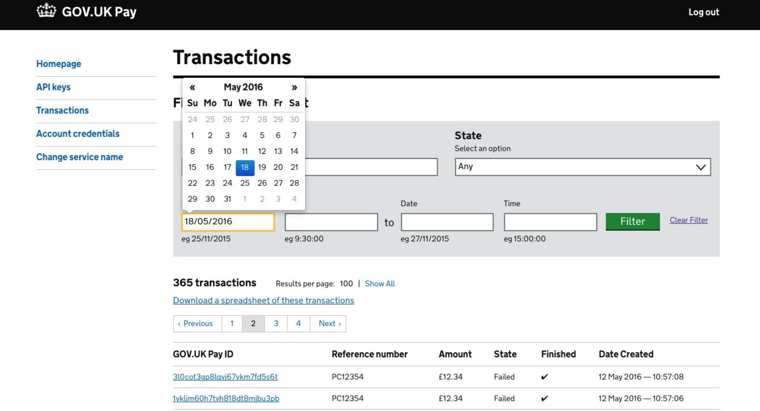
Here’s an example from GOV.UK Pay:
When to use this pattern
Use a calendar control if knowing the day will help your users pick the right date. A common example is for booking an appointment.
When not to use this pattern
Don’t use calendar controls for well-know dates like a user’s date-of-birth, or where the day of the week is not important.
Calendar controls typically rely on JavaScript so should be treated as an enhancement. users should always be able to enter the date into a free-text field as well as use the control.
How it works
Users select dates from a visual representation of the month and can skip through months and years. This allows them to easily see what day of the week and week of the month a particular date is in, which is particularly useful for tasks like appointment booking.
Pop-up or embedded calendar controls
Most calendar controls are pop-up ones, like the GOV.UK Pay example above. However, if you need to represent other information, like date availability, it helps to use a larger embedded calendar control.
Research on this pattern
Calendar controls and Arabic speakers
Mashael Al-Saleh investigated Arabic speakers Understanding the Usability of Calendars on Transactional Interfaces (.pdf, 2013). This small eye-tracking study considered:
- a date of birth entry that mixed text boxes (day / year) with a dropdown (month)
- a date of birth entry that offered a choice of three dropdowns or navigation through an overlaid calendar
- an arrival/departure dates entry that offered a choice of two dropdowns (combined month/year and day) or navigation through an overlaid calendar.
All three options were problematic: about half the participants got stuck on each type of date entry. Note: the paper refers to choosing between 'Georgian' and 'Hijri' calendars for date of birth - something to be aware of for Arabic speakers. (The recommendations in the paper are rather sweeping considering the range of the experiment - be cautious about them).
Prison Visit Booking (PVB)
In PVB we have users are required to pick up to three possible visiting slots within the next 28 days. A day can contain multiple slots. The user must first select a day to see the slots.
Slot Picker Calendar in it's initial state:

The grid is built as a table. Each day is an anchor element allowing tabbing. "May" is also an anchor element. When clicked, JavaScript changes the scroll position of the day cells.
Slot Picker Calendar selected:
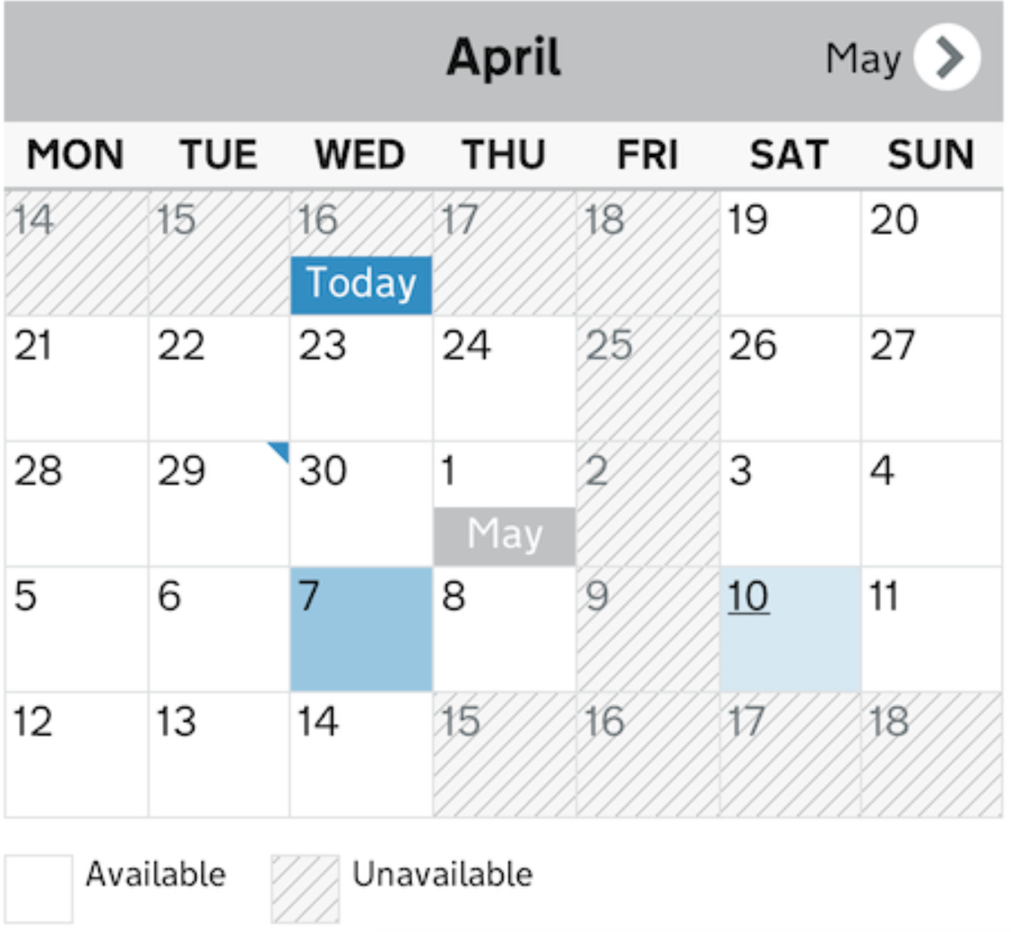
Light blue (10 May) is a hover state. Blue (7 May) is selected state. The blue corner marker (29 April) is a day with a chosen slot (this may not always be relevant.
Slot Picker Calendar scrolled:
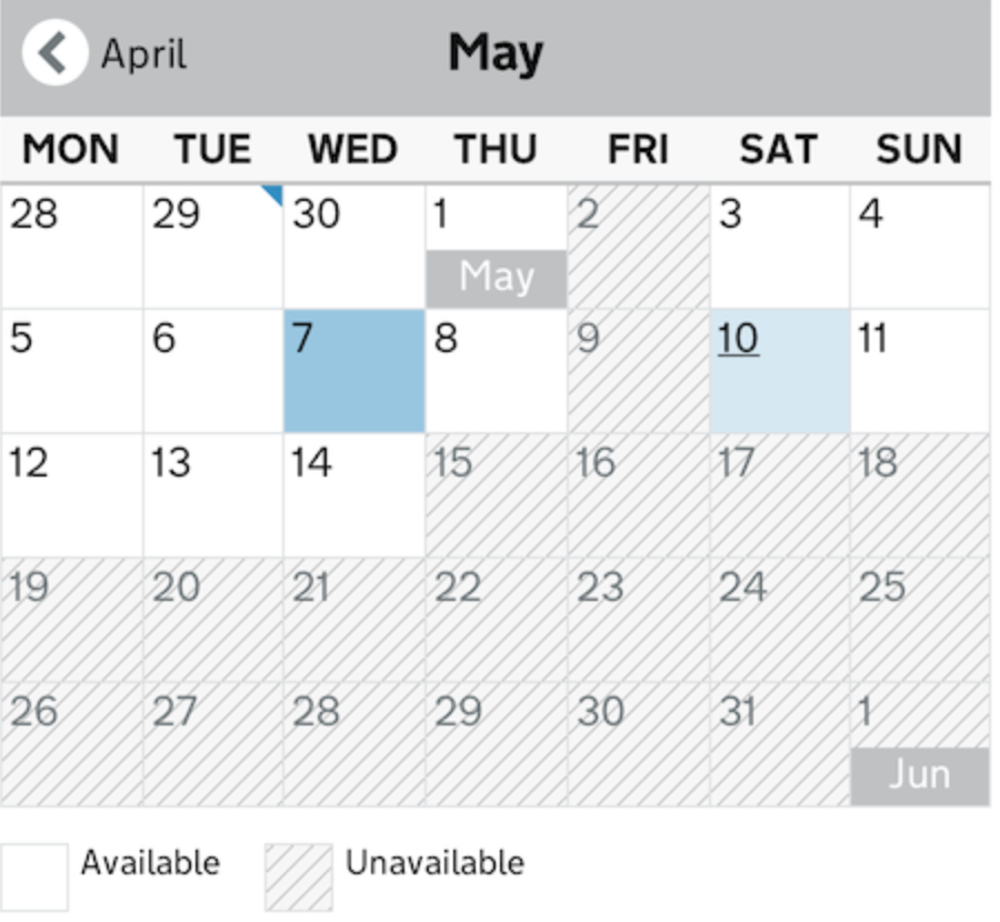
This shows the result of activating the "May" link.
This calendar has tested well with users. It's a conventional calendar which gives the user familiarity.
The Slot Picker UI components have been extracted to a separate repo and a working example can be seen at http://ministryofjustice.github.io/moj_slotpicker/
Related patterns
+Dates +Date of birth +Time picker +Date ranges +Book an appointment
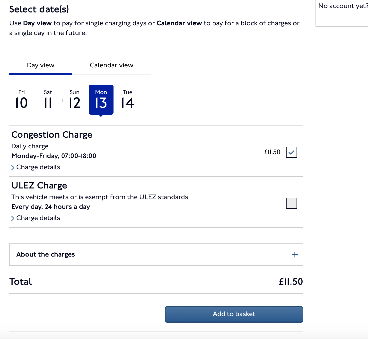
Looking at different approaches to date selection / date picker, and flexibility of choosing a pre-defined day range and specifically where different days carry different costs or services. Been looking at how TfL do this for ULEZs. Example below. Be interested to see anyone else's approach to this recently.


On Street Manager (DfT) we are using the GDS date input which consists of three input fields for the date in the format of DD MM YYYY. To enhance this, we have introduced a date picker widget using a calendar icon (font awesome) and jQuery UI date picker as our choice of library.
We have rules and guidelines for the date picker component as part of our service that helps us use it in the way we want it to. Some of these rules are:
- Use when the user is to pick a single date instance, for example, the date of an inspection.
- Do not force the user to use the date picker, this is an enhancement so the user should be able to enter a date using the input fields alone.

The user can input manually within the date input fields or use the date picker widget by clicking the calendar icon to activate it.

We introduced the date picker widget in response to user feedback following usability testing with pilot users and prototype demonstrations.
We also have a date range date picker component which allows the user to enter from and to a range of dates. This works well in use cases such as filtering to see what works are going on within a timeframe or to filter records within a certain date range.


For this component, we use the calendar icon to keep the pattern consistent so that it helps users identify this component with dates and calendars.
The main rule for this is to use it only when it involves the user making a date selection with a to/from date combination.
Again, the user isn’t forced to use the date picker widget as they can enter the date manually.
This component is helpful as it will prevent the user from selecting a TO date that occurred before the FROM date.
@rajannahar Your date range solution looks great, and suitable for another Gov.uk project I'm working on at the moment (Border Force). I wondered if I could see the actual codebase?
Hi @gavinorland, yea sure.
The date picker documentation can be found here - https://dft-street-manager-style-guide.herokuapp.com/sm-date-picker/
The date range date picker documentation can be found here - https://dft-street-manager-style-guide.herokuapp.com/sm-daterange-datepicker/
Let me know if you would like any more details.
Hey both,
Thanks for sharing these date pickers, just something I've noticed, there seems to be barriers around keyboard access to the component.
Please make sure to test this component with assistive technologies and if possible to do user research that represents disabled people's needs before putting them into production.
You can read more about making your service accessible in the service manual:
https://www.gov.uk/service-manual/helping-people-to-use-your-service/making-your-service-accessible-an-introduction
Hi @nickcolley
Ye good point, thanks for flagging.
We are aware of this and it was noted following an accessibility audit. This is in our backlog and we will be working on this.
Hi @gavinorland, yea sure.
The date picker documentation can be found here - https://dft-street-manager-style-guide.herokuapp.com/sm-date-picker/
The date range date picker documentation can be found here - https://dft-street-manager-style-guide.herokuapp.com/sm-daterange-datepicker/
Let me know if you would like any more details.
Hi @rajannahar. We're interested in using this but noticed that the GitHub repository can't be found. Can you direct us to a new location or is this code unavailable now?
Hi @gavinorland, yea sure. The date picker documentation can be found here - https://dft-street-manager-style-guide.herokuapp.com/sm-date-picker/ The date range date picker documentation can be found here - https://dft-street-manager-style-guide.herokuapp.com/sm-daterange-datepicker/ Let me know if you would like any more details.
Hi @rajannahar. We're interested in using this but noticed that the GitHub repository can't be found. Can you direct us to a new location or is this code unavailable now?
Hi @rajannahar I'd also be interested in this please, thanks in advance
I've done quite a lot of work on accessible date pickers. Here's a screenshot and demo link:
Screenshot
Link http://nostyle.herokuapp.com/examples/date-picker
Details At the moment it's designed so that in browsers that support the native date input (most mobile browsers), they get the native date picker. In all other browsers, they get a custom accessible date picker.
I think that, despite the value of using native stuff where possible, there are some potential problems with the native date picker, especially on desktop browsers. But the code for the component can easily be changed to remove the feature detection and just use the custom date picker in all situations.
I've tested the date picker in a range of browsers, mobile and desktop and with a whole bunch of screen readers. With keyboard and mouse etc. It's pretty robust.
Hi @adamsilver I'd be really interested in gaining access to the code, where would I find it please? Would you say that it's been well tested for accessibility?
Some findings from lab testing a date picker prototype:
The GOV.UK Design System team embedded the Backpack date picker, with a couple of small tweaks, into a prototype that went through lab testing in autumn/winter 2017 (as part of a wider piece of work). See the prototype (patterns/components).
We chose it as it was being billed as an accessible open source date picker. We hoped to generate some insights into how users interact with date pickers and if the Backpack one tested well, also consider using it as the basis for one for the Design System.
We tested it with 17 users in total:
- Session 1 and 2: 7 users that confident or expert level digital users
- Session 3: 7 users with lower digital literacy skills
- Session 4 and 5: 4 users with access needs
The following devices were used during the research: Desktop (Windows), laptop (Windows), iPhone, Android, iPad, JAWS, Voiceover (iPhone and iPad), Zoomtext 10, physical magnifier
The date picker worked well for users with higher digital skills. These users had previous experience of interacting with similar components. An example of this was when buying flight or rail tickets online.
The results from testing with users with lower digital skills were also broadly positive, with users saying they found the date picker "useful" and "something you expect these days". One user did not realise they were on the wrong year when attempting to find a date. One mobile user tried to use the browser "Back" button to close the date picker:
Screen reader users found the picker a more positive experience compared to similar components they had encountered elsewhere.
One screen reader user stated they liked the month dropdown.
One screen reader user said that it would be easy to miss the date picker had it opened while the user had zoomed in elsewhere on the page with ZoomText.
Several users with access needs stated that they would have preferred to type in the date: “being able to just enter a date in DD/MM/YY is more intuitive” and “I did not like combo boxes for selecting a date. Not good for people without vision”
One screen reader assumed that the arrows for controlling months were used for changing days.
One screen reader user tried to swipe left and right on the calendar.
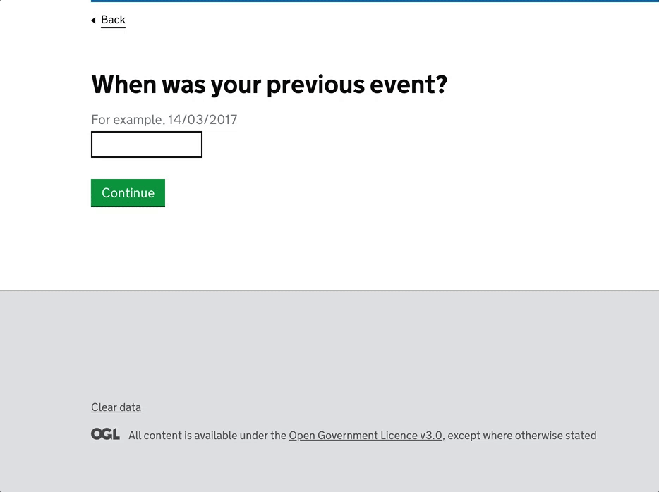
One screen reader user stated that the hint for the date picker ("For example, 14/03/2017") suggested that a manual entry of dates is required.
@hannalaakso I be really interested in getting the code for these please. Would you be able to point me in the direction of it please? Have you done any further testing on accessibility?


@frankieroberto amazing! just what I've been looking for thankyou :) I don't suppose you have a contact for that team?
@hannalaakso I be really interested in getting the code for these please. Would you be able to point me in the direction of it please? Have you done any further testing on accessibility?
@Al-Robinson Apologies, I missed this message. Here's the prototype and one of the pages that contained a date picker: https://github.com/alphagov/temporary-event-notice-prototype/blob/master/app/views/event-start-date.html Please note that this is merely a prototype and it hasn't been touched for nearly 4 years. The GOV.U Design System team haven't done any further testing on a date picker since then so the date pickers posted by other teams on this GitHub issue are probably more useful starting points.
thanks Hanna!
@Al-Robinson Our team don't have a contact for the Book a driving theory test service that you asked about but it looks to be built by DVSA. I wonder if you, or someone else in your team who can do this on your behalf, have access to the cross government Slack, you could reach out there for a relevant contact.
I just discovered that there's now a native datetime picker in HTML.
No idea how usable and accessible it is across browsers though. (I fear the answer is not very...)
@Al-Robinson Someone has reached out to us with a contact for Book a driving theory test. I don't want to post their email address here, so could you please drop us an email at [email protected] and we'll put you in touch.
I find "Accessibility" arguments against using the native date control a bit foolish https://github.com/DFE-Digital/govuk-formbuilder/issues/302
Surely it's a better idea to use a widget that at least is performant on slow devices? Surely that's far more accessible than any bloated date widget?
If the native date picker really falls short, can you please file bugs on https://crbug.com/ https://bugs.webkit.org/ https://bugzilla.mozilla.org/ and track those? https://caniuse.com/input-datetime
Please use the native input date widget.
Accessibility is not to be confused with general usability, it is primarily focused on removing barriers for disabled people.
Government services cannot create barriers for disabled people by law.
The design system has many custom components that are both accessible and performant there doesn't need to be a compromise there.
It is always worth revisiting the accessibility of native inputs to see how they hold up but it is never foolish to do extra work to remove barriers for disabled people when they fall short.
I’d agree that the native <input type=date> component ought to be both highly accessible and usable, and it is super frustrating that it isn't.
There’s an interesting question over whether we could ever use the native component, if the usability and accessibility were to be improved, given that some people may be stuck on current and older browser versions for a long time...
Another important question is why browsers don’t ship accessible and usable implementations in the first place – and how this might be avoided for any future native components.
There is a whole industry applying a11y "solutions", so I suspect that's part of the problem.
To improve the Web, join https://whatwg.org please file bugs on browser implementations on where they fall short.
Is there a reference as to how the native date widget "creates barriers" for reference please? Have you filed bugs about them?