govuk-design-system-backlog
 govuk-design-system-backlog copied to clipboard
Data
What
Styles for representing data in numbers, graphs, charts and diagrams.
Why
Anything else
You could to at reference in the issue on Dashboard page
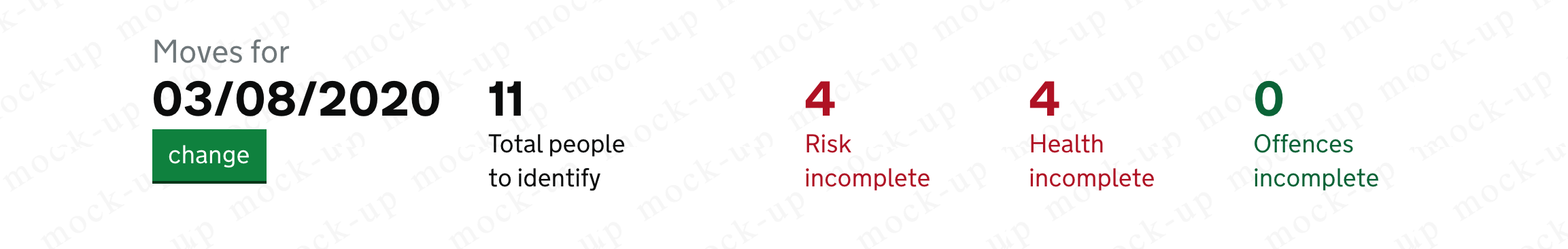
I have a use case from a system used internally by HMPPS.
Previously implemented with gov.uk elements using the data class

I got it working by introducing a few new classes https://gist.github.com/matthewrudy/bc70462479a1e670ca88d4d254c6c1bc
Now looks likes
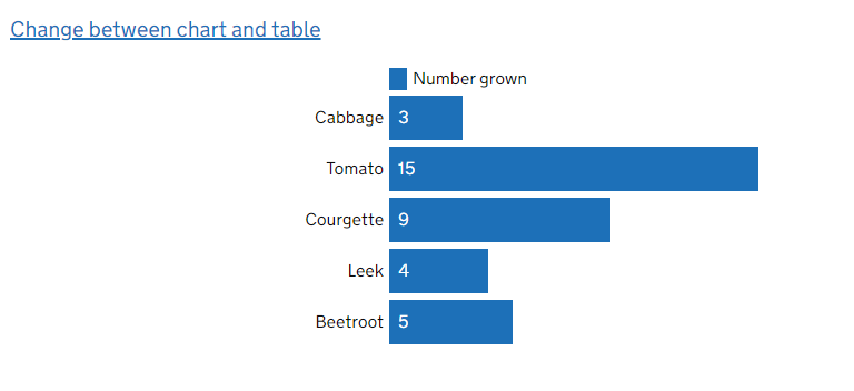
GOV.UK charts markdown allows content designers to create ‘simple’, ‘stacked’ and ‘compact’ bar charts which can also display negative values. You can combine these within one chart.
Users can then switch between the HTML bar chart and the table containing the data on the webpage.
I wondered whether the community could also consider the design and usability of GOV.UK charts in this forum. I know the limitations of GOV.UK charts markdown can cause publishers to rely on images of data, which is a backwards step. It makes sense for the design principles for data in services to feed into those for GOV.UK, and vice versa.
There isn't currently a lot of detail about the design of GOV.UK charts in the content design guidance, so thought I'd share a bit here.
Orientation of charts
Charts are orientated horizontally. My assumption is that this is so they can adapt well for narrow displays, such as mobile phones.
Categorical data that cannot be grouped
Charts use GOV.UK blue (#1d70b8) for categorical data that cannot be organised into broad groups.
Categorical data that can be grouped
GOV.UK charts use different colours when subcategories are common across broad categories.
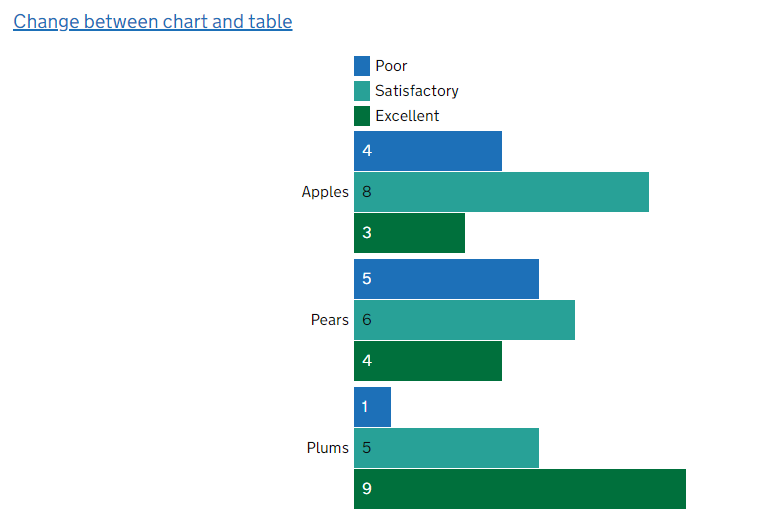
Chart colour palette and order of appearance (as of November 202)
GOV.UK charts apply colours automatically based on the number and order of the subcategories in the data table.
There are a maximum of 9 colours.
The text labels are either white or black – the text colour is whichever provides an acceptable contrast ratio with the background colour.
These colours are from the GOV.UK Design System.
| Order of appearance | Hex | RGB | govuk-colour function | Label text colour |
|---|---|---|---|---|
| 1 | #1d70b8 | 29,112,184 | govuk-colour(“blue”) | White |
| 2 | #28a197 | 40,161,151 | govuk-colour("turquoise") | Black |
| 3 | #00703c | 0,112,60 | govuk-colour("green") | White |
| 4 | #85994b | 133,153,75 | govuk-colour("light-green") | Black |
| 5 | #ffdd00 | 255,221,0 | govuk-colour("yellow") | Black |
| 6 | #f47738 | 244,119,56 | govuk-colour("orange") | Black |
| 7 | #d4351c | 212,53,28 | govuk-colour("red") | White |
| 8 | #912b88 | 145,43,136 | govuk-colour("bright-purple") | White |
| 9 | #0b0c0c | 11,12,12 | govuk-colour("black") | White |
Update: Since this post, chart colours have since been updated to align with the Government Analysis Function guidance: https://github.com/alphagov/govuk_publishing_components/issues/1886)
We recently added the big number component to govuk for use on places like the homepage and the departments page.
The Government Statistical Service has some (draft) guidance on colours for graphs and charts that might be of use:
https://gss.civilservice.gov.uk/policy-store/data-visualisation-colours-in-charts/
The ONS also has guidance on data visualisation at https://style.ons.gov.uk/category/data-visualisation/.
We're looking at this in the UCD + Data community. The first thing on our agenda is line charts. We're working together with colleagues in the Analysis Function. They have some great guidance on their website.
This is where we'd love to better understand user research that's been done within Government.
We'd love to know:
- Where you have identified a user need to display data in a line chart.
- Where you have successfully tested line charts and what you learned.
- Where you have tested line charts and found they were not the right solution and why.
The World Health Organization has a fairly comprehensive set of documentation for how they design interactive charts and data visualisations. https://apps.who.int/gho/data/design-language/