govuk-design-system-backlog
 govuk-design-system-backlog copied to clipboard
 alphagov
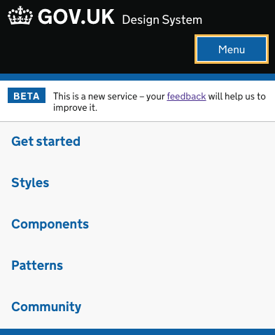
Navigation bar
Previous discussion on tabbed navigation where it was decided styling as tabs would confuse users.
Also known as: menu
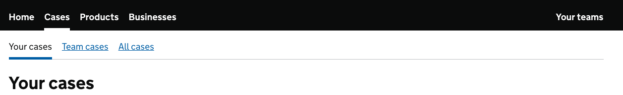
What
Let users navigate between separate sections of a service, and know which section they are currently on.
Why
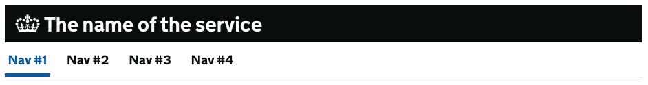
Navigation bars are used on these government services:
- Companies House (currently styled as tabs)
- GOV.UK Design System
- GOV.UK Notify
- GOV.UK Pay
Anything else

One question would be what happens on a small screen? The Design System hides the navigation, and shows a Menu button which reveals the navigation. Would this work with a hierarchy - where you might have separate global navigation and a sub navigation bars?
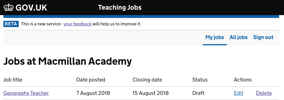
Here's some background from our research team on DfE Teaching Jobs…
One of the aims of Teaching Jobs is for hiring staff to post job listings onto the service, and in order to be able to achieve this, they must first be able to successfully sign in. During testing, we asked hiring staff to post a listing, however 7 hiring staff were unable to find a call to action to first sign into the service.
Users stated:
- “I can’t see a log in.” - Head of Communications
- “To be honest I can’t see what I’d do from this page….I can’t see anything there that tells me how to post.” user misses list a teaching job link at the top-Business Manager
- “I don’t see the sign in.” -Department head & School Business Manager
- “It’s not obvious how to sign in for the first time.” - Head of Procurement
- “I’m not sure, where is the log in?” can’t find school sign in, even when directed to top of page - Curriculum Resource Manager
After prompting users to the top of the page or to the wording of the button, users stated:
- “That’s not a button, it’s a header, it shouldn't be in the same banner….I wouldn't have never seen that. I thought it was a title, it doesn't look like a hyperlink or button.” - Head of Procurement
- “[It] looks like a heading rather than a call to action.” - Head of Communications
- “...it just looked like part of the title so I didn’t spot it first time. It doesn’t look like it’s an active link so I wouldn’t have thought to try to click it.” -Business Manager
- “That’s a bit small, I missed that!” - Department head & School Business Manager
Conclusion
Based on the insights that we have gathered from hiring staff in testing, it is clear that hiring staff’s ability to navigate to log in is a current pain point. Due to the listed reasons why hiring staff struggled to find the navigation link as currently set out, we recommend navigation that is below the gov.uk header, more clearly a link, and larger/more visible. Having looked at comparable services, such as Civil Service Jobs who have also chosen to move their sub navigation to below the gov.uk header, we feel that testing similar formats may improve the user experience when signing in and navigating through the service.
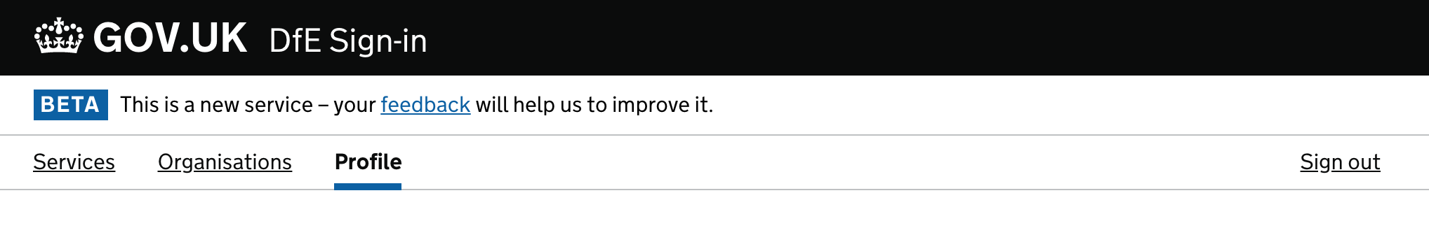
…and here's a grab of the header referred to above — with a verb-driven sign-in link, using the proposition links styles from the GOV UK Template:

Thanks for sharing this feedback @gazaston - it's really useful for us to know when things aren't performing as well as they should.
Would you be able to also share the navigation design that you ended up using?


@timpaul Sure. Here's what we're planning to test. I'm not 100% happy with the detail it as it feels like it could be more elegant, but it should be enough to validate the pattern:

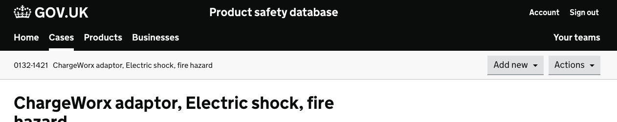
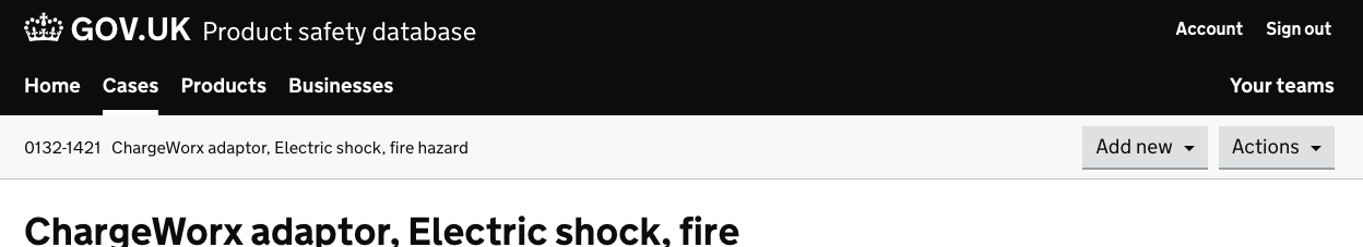
Here's another example from the GOV.UK Registers admin tool for updating registers
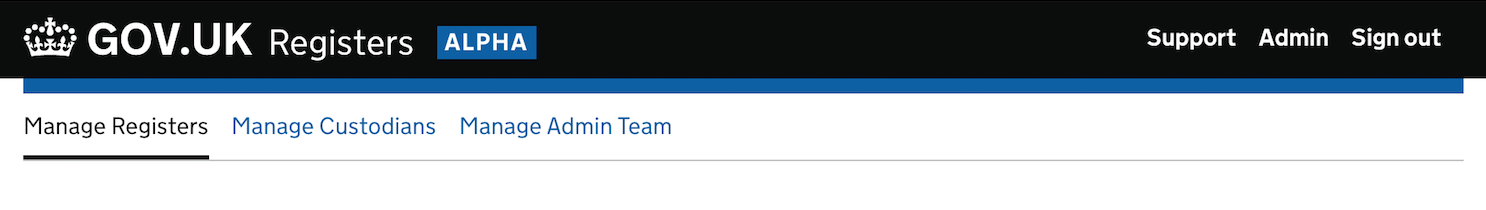
Moving this straight to the 'To do' column on the backlog, as it's required by the Navigation pattern.
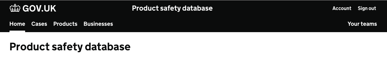
We've got a pattern like this in OPSS.
Example:
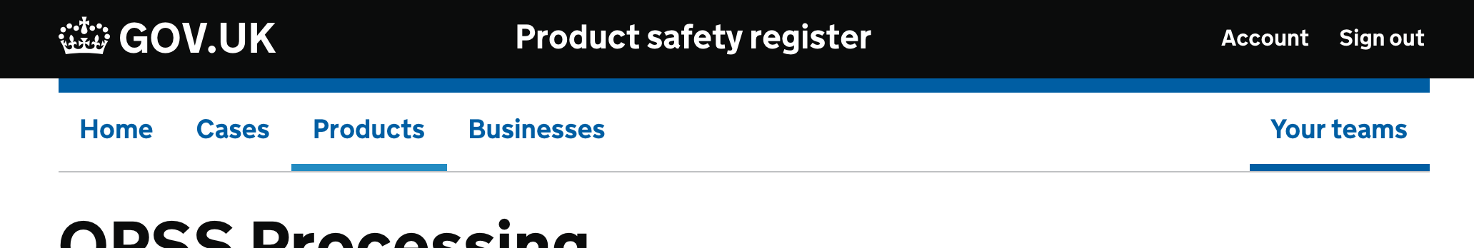
Something I need to decide on is how to deal with small viewport widths. Currently our account and sign out links go in a menu - but potentially the site sections should too.
In Publish teacher training courses we tried tabbed navigation and then a navigation bar.
We found in research that users consistently missed both, missing out on significant features they needed to use.
We moved from tabs to a navigation bar to make the navigation more obvious but this didn’t do the job.
We then inlined all the content and used back links and breadcrumbs to move around – we’d already seen users interacting with these navigation elements.
| 1. Tabs | 2. Navigation | 3. Final version |
|---|---|---|
 |
 |
 |
My service (internal casework tool) is moving towards two levels of navigation - primary nav that sits in the header, and secondary navigation that applies on a per-section basis.
I'm about to test this form of primary nav, stolen from HMCTS / BEIS:
Changes from existing pattern:
- Does not rely on colour alone to indicate the active site category.
- Left align primary nav links with obvious active indicator.
- Right align account type links
nb: On mobile we'll likely collapse all of the links in to a menu like the existing pattern.
The advantage of having the links in the header is we can have a clear distinction between main site categories and sub categories. If you've got secondary nav, then the primary needs to be visually distinct.
With secondary nav
With case / actions bar
Note there's no bottom blue border - when combined with secondary nav / an identity bar, the blue border gets in the way / looks out of place.
We'll test this with our users and see how it goes.
One other thing: I think it actually looks better for us to use the productName option rather than serviceName:
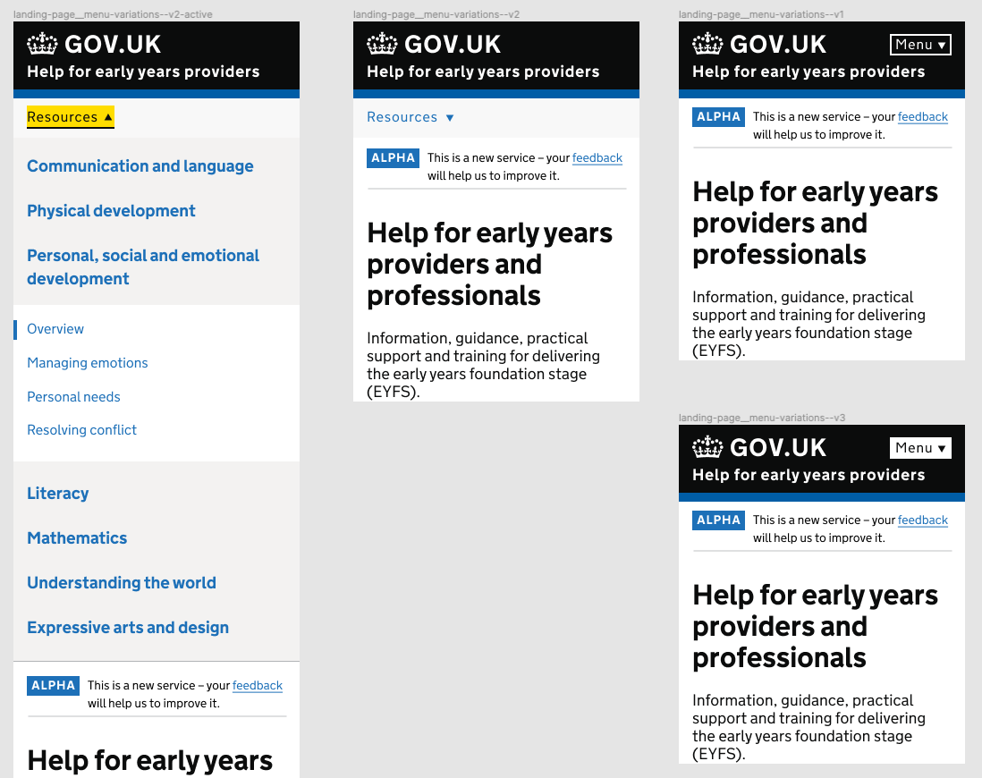
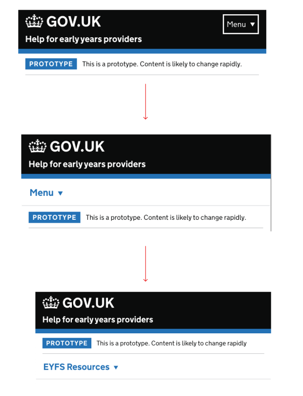
Our service – 'Help for early years providers' uses a mobile header 'Menu'. During research sessions, users have missed the menu button on the header and used breadcrumbs to navigate around.
Has anyone tried putting a white background to the 'menu' text and if so, did it work?
There are couple of options that i wanted to try, but we are waiting for the final feedback from ur to proceed.
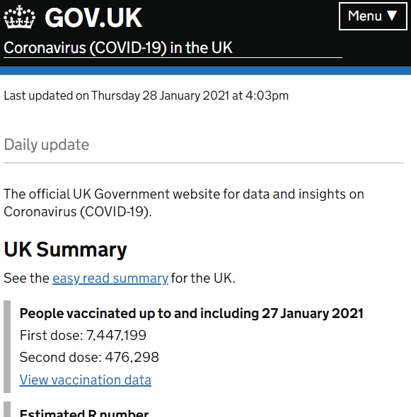
@rinto-c I also failed to see 'Menu' in the header of the Coronavirus daily update (see image below). I've been viewing the site each day (sometime on mobile, sometimes on laptop) and only noticed the menu within the last two days.
It sounds like something that needs an experiment, if it hasn't already been done.
We tried various versions of menu on a service that I am working on in DfE. Initial assumption was that if we make the menu more obvious and within reach to the user, they will find it easier to navigate to other areas of the website.
Our assumptions were invalidated when users were freely moving between pages using breadcrumbs and browser back button on mobile.
Therefore we are reverting the design back to the original design from the design system as we have not found significant value in developing a custom navigation.
We’ve chosen to prioritise ‘Navigation’ as one of our Upcoming components and patterns.
If you’d like to help, join the GitHub discussion page for Navigation. We’ve created it to make it easier for the community to discuss issues and options.
Hi folks, for anyone who missed or wants a recap of our Navigation: help us define our next component kick off workshop, on 18 April 2024, we've posted a summary to the discussion thread Navigation - related research and resources #3661