govuk-design-system-backlog
 govuk-design-system-backlog copied to clipboard
 alphagov
Search box
What
Help users search through large collections of information or documents using a search box component. This is potentially part of a pattern for 'search for something'
Why
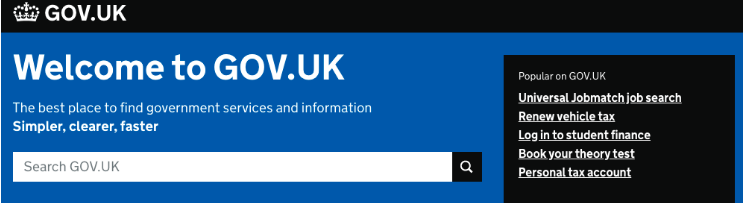
Search boxes are used in many government services - including:
- GOV.UK
- Companies House
- Find your local park (variation)
- What evidence do you have that it meets the needs of the users of those services?
Anything else
Search boxes: Dropbox paper Search: GOV.UK Publishing Search: DWP design patterns
GOV.UK Publishing has this documented here: http://govuk-static.herokuapp.com/component-guide/search
@ignaciaorellana Should the search box on www.gov.uk use placeholder text? It is not great for accessibility and elements says "don’t use placeholder text in form fields, as this will disappear once content is entered into the form field".
Hi @stevenaproctor I found this that might help to understand why the search box on GOV.UK uses placeholder text. This is from a "Site search analytics report" from 2013:

"Empty searches where people click on the search button without entering a search term - jumped up on 19 November when Universal Jobmatch went live; went down from 8 April when redesigned navigation went live."
@ignaciaorellana Thanks for the information. I wonder if having a form label was ever tested rather than placeholder text.
Thanks @stevenaproctor - we'll try and find out.
The advice against using placeholder text is sound, but very occasionally other factors come in to play - for example the need to conserve space in the header. Search boxes get additional affordance from their top-right position and this seems to offset the negative effect of the placeholder text.
Other services using this pattern:
https://search-property-information.service.gov.uk https://flood-warning-information.service.gov.uk/warnings https://probatesearch.service.gov.uk/ https://courttribunalfinder.service.gov.uk/search/ https://www.contractsfinder.service.gov.uk/Search https://findpensioncontacts.service.gov.uk/find-pension-contact?type=workplace https://www.findapprenticeship.service.gov.uk/apprenticeshipsearch
Here are some screenshots of different approaches:


Questions:
- Is it better to use a magnifying glass icon or "Search" label on the button?
- Should the button be to the right of the search box, or below?
- Green or blue button?
- Should
<input type="search">be used, or<input type="text">?
@frankieroberto would there be an advantage in using type="text" instead of type="search"?
@adamsilver I can't see any advantage to not using the HTML5 type. The UI is slightly different, in some browsers. eg in Safari as you start typing into a type="search" input, you get a (x) button to clear the search - but I think that's helpful.
I don't know if it’s announced differently by screen readers or not.
Hey, just joining this conversation as I pointed to it via Slack.
I was wondering what research there's been done on this as a fair few services seem to be using a search button joined/to the right of the input. Is there a need, does it work better for some users, or worse with things like magnifiers?
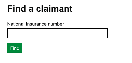
Hi there, I am taking a similar approach to @chdesign here. This is for a DWP agent admin.

We're using this pattern on Explore careers.
 https://beta.nationalcareersservice.direct.gov.uk/
We've also used a slight adaptation of the pattern as part of the right hand column.
 https://beta.nationalcareersservice.direct.gov.uk/job-profiles/police-officer
Has anybody else used this as a non key element on a page, or in a one-third section?
https://beta.nationalcareersservice.direct.gov.uk/job-profiles/police-officer
Has anybody else used this as a non key element on a page, or in a one-third section?
Interesting blog post comparing different kinds of search boxes: https://www.gyford.com/phil/writing/2018/12/05/search-forms/
We have done some work on search patterns where it's part of the header on every page.
This one searches everything in a system and uses the search button text as a quasi label for sighted users.

This one searches on specific properties like a reference number or whatever you need. The toggle button has configurable text (“Find case” in this example) and custom hint text to help users understand the more limited scope of the search:
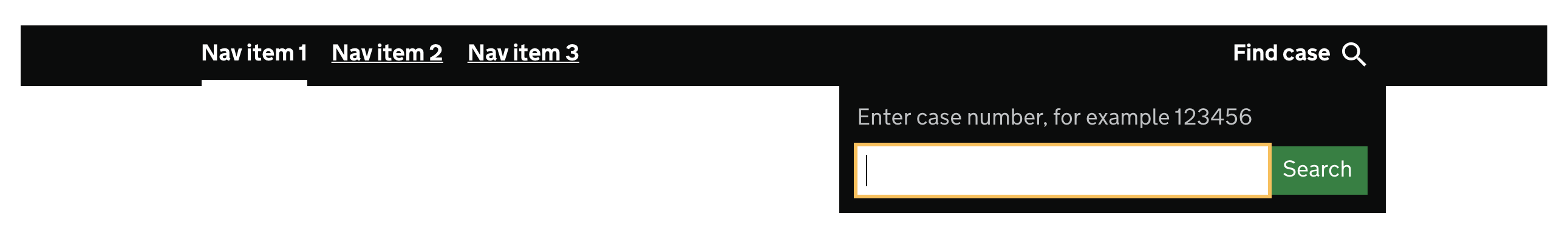
Here's how this component works as part of the overall layout:

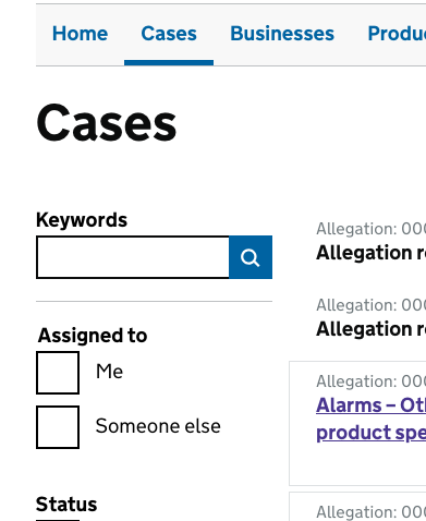
My service (internal casework tool) uses a search box as part of a filtering pattern. It's similar to what's used in the design system app, though the search button itself is focusable - on the design system when the search is focused the 'button' disappears.
We've moved this card to the 'To do' column of the community backlog because it's a dependency on the Search for something pattern, which is already in the 'To do' column.
We have quite a unique case where users need to search from the GOV.UK taxonomy, which is tree-based. Sometimes the lower levels don't make sense out of context, and so showing the entire tree is important.
The search uses autocomplete and we highlight the key words so when it's a longer list, it is very clear why results are being shown.
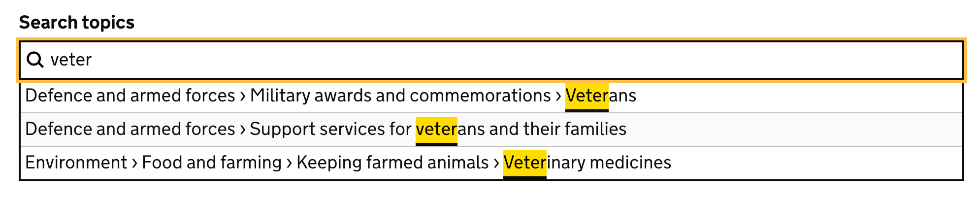
Note: the brighter yellow is from the new design system release, and our focus state will be the same yellow once it’s out.
We've had this issue raised about the search box in the Design System:
#937: Search button disappearing can be confusing for some users

@timpaul do you have examples of those elements when focused? We're using a variation of #2 and I'm just working on the focus state for the search button itself.
@timpaul are there any coded examples of the above search boxes that we can take out to include in some user testing we have planned?
Hi @kim-trow . There are no coded search box examples in the Design System right now. We're not prioritising the development of new components this quarter, but will be from April.
Hi @kim-trow . There are no coded search box examples in the Design System right now. We're not prioritising the development of new components this quarter, but will be from April.
Here's one!: https://design-system.service.gov.uk/components/#app-site-search__input
@RobinKnipe just to clarify, the code of the Design System website itself is not intended for use across government, in the way components in the Design System/GOV.UK Frontend are.
@joelanman that's a shame, because in this case to include such a useful component in the features of the site, but not in the content, seems like a missed opportunity.
Hi @stevenaproctor I found this that might help to understand why the search box on GOV.UK uses placeholder text. This is from a "Site search analytics report" from 2013:
"Empty searches where people click on the search button without entering a search term - jumped up on 19 November when Universal Jobmatch went live; went down from 8 April when redesigned navigation went live."
Looking at this the suggestion is that the placeholder text is what made the difference. No comment on the fact that the button went from the word "Search" to a magnifying glass icon.
Maybe that was the difference that mattered?
Nobody was drawn to click on the word 'search' to perform a search anymore.
I think that's a really good point! I've always been a little hesitant to infer too much from this data, but I think your suggestion is really plausible. A proportion of people will always click on the word 'Search' first - whether it's button text or a placeholder.
Can't you just make clicking the search button (or magnifying glass icon) switch focus (and highlight) the search field when that field is empty? That would surely remove the problem of empty searches.
I can't find a 'Sort by' pattern on gov / github - the default for a dropdown is to have the label above. Is it ok to use just one line? - ie so that the 'Sort by' label and the dropdown are on one line and it reads as a sentence more.
I can't find a 'Sort by' pattern on gov / github - the default for a dropdown is to have the label above. Is it ok to use just one line? - ie so that the 'Sort by' label and the dropdown are on one line and it reads as a sentence more.
Not sure this is a question for search?
Regardless, yeah I think same line is something you could consider.
If you've only got two things to sort by, you could also consider links:
