govuk-design-system-backlog
 govuk-design-system-backlog copied to clipboard
 alphagov
Card
What
Panels of structured content (eg. image, title, description, link), typically organised in rows or grids:
Example 1: Home Office
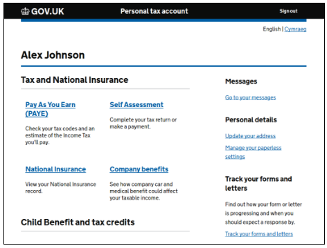
Example 2: HMRC Tax Platform
Example 3: GOV.UK Notify

Example 4: GOV.UK Home page

Why
Versions of this pattern are already being used in various government services (see examples above).
HMRC have some evidence that adopting this pattern has improved the usability of their tax platform.
This specific component doesn't exist, but it's possible that it could be build from GOV.UK Frontend styles and the panel component.
Anything else
Cards: Home Office design system Cards: HMRC Design Patterns
Recommendations
This proposal was reviewed by a panel of designers from GDS, DVLA, HMRC, DWP and Home Office on 15 Feb 2018.
The panel agreed that the pattern should be included in the GOV.UK Design System with the following recommendations.
Guidance
There were concerns that cards are often used to compensate for poor information hierarchy or content design.
Contributors to this pattern should establish what user needs the pattern is designed to meet and write appropriate guidance explaining when to use, and not to use, the pattern.
Design
Cards are already being used in many government services, but quite inconsistently. When used appropriately, cards are a good way of chunking up related content, data and links. They can also be used to highlight content on a page.
A consistent style and structure for cards should be established. A number of variants should be provided, with guidance for their appropriate use.
Accessibility
Close attention should be paid to the accessibility of the pattern, in particular colour contrast and the affordance of links.
Component or pattern
Consider whether Cards should be developed as a new component, or as a pattern built from existing styes and components.
The services and information listing on www.gov.uk is another example of a card.
The Home Office examples have not been used widely and not in a live service like HMRC tax account so any insight we have is minimal.
I have done a fair bit of work on cards before (pre-GDS)
Also this relevant blog post was just published - https://daverupert.com/2018/04/pitfalls-of-card-uis/
I've put together a prototype of a configurable card. It has a few "slots" available for an image, text and action and the appearance can be changed by using modifier classes.
These modifiers can give the card a background and add padding, remove a border, make the whole card focusable, make cards the same height if have different content etc etc
https://govuk-card-test--region.herokuapp.com/ username: govuk password: card

This is fantastic work @dashouse. I wonder about the bottom border. It works really well with the images and background colours but not quite sure about its use on the other examples.
I was thinking it would essentially be a choice, it has a border by default but you could add the govuk-card--borderless modifier class to any of those examples to remove the border if it didn't work for you in context.
Yes, I suppose I was questioning whether the border should be a default or not. My gut says it should be added rather then removed, so adding a border becomes a conscious decision based on need.
@dashouse For the govuk-card--selectable, we have done a lot of work to make them as accessible as possible. Worth asking @roblav and @Fenwick17
@owenm6 Yep probably right
@stevenaproctor Great stuff, couldn't work out the best solution (but I'm not a developer)
Registers have some nice cards https://www.registers.service.gov.uk/registers
From GOV.UK Platform as a Service (the ‘preview’ card is showing the hover state):

@roblav commented on 20 Dec 2017
PTA Card - Submission to HMRC Design System
What is the user need?
Caption: Old PTA home page
- The previous home page navigation system provided a single link into a service.
- The problem is that there are useful things that users wanted to do within the tenant services but it wasn’t obvious that those services contained those features.
- At different business events the content and the links needed to change so the user could do a task that was related to a business event.
- The organisation and names of those services hadn’t undergone any information architecture or UR.
- UR showed that quite a few users would click on the text thinking that was the link.
Current Pattern
Caption: Current PTA home page
- Current pattern addresses the issues above.
- Undergone multiple rounds of tree testing, card sorting and first click tests, as well as UR sessions.
- The content and links have all been provided by the individual services based on their best understanding of their users’ needs.
- The links can change to meet key business events or any other demonstrable user or business need while the main link into the service remains constant.
- Font size - Header 19px, default font size 16px. The cards are a navigational tool and the font size makes the page less cluttered at the smaller size, making it easier for users to identify key information.
Known limitations
1. For other services to use this pattern we need to provide some more flexible use cases for the card. It needs to support when there is only 1 link into a service We also need to decide absolutely whether or not we want to link to content outside of PTA (eg guidance content, or calculators), because this may impact the number of links services are able to offer. We currently don’t offer external links.
2. We need more ways to display different kinds of information in the main section of the card It seemed to me, from watching the recent UR videos, that users were interacting with the blue in-card banner (eg SA ambig “You can’t access this service” or whatever it says) in the same way that they do with green buttons - by viewing it to the exclusion of everything nearby and taking primary direction from what it tells them to do (in this case, to look elsewhere for the task they need to perform). I think this design needs to be reviewed and possibly flagged for further UR.
3. We need a way to not have the main section clickable, but still have links
4. There are some general interaction issues with it Current tile versions in prototype have borders that aren’t fully responsive. Not sure if this is the same in live.
5. There’s a strong belief that all the links should have a visible underline Disputed point. Sheldon’s understanding is that lists of items with links set within sentences should be underlined, but lists where the whole sentence is a link should be underlined. My understanding matches but only to a point. Experts agree that underlines should be retained if accessibility is a priority (which is the case for us) and in addition our text / link colours don’t have a good enough contrast (2.93:1) to meet accessibility requirements. The purple of visited links is even worse (1.94:1).
6. The consistent height of the cards is set by minimum height
7. The content on the main card link is contained in an anchor tag and all of it is read out by a screenreader
We have recently been testing a new 'hub' for our service which directs users to various sub services or actions. While I don't agree with creating portals, our users aren't the general public and have specific needs and services which they need to use. So, having individual searchable services is just not possible.

The GOV.UK Registers ones have changed to look more like the ones on GOV.UK Platform as a Service and less like those on GOV.UK publishing:

Our service, which allows people to view and repay money they owe to DWP, uses a version of a card. It's been tested extensively and, despite my initial reservations, has proved to be successful in guiding users through the service. It's been especially well received on mobile, which we understand will be the device of choice when interacting with the service.

Our service, which allows people to view and repay money they owe to DWP, uses a version of a card. It's been tested extensively and, despite my initial reservations, has proved to be successful in guiding users through the service. It's been especially well received on mobile, which we understand will be the device of choice when interacting with the service.
@dommn – is the card as a whole clickable? if so, does it allow the users to select the text inside it?
Our service in ESFA is for Submitting Learner Data and is now live using a card pattern taken from the Gov notify initially. However there were a few iterations based on accessibility. We had to adjust the font sizes slightly and use the bold font style.

We designed a card variation for a service that I am working on in DfE and it proved to be quite effective and prominent. I have taken inspirations from the card design provided by @dashouse and utilised the code from nhs card design.
Added few tweaks to our version of the card to fit for our needs. The code for this can be found here:

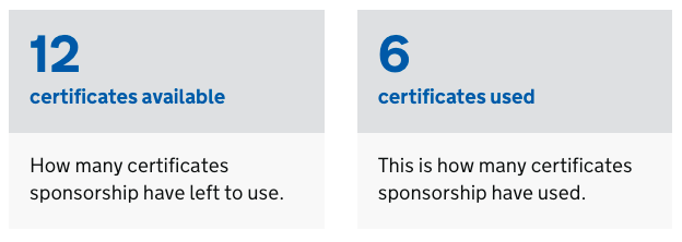
We have used the cards pattern to create an Account home dashboard for users of check and pay for multiple vehicles, within the "Drive in a Clean Air Zone" service https://www.gov.uk/clean-air-zones. This product allows business users with more than two vehicles to create an account to check and pay charges. We have tested this design with 152/how many? users during usability testing sessions and all have understood how to navigate through the service using this pattern and have understood that each tile covers different sections of the service. When testing alternate design options, such a step-by-step pattern or list, around 70% of 14 users preferred this design and found it most easy to use.

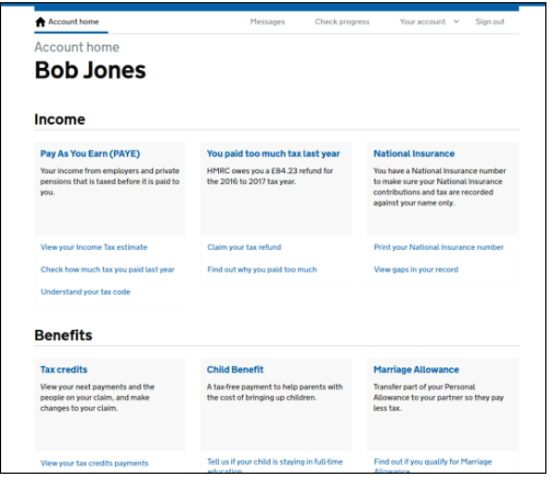
In HMRC we designed a full width card for the Business Tax Account service. The user need was to be able to view the range of all taxes held in their account, and to quickly see important actionable information. A dashboard of sorts.
The homepage displays a set of taxes the user has in their account. The taxes are presented as cards that the user can add and remove. A card layout can be simple or complex depending on the tax.
All cards, simple or complex have a common basic structure, starting with the tax name and tax ref number and a link to the corresponding tax service. The simple cards have an additional static paragraph describing the tax. The complex cards instead have a two column section, each independently playing dynamic information made up of heading, paragraphs, lists and links. The cards are not active, only the links within them are clickable.
During the iterative 18 months process cards tested consistently well over 100+ UR session users, including three assistive technology users.

Positives
- The card outline helps the user isolate a card, focus attention within it and ignore neighbouring cards.
- The list of cards is easily browsed in the vertical up/down. This is in contrast to narrower three-aside cards that can invite a more disordered vertical, horizontal and diagonal browsing sequence.
- The card's landscape format makes all its information visible and self contained within a desktop screen and horizontal tablet -- as opposed to vertically stacked content that would be only partially visible.
- The two-column section can help side-by-side comparison.
Negatives
- The dynamic content makes the complex cards unpredictable and can result in awkward card layouts.
- The dark grey outline that helps hold together together an unbalanced layout can sometimes display poorly in some screens, weakening its benefits.
- Content limits were not fully defined and enforced so the cards are vulnerable to bloating and feature creep.
govuk
Does anyone know wher I can grab the code for this for my prototype?
Sorry, @asier-hmrc my initial post didnt quite go where I wanted it to. I am looking for something like this...

A few teams had a crit lately where we used cards similar to these with the light grey background and no borders, and on several people's screens, including one who was presenting, the backgrounds weren't visible. These cards definitely need additional borders for that reason!
We also encountered issues with boxes that had a lot of space at the bottom, when they would stack on mobile the space would persist and make it harder to tell if the page had ended or if more cards were beneath them.
I've put together a prototype of a configurable card. It has a few "slots" available for an image, text and action and the appearance can be changed by using modifier classes.
These modifiers can give the card a background and add padding, remove a border, make the whole card focusable, make cards the same height if have different content etc etc
https://govuk-card-test--region.herokuapp.com/ username: govuk password: card
On our DFE service; a training platform for early years providers, we used the card design to help reduce cognitive load when a user has modules in progress. We used the attached design, and it tested very well with users. They were able to distinguish the difference between modules in progress and modules that were yet to become available. Users clicked on cards that were active to continue or start a module, and responded well to imagery.
