govuk-design-system-backlog
 govuk-design-system-backlog copied to clipboard
Start using a service
Use this issue to discuss this Start using a service pattern in the GOV.UK Design System.
Description
The first page of a service on GOV.UK. Helps users understand:
- who the service is for
- what the service helps you do
- what you need to do to use it
- alternative channels to access it
Example
Further reading
- Blog post about analysing all the start pages on GOV.UK
- Blog post about Start page discovery
- Blog post about Start page discovery — update
Are you saying that the information which quite often appears below the 'Start now' button under a heading of 'Before you start' can now appear before the 'Start' button?
In our user testing, people have often commented that the 'Before you start' info should be before the button. GDS have historically resisted moving that content.
This is something mentioned in usability testing all the time. I have seen people read the information above the 'Start now' button and not even realise the content under it was there.
It does not make sense to order content this way. You would always give people context or help before the call to action it relates to. I know having a call to action before the context or help is poor from an accessibility point of view too. People may not even realise the information is there.
Agree with Steven - from observing users during usability sessions, its evident (on regular occasions) that the 'before you start' content is rarely acknowledged. Users identify (quite quickly) the start button and head for that. They often oversee elements of content that is immediately visible on the screen - and the 'before you start' content is hidden in the first instance - less chance of the user thinking to scroll down in order to (a) identify and (b) take note/apply.
What are the implications of missing the "before you start" information on a page like this?
https://www.gov.uk/pay-court-fine-online
On my MacBook the green start button sits neatly above the fold. The vital information I need to meet the deadline for payment isn't visible or hinted at. I think that's quite dangerous.
Agree with Chris/Steven. When I raised this in design reviews when I first joined, I was told that even when the Before You Start info was above the CTA, many people skipped it anyway. BUT, it seems clear that if users are attracted to the green button, we should do whatever we can to get crucial information to them before they click. This is especially true for people using a screen reader. Re: keeping things "above the fold" - this is much less of an issue than it was years ago, given that people are used to scrolling on mobile and there is such a variety of screen resolutions on devices. Where it is a clear issue in testing is when a page appears to "stop" - there is so much vertical space between elements that people just assume they are seeing the bottom of the page. So, I'd be very pleased to see if we can iterate this pattern to bring all the crucial info above the CTA.
While I agree with a lot of these points, I'd say people often miss written information. If there are vital requirements, I'd make them opening questions in the service itself, to be safe.
“I'd make them opening questions in the service itself, to be safe.”
Not so sure I agree with that. Having to sign in only to answer questions that then exclude you from the service doesn’t feel like a good experience.
You could ask the questions before someone signs in using something like the Check before you start pattern. Some services already do this.
In @JohnnyLoz's example, you could ask "Where do you live?" to direct someone to the best place to pay their fine. Rather than relying on content on the start page.
Thanks everyone for this discussion, it's really useful. I was about to comment but Steven beat me to it - ideally any eligibility checking should happen before the user has to invest effort signing up for something
A related question: the content below the button is often broken into 2 sections; 'Before you start' and 'Other ways to apply'. Are your concerns specifically about the 'Before you start' content?
My concern is that some or all of this information is ignored.
I do not think we should tell people there are other ways to apply underneath the button to start the online service. It will be in guidance on GOV.UK but should be referenced on the start page above the button.
I've been challenging the placement of crucial content appearing after the Start now button since 205 as a screen reader user.
I've also collated a bunch of comments from the Digital Accessibility Centre:
1.0 Summary
DAC team have been providing accessibility testing services for Government Agencies for many years. We test prior to the service going into public beta stage. Most service we test will be housed on GOV.UK website.
Over the years out team have noted that the 'Start' page, owned by GDS is not quite as user friendly as it could be. We have been asked to provide our comments and suggestions for improvement of the 'Start' page and the results are shown below.
Jonathan Brew | Cognitive Analyst "I would prefer the 'before you start' details to go before the 'Start now button to let the user know what he/she should have with them before starting the process."
Mike Taylor | Screen reader analyst "I think having the information before you start, prior to the 'start now' button will be better from a screen reader point of view."
Tara Owton | Screen reader analyst "I don't mind either using the arrow keys to find the 'Start' button, or pressing the B key with JAWS or NVDA, or using the rotor in iOS and the 'Form controls' option in TalkBack to navigate quickly to the button. Screen reader users would not expect to find vital content appearing after the start now button as that may have an impact on the things they need to do or have to know before they start using the service. Important content which the user will need to know to use the service they want or to apply for something should always be placed before the 'Start' button. If it isn't, the user may activate the button without navigating past the button to see if there is any more information they need. If there is information below the 'Start' button, the user will miss out, and will thus possibly fill in a form incorrectly or not understand how to use a service correctly."
Carly Malone | Screen reader analyst "I think that the solution to include the start now information prior to the start now button would be a good solution. This would mean that users have all the information they need prior to signing up or starting the process."
Mike Jones | Screen reader analyst "I have found that the button to begin the process announces as 'Start now.' Although it is likely that the user would be aware of what process they would be beginning there is the possibility that a user navigating out of context would not be aware of this. This could particularly occur where a user has reached the page from a search engine for example 'Google.' As such I would personally recommend that the process name is contained within the 'Start now' button to ensure that all users are aware of what they will be starting regardless of navigational method.
I have found that often on these pages a significant amount of important information for example what the user will need to begin the process is situated below the 'Start now' button. It is highly likely that many screen reader users will not navigate past the start feature as this is believed to be the end of the main content and could therefore lead to information being missed by the user. It would be advisable to contain all important and necessary information before the start button to ensure that the user has all required information.
In relation to the amount of information on the start page, I would personally still like to see the information relating to what documentation I will require. I would find it highly frustrating to log into a process to find that I do not have the required documents. Although I would not wish to see a highly lengthy page I would wish to see this information. I feel that the present usual length of details often situated below the 'Before you begin' heading is adequate and concise without being over detailed. I would like to see this continue, only with the information situated above the start button.
I would be happy to scroll down to the start button in context as I would want to gain the necessary information. I would not want this to be contained above the information as it is unlikely I would navigate past the start button when not testing. However, as it is not possible to determine how a screen reader user will navigate I would still advocate including the process name in the start button.
In brief I feel that the start pages in their current format can be accessed, however to make the pages a very positive experience I would request that all important information is placed before the start button, with the process name being included within the button's text." Ziad Khan | Low Vision ZoomText analyst "Personally, I have always commented on the position of the Start Now button.
The fact that key information is situated out of my visual focus below the 'Start Now' button has been frustrating. Keen to progress an application, I would scroll down to the button and select it to continue, oversighting the key information below this. The impact being that I could well have to leave the application if relevant required detail was not already present at the time of an application. I have always felt that the 'Start Now' button should be positioned at the very bottom of the Start Page.
As with regards to the level of information on a 'Start' page, I have always considered it to be important and crucial to a successful application. To maybe split the detail onto another page would be acceptable. For me though, to have an independent 'Start Now' page followed by a page of detail before the need to register, would be possibly irritating. The reason for this being that the anticipation of starting an application, but then to find that after reading important key information, realising that you are not in a position to continue would be mildly annoying.
Finally, to help prioritize crucial information on a start page, I have always paid closer attention to points that have followed a bullet point."
Rebecca Morgan | Voice Activation analyst "The 'start now' button actually being a button would be good for consistency for voice activation users."
Cam Nicholl | Sales and marketing director "I would prefer to see 'things you need before you start' in an expand collapse in page link ABOVE the 'Start' button. Alternatively, adding an additional page post 'Start' providing the information would be a good option. Either way will keep the 'Start' button above the fold but will enable users to easily find out which information they will need to gather prior to commencing an application process."
Gary Thomas | Low vision and Magnification analyst From a user perspective, I do not mind scrolling down to find the start now button as long as the start button is visible. A longer page where the start button is displayed off screen can provide a confusing platform to navigate as functionality is hidden. In my opinion, a landing page like this example should have short and precise information but displaying the start now button without having too scroll. This gives the user an immediate idea of page layout and where the functionality is.
Should further information be needed to be viewed by the user prior to starting any process, additional links can be added to provide this. Providing a link back to the start now page would also be advised.
In my experience, any information located after the start is information I have always considered to be somewhat irrelevant. Users generally visit the desired page to get started, enter data and complete the process as quick as possible. It is generally understood that any information related to the process is given prior to starting. As soon as a user reaches the start button, they are generally inclined to click start, the page display changes and the information provided after the start button is lost. I personally would expect to see a back button and footer after the start button display. This is experienced whether magnification is used or not however, should magnification be used, it does become more problematic as the page is not viewed in context and layout is missed.
Other members of DAC user team also fed back but their feedback is consistent with what had already been provided so we omitted to show their comments.
End of Document
I would like the add to this observation. Here at the Criminal Injuries Compensation Authority, I have been testing a new application service with users, and in the majority of cases, our users are missing the crucial information that sits below the Start Button.
For these users, the Before you Start content is important information that allows them to complete an application. Many of our users are vulnerable and will find the process emotionally difficult, so any blockers to completing the application, could result in them walking away altogether. This includes in our case, not having to hand vital Police information.
When I have bring users back during testing, their first response is why is the Start button before the Before you Start info. They are confused by this pattern.
@timpaul up there ☝️ you said:
A related question: the content below the button is often broken into 2 sections; 'Before you start' and 'Other ways to apply'. Are your concerns specifically about the 'Before you start' content?
Do you - or anyone else - know if it's possible to put other headings in the sections or is the pattern locked down and restrictive technically?
We have used "Other information you might need to tell us", instead of "Before you start". I guess you could call this a fudge! All our user research on this proved it was common sense to include this information before the start button.
On Mon, 8 Oct 2018 at 14:31, Gavin Wye [email protected] wrote:
@timpaul https://github.com/timpaul up there ☝️ you said:
A related question: the content below the button is often broken into 2 sections; 'Before you start' and 'Other ways to apply'. Are your concerns specifically about the 'Before you start' content?
Do you - or anyone else - know if it's possible to put other headings in the sections or is the pattern locked down and restrictive technically?
— You are receiving this because you were mentioned. Reply to this email directly, view it on GitHub https://github.com/alphagov/govuk-design-system-backlog/issues/111#issuecomment-427833886, or mute the thread https://github.com/notifications/unsubscribe-auth/AiVDU_YzoQE-Zca-2nbcEiNH7KUQ3Q-yks5ui1O5gaJpZM4ReKyC .
Is it recommended to use the Start Page for all services? Does a semi-transactional service still need one e.g. Should we use a Start Page for someone to log into an account?
One concern I have with this journey is that the information page is only on the start page. If the user gets to the service via a link (see below), they have no context for the page.
There's no back to the start of the journey, no help pages, and they have missed out on the "important information", with no way to find out more. If the information on the start page is important, the user needs to be able to get to it, even if they start at another page.
https://courtfines.direct.gov.uk/courtfines/pages/preselect.do
@dghatch it's a good point, but also services should redirect any new visitors to the start page: https://www.gov.uk/service-manual/technology/get-a-domain-name#ensure-users-start-their-journey-on-govuk
Do you think that Start pages should be indexed in the main website search? Or have navigation links to them? Sometimes there is useful information on a service information page - and I am wondering if there is any research on how users navigate between service info page and start page?
Dropbox Paper audit
On 16 January 2019 the Design System team reviewed a Dropbox Paper document discussing the start page pattern.
The aim was to reduce the number of places containing guidance and code by:
- migrating relevant, useful content into the Design System itself
- recording important research findings in the community backlog
- removing the original Dropbox Paper page
Below is a record of the outcomes of that review.
If you need to, you can see the original Dropbox Paper content in the internet archive.
Review outcomes
Research and examples
Added 2 links to the discovery that was done in 2013 into the main comment further reading section.
Is there any update on moving the 'Before you start' content above the Start button? Testing a new service and, yet again, the vast majority of users are not reading anything below the Big Green Button - we're seeing it happen via eye tracking, and users confirm it at the end of the tests when we ask about it.
(Our Start page is quite small - there's not a great deal of content within 'Before you start' - so I don't think the content itself is the issue, it's the position of it).
This has been going on since September 2015 according to my email sent items.
It also dawned on me recently that if this page was read out by Alexa she would ask the user if they wanted to start now before the user had the opportunity to read the things you must do before you start.
When can we finally address this?
Chris
On 27 Feb 2019, at 14:57, James Francis [email protected] wrote:
Is there any update on moving the 'Before you start' content above the Start button? Testing a new service and, yet again, the vast majority of users are not reading anything below the Big Green Button - we're seeing it happen via eye tracking, and they confirm it at the end of the tests when we ask about it.
(Our Start page is quite small - there's not a great deal of content within 'Before you start' - so I don't think the content itself is the issue, it's the position of it).
— You are receiving this because you commented. Reply to this email directly, view it on GitHub https://github.com/alphagov/govuk-design-system-backlog/issues/111#issuecomment-467893335, or mute the thread https://github.com/notifications/unsubscribe-auth/ATkM53ROHluQ29S47WMR3xeLi0Ba6Yocks5vRpy-gaJpZM4ReKyC.
In regards to the Start now 'button', the NHS are using a larger link style which seems like a good alternative. Means they avoid links that are styled as buttons.
https://www.nhs.uk/conditions/stress-anxiety-depression/self-help-therapies/
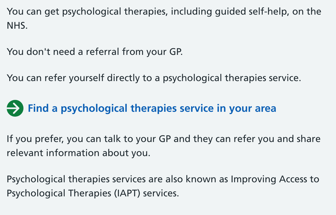
They seem to call it an action link.
Always depends on context, but I've seen large bold links like this mistaken for headings in user research
Why are links that are styled as buttons a problem?
If it looks like a button, has been given the role of button, then what is the benefit of the NHS approach over GOV.UK?
On 20 Mar 2019, at 10:18, Nick Colley [email protected] wrote:
In regards to the Start now 'button', the NHS are using a larger link style which seems like a good alternative. Means they avoid links that are styled as buttons.
https://www.nhs.uk/conditions/stress-anxiety-depression/self-help-therapies/ https://www.nhs.uk/conditions/stress-anxiety-depression/self-help-therapies/ https://user-images.githubusercontent.com/2445413/54676774-5b43e880-4af9-11e9-94bb-82c66529fa4b.png They seem to call it an action link https://nhsuk.github.io/nhsuk-frontend/components/action-link/index.html.
— You are receiving this because you commented. Reply to this email directly, view it on GitHub https://github.com/alphagov/govuk-design-system-backlog/issues/111#issuecomment-474769369, or mute the thread https://github.com/notifications/unsubscribe-auth/ATkM55qbndUjh804tSgDzST_Sj9Y_-NNks5vYgsHgaJpZM4ReKyC.
If it looks like a button, has been given the role of button, then what is the benefit of the NHS approach over GOV.UK?
It may look and have been given the role of a button but it doesn't act like a button. I can't right click it and open it in a new tab or copy the target address.
I know they can be used in a similar fashion but aren't the same thing. Material honesty is important.
Issues around the placement of the button came up again when we had this pattern tested in an external accessibility audit: https://github.com/alphagov/govuk-frontend/issues/1415#issue-450856056
Even a detail summary widget above the Start now button would do! It could be collapsed by default if we are concerned about pushing that big green button too far down the page.
At least users on mobile devices, people using screen magnifiers and those following linear content determined by the DOM (screen reader users like me) would spot the element if it was placed before the green button.
I’ve been banging this drum since September 2015. How much more evidence do we have to provide?
On 6 Jun 2019, at 10:15, Nick Colley [email protected] wrote:
Issues around the placement of the button came up again when we had this pattern tested in an external accessibility audit: alphagov/govuk-frontend#1415 (comment) https://github.com/alphagov/govuk-frontend/issues/1415#issue-450856056 — You are receiving this because you commented. Reply to this email directly, view it on GitHub https://github.com/alphagov/govuk-design-system-backlog/issues/111?email_source=notifications&email_token=AE4QZZ4OZH27RNLGCQ5GVS3PZDISDA5CNFSM4ELYVSBKYY3PNVWWK3TUL52HS4DFVREXG43VMVBW63LNMVXHJKTDN5WW2ZLOORPWSZGODXCHX7Q#issuecomment-499416062, or mute the thread https://github.com/notifications/unsubscribe-auth/AE4QZZ565PX66WW4GLFIWKDPZDISDANCNFSM4ELYVSBA.
We did a few rounds of contextual testing with users with accessibility needs this week. Again, a blind user (using the Jaws screenreader) completed missed the "Before you start" content under the Start button.
This pattern needs to change - I'm at a loss to think of a reason it still hasn't been done?
Tim,
You were looking at this ages ago, can we have an update on how GDS propose to resolve this please?
Cheers
Chris
On 7 Nov 2019, at 08:04, James Francis [email protected] wrote:
We did a few rounds of contextual testing with users with accessibility needs this week. Again, a blind user (relaint on the Jaws screenreader) completed missed the "Before you start" content under the Start button.
This pattern needs to change - I'm at a loss to think of a reason it still hasn't been done?
— You are receiving this because you commented. Reply to this email directly, view it on GitHub https://github.com/alphagov/govuk-design-system-backlog/issues/111?email_source=notifications&email_token=AE4QZZ4YPZVFKRWBGMD3RZDQSPDZDA5CNFSM4ELYVSBKYY3PNVWWK3TUL52HS4DFVREXG43VMVBW63LNMVXHJKTDN5WW2ZLOORPWSZGOEDLRZGQ#issuecomment-550968474, or unsubscribe https://github.com/notifications/unsubscribe-auth/AE4QZZ4N256O5IIEI2GZPITQSPDZDANCNFSM4ELYVSBA.