govuk-design-system-backlog
 govuk-design-system-backlog copied to clipboard
 alphagov
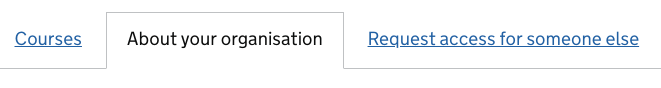
Tabs
Tabs
Use this issue to discuss this pattern in the GOV.UK Design System.
Contributors
- @adamsilver
- @trevorsaint
Related components
- #138 Tabbed navigation
Related links
- Tabs in Home Office design system
- Tabs in HMRC design patterns
- Tabs in Rural Payments Styleguide
- Tabs in Reform pattern library
- Tabs discussion in Dropbox Paper
- Tabs in the Citizen's Advice Design System
- Neilsen Norman guidance on tabs
- Léonie Watson blog post on accessibility testing, including tabs
@adamsilver and @trevorsaint have very kindly agreed to develop this component, using their work on tabs in the Reform pattern library. The Sass and JavaScript for their tab component is available on GitHub.
@adamsilver and @trevorsaint have reported that the original version of the component is being used successfully in the following services (amongst others):
Criminal Justice Services (CPP)
- Prosecutors
- Legal Advisers
- Court Administrators
- Online reporting (SJP performance data)
Judiciary UI internal systems (HMCTS)
- Divorce
- Civil Money Claims
- Financial Remedy
- Continuous Online Resolution (COR)
- Court Case Data (CCD)
Rural Payments (Defra)
Tabs component criteria
Following 2 discussions with @adamsilver and @trevorsaint we've agreed that, in addition to meeting the Design System criteria, this component will meet the following additional criteria:
Coding criteria
The tabs component must:
- be built using GOV.UK Frontend
- follow the GOV.UK Frontend coding standards
- be tested with these browsers
- be tested with these assistive technologies
Design criteria
The tabs component must:
- be based on existing elements from the Design System
- be operable with a keyboard
- be usable on a small-screened device
- degrade gracefully if JavaScript is not available
- handle cases where tabs run across multiple lines
- handle cases where the user changes their default colours
- let users bookmark the selected tab
- not have a visited state
- appear in the browser history
- have an optional bordered variant
Guidance criteria
The tabs component guidance must:
- follow the GOV.UK Design System content pattern
- follow the GOV.UK style guide
Research criteria
The component must have been tested with a representative range of users in a prototype or live service.
Accessibility criteria
The tabs component guidance must:
- be focusable with a keyboard
- indicate when a tab has keyboard focus
- inform the user that it is a tab
- inform the user if it is selected
- inform the user about the label of the tab
- inform the user about the total number of tabs
- inform the user about the number of the current tab out of the total number tabs
- allow to switch between tabs using arrow keys
I'm wondering if it's helpful to split this work into smaller chunks, something like:
- Visual design, HTML, guidance. The tabs are links to page where that tab is selected.
- JavaScript, ARIA (if needed), history API
I think 1. might be significantly easier to do, and easier to get through the process and deliver value quickly. We could then enhance it to 2.
@trevorsaint and @adamsilver - what do you think? Would that help, or do you think that both chunks will be ready in good time?
We've already tackled all of those things now and we're close to finishing V1 (subject to crit etc).
We just had a quick discussion about this on the team - to try and summarise (these are all just thoughts and not a steer in any particular direction):
It might be tricky to convey when teams should use version 1 (full page navigation, tabs link to content on separate pages) and version 2 (all content on one page, enhanced with javascript to switch between them).
Version 1 seems to be in wide use around government.
Version 1 is useful when the pages are quite large, and combining them in version 2 would mean users download a lot of data they don't necessarily need.
We need to be careful to only use ARIA on version 2, it would be incorrect on version 1.
Following a productive discussion with @adamsilver and @trevorsaint we've agreed the following:
- we'll rename this component from 'tabs' to 'tabbed panel'
- the default style will now be bordered
- this component is now specifically for bordered tabbed panels
- we'll create a new component called 'tabbed navigation'
- this is for the other use case, the non-JS tabs
- for now, the visual style of both components will be the same (without the border for tabbed navigation)
- we may iterate the style of tabbed navigation if we find it's confusing to users
Also of interest https://inclusive-components.design/tabbed-interfaces/
DWP using JS tabbed interfaces with research showing the need and proof of accessibility testing https://github.com/dwp/design-examples/tree/master/tabs
DWP draft guidance https://docs.google.com/document/d/1nalvO7QwNiSyX8aVYeM6U1iNtB9-UDMNNjsHFhS4u-U/edit#heading=h.u45atcpl9klz
These DWP internal services use tabbed panels with JS:
- Manage Bereavement Support Payment
- Access to Work Integrated System
Probably worth mentioning on here that our stance on tabs at DWP was not to have both tabbed navigation and javascript tabs with the same styling. The reason being that if they look the same, the expected behaviour is the same, but it's not.
We opted to keep our tabs styling for the progressive enhanced version, and for our tabbed navigation, we are going to switch to a component with different styling. This way you don't see two things that look identical and have an inconsistent experience with how they work.
Also, the user need for having the JS tabs over the tabbed nav fell out of research we did on Bereavement, where our agents were getting disorientated. The tabs were a little way down the page, and when we used the non-js version it would pop them back to the top and they would lose their place.
We also tried doing it with anchor links to the ID's, but it never quite puts them back to the same place. It's still jarring, and it was creating unnecessary cognitive load to try and orientate themselves again.
Some of the Accordion guidance, I think, is relevant to Tabs.
https://paper.dropbox.com/doc/Accordions-4lnTjyNru2mN1XXjA1Xf3
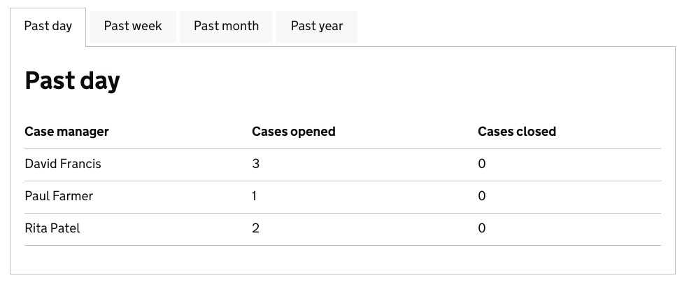
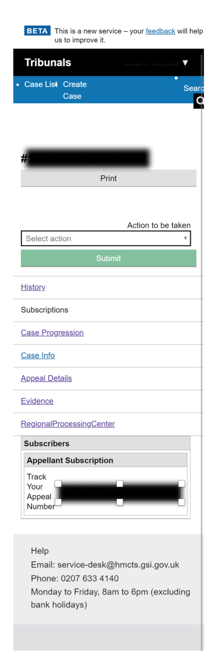
Judicial case manager screenshots
With a cheeky example of sub nav too.
Big screens

Small screens


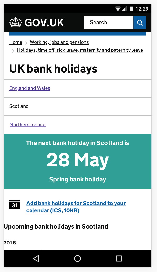
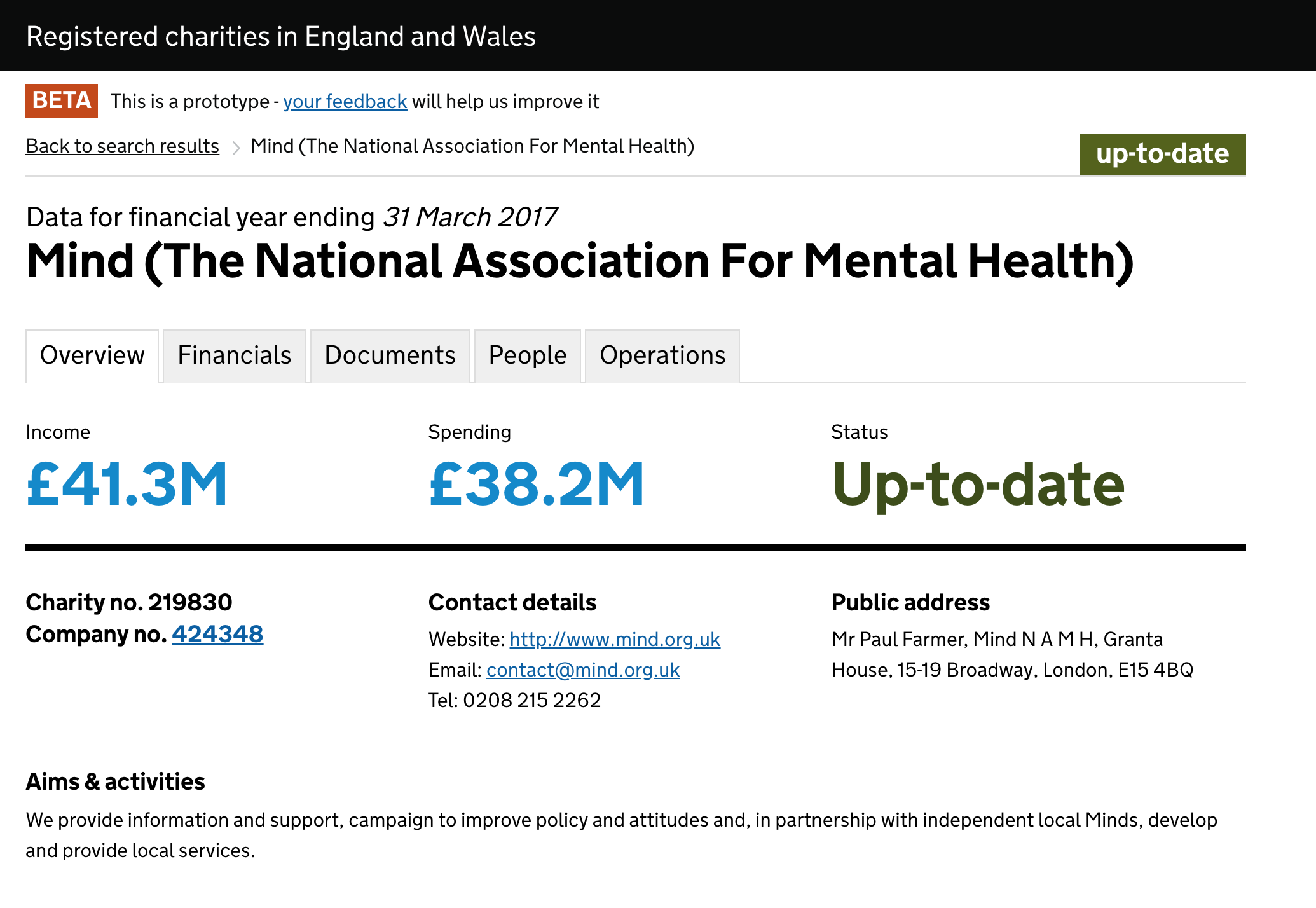
Find a charity uses tabbed panels
http://beta.charitycommission.gov.uk/charity-details/?regid=219830&subid=0
Big screens
Small screens (broken)


Working group review session
This proposal was reviewed by a panel of designers from GDS, HMRC, DWP, EA and Home Office on the 24 of May 2018.
The panel agreed that the pattern should be published in the GOV.UK Design System.
The panel also made the following recommendations:
Before publication
- rename the component to 'tabs'
- the first paragraph should be more closely defined, to make the use case really clear
- the first paragraph should avoid overly negative words like 'risk'
- make sure that the 'When to use' content has sufficient prominence
- avoid nested bullets if possible as they’re not as accessible
- add information about maximum number of tabs to use
- add more context to the example tab
- make sure the example matches the guidance (for example, the tab labels)
- double-check that the light grey has sufficient contrast
After publication
- review the style of closed tabs - are they obvious enough?
Also, for after publication to have a variant where the panel is borderless (on the left, right and bottom).
We tend to use tabs solely for staff systems, agents at DWP have IE11. The grey background colour (#f8f8f8) for the inactive tabs doesn't display at all, whereas the darker grey does (#dee0e2) does display. See the screenshot from a Windows machine using IE11.

The guidance and examples have now been updated, following the feedback from the working group. Thanks all for your help.
How much as this been tested with low vision users? I'm suprised the difference beteween the selected and unselected tabs is so subtle, the matching title aside admittedly, but seeing both could be a challenge at high magnification
@jbuller we had the same concern. @steven-borthwick pointed it out a month ago that it also doesn’t show up on government machines so all the tabs are white. Must be because of the compression as the desktop is technically streamed. The tab pattern we developed in DWP had a darker grey background. It would be good if somebody from the design system team could update on this.
Hi @abbott567 and @jbuller , thanks for your question and feedback. This component is currently marked as experimental because we know it needs more research and testing. We have used the research section in the component's guidance to describe known gaps, and we will add this issue as a point to further research. We will talk to the original contributors to see if they can help, and if not, we'll ask the community to help us do proper user research. If you have any research that you're able to contribute, it would be great if you could share some details here. @alex-ju has some comments about this, could you add them here? Many thanks :)
Indeed the light grey on non-active tabs is only slightly different than the white on selected tabs, but the idea was to differentiate using the border and the active state (yellow border) when interacting with it.

Our tests with IE11 (screen shot below) show the same slight difference.

Bottom line is that potential ways to improve the component will be to try a darker shade of grey or inactive tabs and/or potentially a thicker border.
@alex-ju I think the concern is that a lot of people won't realise these are clickable. The background only has a contrast ratio of 1.06:1 which is almost the same as the white. It maybe wouldn't be as much of an issue if the blue link style was used or the darker grey like in Steves example. But at the moment the other tabs look like body text to anyone with poor vision or poor equipment, rather than buttons or links.
Before switching to the design system we used a similar tab design but where the tab label was styled as a link, which tested well with our admin users:
If the tab text is styled as a link does this resolve some of the concerns around the grey?