govuk-design-system-backlog
 govuk-design-system-backlog copied to clipboard
 alphagov
Accordion
I've done some work to extract the Accordion javascript from the Design Manual into a standalone component which no longer requires jQuery.
You can see the code here: https://github.com/frankieroberto/accordion
Just a note that the DVSA heroku app link has a password. Below are the details:
username: admin password: dvsa
Also source can be found here: https://github.com/dvsa/front-end/blob/master/src/assets/js/dvsa/modules/accordions/accordion.js
@tameemsafi the DVSA components seems to have two versions, one with + and - icons, and the other with arrows. Have you tested both? Any reasons to prefer one over the other?
Also looks like your javascript does some scrolling, which I find slightly jarring, but perhaps there's a reason for this?
@frankieroberto We did test both and the one with up/down arrows is the one that was chosen as it was more user-friendly. However, I put both in the styleguide just to show the different versions.
The scrolling feature works better if there is more content but I see what you mean that it looks a little annoying on the styleguide page.
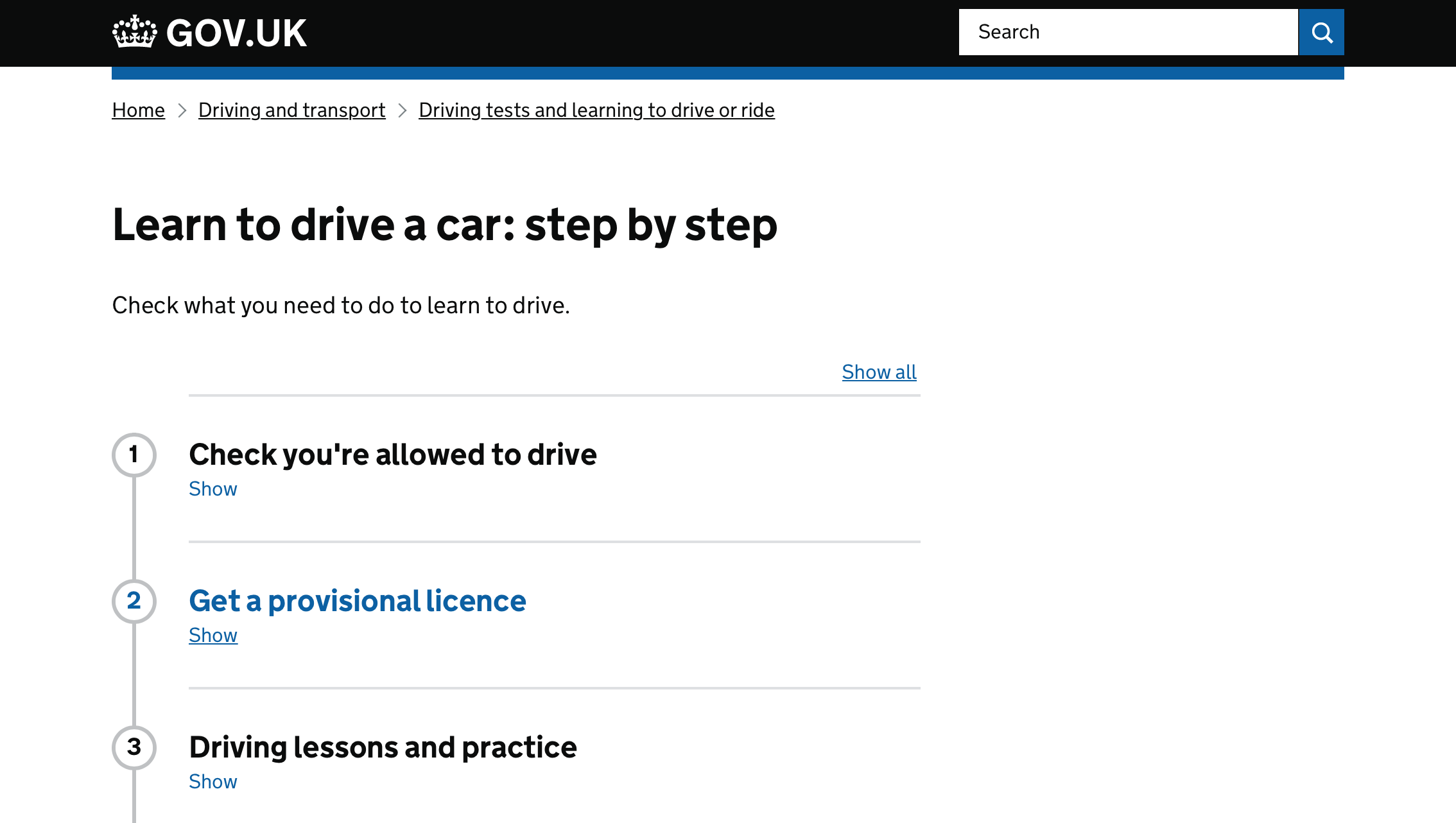
You can see it being used live here: https://www.check-mot.service.gov.uk/
We're trying out a version of this in a form on "Find postgraduate teacher training courses": https://search-and-compare-prototype.herokuapp.com/start/subjects (bat/beta)


@frankieroberto has very kindly agreed to work with us on developing this component. The work will be based on https://github.com/frankieroberto/accordion
Accordion component criteria
In addition to meeting the Design System criteria, we have agreed that this component will meet the following additional criteria:
Coding criteria
The accordion component must:
- be built using GOV.UK Frontend
- follow the GOV.UK Frontend coding standards
- have a Nunjucks macro
- have unit and integration tests
- be tested with these browsers
- be tested with these assistive technologies
- if appropriate, use Details disclosure element (this should be explored as part of the coding work)
Design criteria
The accordion component must:
- be usable on any screen size
- allow users to complete their task if JavaScript is not available
- change appearance when it is expanded/collapsed
Guidance criteria
The component guidance must:
- follow the GOV.UK Design System content pattern
- provide examples of common use cases
- describe what research has been done and what still needs to be done
- follow the GOV.UK style guide
Research criteria
The contributor must:
- have collected at least 3 different examples of accordions being used in services on GOV.UK
- have tested with a representative range of users, including those with disabilities, in a prototype or live service OR
- be able to show that the component is clearly based on relevant user research from other organisations and best practice (in this case, the component would be published as experimental)
Accessibility criteria
- must meet WCAG 2.0 AA guidelines
- not depend on colour to communicate information
- handle cases where user changes their default colours
- it must be possible to focus on the controls using the tab key
- the controls must change in appearance when keyboard focus moves to it
- it must be possible to activate the controls using the appropriate keys
- the controls must indicate when the mouse is hovered over it
- it must be possible to activate the accordion controls using a click
- the controls must be large enough to tap accurately with one finger
- it must be possible to activate the controls using voice commands (see Coding criteria).
- the expanded/collapsed state must be available to screen readers
- the relationship between the accordion controls and disclosed content must be available to screen readers
- it must be possible to focus on the accordion controls using standard screen reader button commands
- the controls must have a visible text label
- the contrast between the accordion text label and its background must meet (or exceed) a ratio of 4.5:1
- the markup must validate against HTML5 validator
- the content must be in a logical order in the source code
This contribution in being worked on GOV.UK Frontend by @frankieroberto, see further details here: https://github.com/alphagov/govuk-frontend/pull/958

This looks really good—nice one, Frankie!
Here’s some notes/questions:
-
There’s a typo in the Nunjucks macro documentation: it says “Required. undefined See items”
-
Is “Open all” clear enough for screen reader users? I wonder if it should have “sections” (or similar) added to the end using visually hidden? Same for “Close all”
-
Is the “Open all/Close all” toggle button text configurable?
-
Hover state: is the subtle change of background colour obvious enough? We had a subtle grey used on Tabs (https://github.com/alphagov/govuk-design-system-backlog/issues/100#issuecomment-414043554)
-
Can it be configured so that particular sections start open?
-
Can it be configured so that all sections start open?
-
The focus outline only surrounds the button on the left even though the entire row is clickable. Is there a reason for this? I’d suggest the whole thing gets the focus outline.
-
Further to (7) could the
<button>wrap the entire row contents including the H2 and SVG icon. -
Could you add focusable=false to the SVG so that it’s not part of the tab sequence?
-
Could you add a visually-hidden class to the SVG so that it’s not read out for screen reader users as the
<button>seems to provide enough information? -
While forms shouldn’t be used with accordions, there is a potential need to have form controls inside an accordion like this for filtering controls. See the following links:
- http://nostyle.herokuapp.com/examples/filter-form
- https://github.com/alphagov/govuk-design-system-backlog/issues/1#issuecomment-407744868
-
With the filters, it's worth noting that the accordion label/heading is actually a legend. I wonder if we can make the accordion component work on legends etc.
-
There is a bug, at least in the second example where the
<h2>contains the<button>and then another<h2>inside it. -
Can it be configured so that the accordion doesn't have the “Open all” button?
@dashouse Hey Dave. @frankieroberto asked me to do this on Monday so I duplicated my comment on the PR: https://github.com/alphagov/govuk-frontend/pull/958
I have a comment on the placement and use of the 'plus' signs/ arrows:
- I'm not convinced that a plus sign or arrow necessarily has enough affordance for low confidence users
- The placement of the arrows to the far right of each section might make it invisible for users who use screen magnification
- Ditto the placement of the 'open all' element
- Using a word such as 'open', which refers to the interaction itself, may be confusing for screen reader users (who would not see anything opening). It may make more sense to use a word such as 'show', which explains the intent of the interaction, and does not describe the interaction
The way that we dealt with these issues on the GOV.UK Step by Step accordion was to use descriptive link text beneath the section headings:
(Please note that the placement of the 'show all' link should ideally be on the far left to accommodate magnified screen use. It just hasn't been implemented yet!)
@miaallers great feedback.
Thanks to your comment, I've just realised that the step by step pattern is basically an accordion but with numbers (and a connecting line). That's pretty cool and wonder if this could end up being the same pattern (or reusing what's under the hood) somehow.
In the screenshot, the “Show all” text is also aligned right and may be problematic for people using a magnifier (like you said). Did you do any testing around this?
@frankieroberto did you consider using several instances of the Details component as a style for the accordion?

@miaallers thanks for your comments. We did consider that the placement of the + and - icons and the "Open all" button on the right means they may be missed by users (included those using screen magnification). However we don’t have any strong evidence yet that those poses any actual problems, especially as the context of the page and the blue link-style headings provide the primary cue that the section is navigable. Whilst some users may interpret these as links to a new page, this interpretation doesn’t prevent them from discovering the content.
We do acknowledge that moving the icons and the "open all" button to the left may be an improvement, however the downside would be having to indent all of the text in both the heading and the expanded panel, leaving less space for the content (particularly on mobile).
For the time being, we thought it best to stick to the existing design, which is use across a wide variety of live services, and acknowledge the issue via the "experimental" badge and this message in the documentation:
Known issues and gaps
The plus and minus icon is on the right side of the component which means users of screen magnifiers might not see it.
As to the label on the button, "Show all" and "Hide all" is a good suggestion, and perhaps more generic than "Open all" and "Close all". However I think both can be interpreted in a fairly abstract way. Another alternative might be "Expand all" and "Collapse all", which are the words used in ARIA, and in the Voiceover screenreader on Mac / iOS.
@adamsilver I think the Accordion has a different use case from the Details component. We should probably give more guidance on this in the documentation though.
In my mind, the Details component is for revealing more detailed content related to the current context which only some users will need. The revealed content is likely to be 1 or more (but less than 5) paragraphs of prose.
Whereas the Accordion component is for presenting several comparable sections of content where it is likely that users will only need or or two of them. The revealed content is likely to be more structured content than simply paragraphs, such as a list, tables, or even form fields.
Something that I've found interesting reading these comments and looking at the proposed guide is that there are potentially a wider range of options for using this, such as showing filtering options as highlighted earlier in this thread for find courses.
In the guide you say:
Accordions work best for simple content and links. Do not use accordions to divide a form into sections. Split the sections across separate pages instead.
I'm not sure if this this means that using it for filtering options is not recommended?
I feel that the filtering is a situation that people may want to use an accordion, so some form of steer could be good. For example, it could be:
- discouraged - for example, do not use this for filtering
- recommended outright and then shown as an example
- described as something that may need more research
"Expand all" and "Collapse all", which are the words used in ARIA, and in the Voiceover screenreader on Mac / iOS.
They also describe more precisely what is going to happen.
Nested accordion
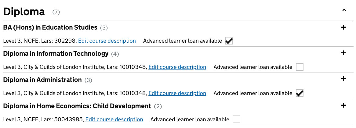
What
An accordion nested inside accordion
Why
- Inline admin form used by FE Providers to quickly update and edit course information has high-level sections. The course list is hidden by the default. By opening inner accordion providers are able to see all the instances of their courses.
Thanks for posting this example @davidolsan.
Just as an aside, we'd recommend positioning checkbox labels to the right of their inputs, as it makes it easier for users of screen readers to discover them.
We'll update the guidance to reflect this.
For what it's worth (mentioned previously by others) - we found in our service that when we originally had the + icons to the right, people often missed the fact that it was an accordion and often clicked 'No, I do not get any of these benefits' despite in fact having one a benefit that was actually an option.
Our fix was to move these to the left, and put 'show' underneath each title. This tested a lot better with users and since doing this we've had very few problems.

Or put the + in front of Show, in the second line?
Potentially. What you see above was our first iteration at trying to improve this for our users and since doing so we haven't had any further issues - but I'm sure there could be some further A / B testing if needs be.
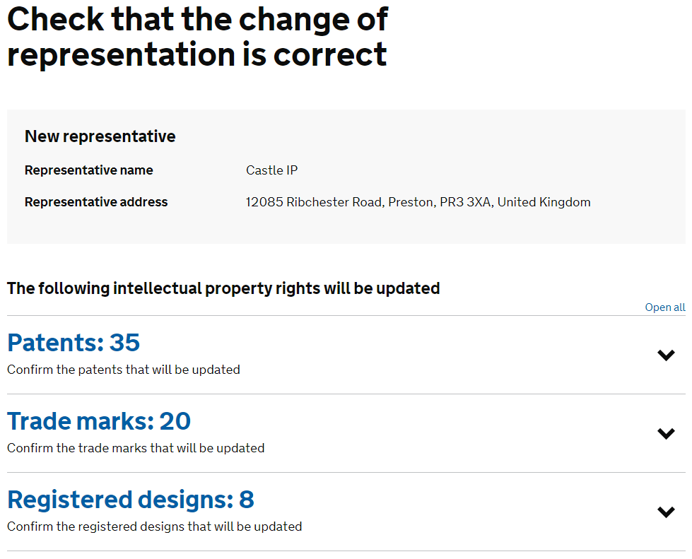
To add a bit to this discussion from a slightly different context.
We're in the process of designing a service that contains a potentially information dense transaction summary screen. We adopted accordions to separate out sections of the transaction (in our case types of intellectual property rights). Our implementation of the accordion contains a number in the section heading, see below:
All data contained within the screenshots below has been mocked up for demonstration purposes and is not representative of any real entity.
Closed accordion:
Open accordion:
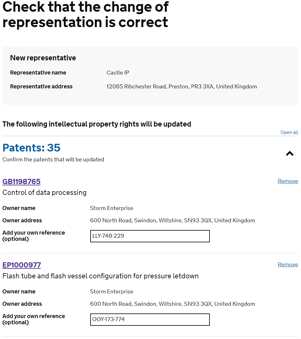
In a previous iteration; given the context of the element and the screen, when tested users believed the 'plus' and 'minus' icons related to adding or removing items in the transaction. Users were sometime hesitant to click on the sections because of this. We resolved it by opting for 'chevrons' as seen in the 'Check MOT' service. So far this has tested much more positively.
@TMDX thanks. Would you be interested in opening a Pull Request to govuk-frontend to add your chevron icons as an alternative option, so that others could potentially use it too?