Resources for Hebrew diacritics positioning
Here are two bugs related to Hebrew diacritics, the previous maintainer have no ideas on them, and finally closed them. Now I’ve found there are some good reference implementations on them, provided by Culmus project. http://culmus.sourceforge.net/taamim/index.html This page give some Hebrew fonts with good mark attachments, available in both TTF font file and SFD source, so every developer would possible to find a solution to fix. So I leave this resource here and everyone who has interests or ideas in such bug fixes would get benifits.
The Culmus resources have been mentioned in connection with Libertinus (Serif) before, in one of the issues picked up in the link provide by @KrasnayaPloshchad.
I don't know how much the design of the Hebrew and Greek (the two non-Latin sets I'm most interested in) are dear to Libertinus or Linux Libertine before that. Both are slightly compromised in a design sense (or so it seems to me), but whether "dropping in" something like Taamey Frank (from the Culmus collection) would be possible for Hebrew, I don't know (and doubt it, frankly). (The Greek is serviceable, and there would be knock-ons with Cyrillic, I expect. Best left alone, anyway.)
(P.s. Congratulations (I think!) on picking this up, @alerque! I shudder to think what this will do to your already over-burdened in-box...)
@reimerd Yes, I did, but I didn’t know Culmus has a portal gives such a good example for how to develop Hebrew fonts with Niqqud/Cantilation marks that can be reused.
Another resources available at SIL, started from the section “Ezra SIL info”. https://software.sil.org/ezra/ezrainfo/
Fantastic mini explanation of what the different levels of support are about: https://github.com/be5invis/Iosevka/issues/690#issuecomment-701440398
I am willing to answer questions and blather on at length about Hebrew typography and what's needed, optional, helpful, and awesome in terms of font-support and generally attempt to be a resource (as much as I know) regarding typesetting Hebrew if I can help anyone by so doing. I'll take a look at bugs here mentioned, maybe I can help.
Thanks @clsn, that would be awesome. I inherited this project, but neither the former maintainer nor I actually speak Hebrew. I'm vaguely aware of how it works, but certainly not is a position to know what's right or wrong. I know there are various issues with Libertinus' Hebrew script, but even if somebody comes along and contribute a PR with changes I wouldn't be is a position to know if it was being done right/well.
... I wouldn't be is a position to know if it was being done right/well.
I know what fully "vocalized" (classical) Hebrew ought to look like, but have zero experience in font building. I can certainly test! If @clsn is in a position to contribute, I could at least offer that ancillary "support".
It would be great to see Libertinus's Hebrew taken to the next level. SBL BibLit (a John Hudson production) is a bit of a kludge, and his Brill font doesn't include Hebrew ... so Libertinus could be very well placed in that specialist (but still fairly sizeable) community.
I'm not a native Israeli or native Hebrew speaker, but I do speak and read Hebrew and I do have some knowledge (self-taught, mainly, but from actual sources) of Hebrew typography historically and currently. I'm even responsible for one or two of the characters you're dealing with (YOD TRIANGLE). And I have an opinion, which is always crucial. Naturally, we can therefore expect someone out there to claim superior expertise to mine and to explain how I have done everything wrong... Let's just hope it isn't quite everything.
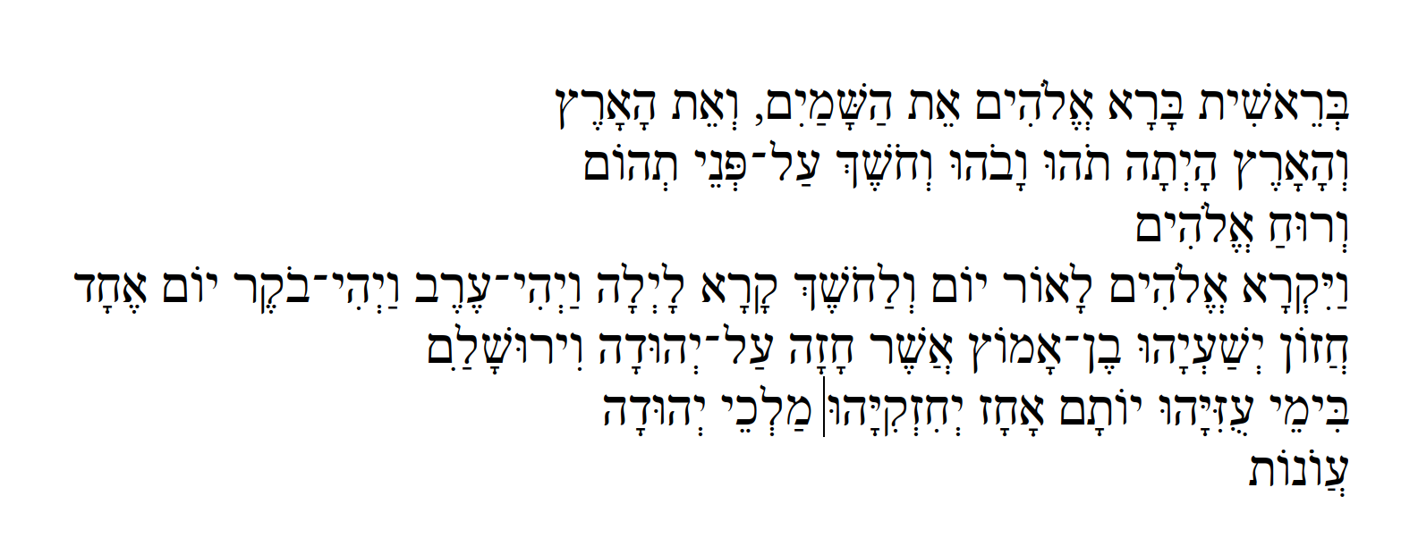
Above you see an example of the font as changed according to my PR.
BTW: I have looked at SIL and Culmus and learned from them, but they include accents and that makes it very complicated. I have tried to keep things simple and hopefully in the style of the font. Also, my time is limited and accents are a lot of work.
@cornelisbb - Thank you so much for putting this hard work into fixing the niqqudot (vowels) for Libertinus's Hebrew. The te'amim (accents) would very much be icing on the cake!
This is a vast improvement on the current state of the Hebrew provision in Libertinus, but it looks to my eye like things could be tweaked a bit further. I notice a couple "classes" of issue:
- With initial waw, the vowels patach and qamets could be shifted further to the right to ensure they are centered below the waw.
- For dalet and resh, the vowels should be centered under the stem, and the pull request is a real improvement on existing Libertinus here. It looks like they could still go a little further right to get this centering more precise.
In the PNG below I've included: (1) SBL Hebrew (the current "gold standard"); (2) existing Libertinus; and (3) your "pull request PNG", for comparison. I've circled one example (I think!) of each of my ##\1 and 2 to show what I'm seeing. I hope this helps, and be assured this is really appreciated!
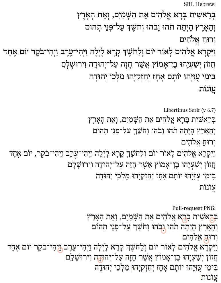
Yes, @cornelisbb's pull request is a huge improvement, and @reimerd makes valid points about shifting things a little more to the right. I note, btw, that the pull-request also makes the two-vowel combination in יְרוּשָׁלִַם readable for the first time: good job! You circled one thing that wasn't one of your numbered points: the furtive patach in וְרוּחַ. SBL Hebrew does shift it over to the right, and that is a scribal and typographical tradition, but so is leaving the patach exactly where it would be otherwise, which is what we see in Libertinus. If you were meaning to say that was another thing that should be shifted over, I don't think that's necessary, and shifting it wouldn't be just moving some points over: you'd have to have the OpenType distinguish furtive patach from regular patach and all that. So, yeah, I agree that the points mentioned by @reimerd should be shifted over a little to the right. But not so strongly that I couldn't be convinced otherwise, if @cornelisbb disagrees! Te`amim would be great, but they're a headache at least the size of the vowel-points and then some. Improving vowels is good enough for one day. (Mostly I just agree with people above. Sorry for uninformative post.)
Thanks for the feedback. It's always good to have another set of eyes looking to the details. I agree withe the points made.
I have now a working furtive patah opentype feature, so that will come in the future.
@clsn - thanks for further feedback, and for noting furtive pathach. I knew I had three in mind, but couldn't/didn't remember that one when writing up my comment!
@cornelisbb - great to see your attention to this, so thanks again for persevering and enhancing this great font.
@reimerd The Holam at the left of Lamed still have bad spacing in “pull request PNG”.
@reimerd The Holam at the left of Lamed still have bad spacing in “pull request PNG”.
@KrasnayaPloshchad - I agree, the placement of holam + lamed remains sub-optimal (compare the SBL Hebrew examples). I didn't highlight it in my reaction to @cornelisbb since it was, however, fundamentally "fixed" (compare Libertinus v. 6.7, where it fails completely). At least it is visible, and to the left of the lamed! :)
However, if refining the placement of holam + lamed could go on the list of desired "tweaks" to this enhancement, that would be a good thing.
I know the holam with the lamed is not right. I have made many improvements in the mean time and hope to have a beta version ready in the new year that can be tested then. Finetuning the placement of the vowels is patient work.
The post-pull-request LAMED-HOLAM really isn't bad. There's only so much you can do with the letter-shapes and spacing you're starting with. Could it be improved? Maybe, but what you've done is nothing to be embarrassed about. I'd accept it in a font without much judgment, as opposed to the pre-pull-request LAMED-HOLAM, which is completely unacceptable.
Improve how?
Compared to other Hebrew fonts I think I have done okay. Is this not more a matter of taste?
BTW: I have made a prelease with the fonts in my fork: cornelisbb/libertinus, so that you can test them.
Sorry, I didn't mean to imply any criticism. I can't say there's anything I'd change about it. I didn't want to flatly disagree with your own assessment that "I know the holam with the lamed is not right," so I put in the "maybe." I guess it's true, since, as you say, it's a matter of taste, so "maybe," if one's personal preference is different, it could be "improved" by that standard, though that's stretching a little.
I don't mind the feedback, only I did not know what you meant with "improve". And maybe more important than taste, now I think of it, is readability, which partly has to do with what people expect. So I compare other fonts and the BHS. If you think something can be improved, please let me know, including how.
Like I said, the implication that it could be improved was mostly me being too timid to dispute your own implication to that effect ☺! At any rate, it looks like you HAVE improved it a lot anyway, looking at your recent comparison screengrab vs the older samples on this page, which is what I was looking at. The older LAMED-HOLAM was tolerable, but your newer one is rather clearer.