On a system with many cores, only a few are listed
Environment
- OS: Ubuntu 16.04 LTS on Packet Type 2A / Cavium ThunderX 96-core ARMv8
- Node version: (
$ node --version) 4.2.6 - gtop version: (
$ npm info gtop version) 0.1.5
Description
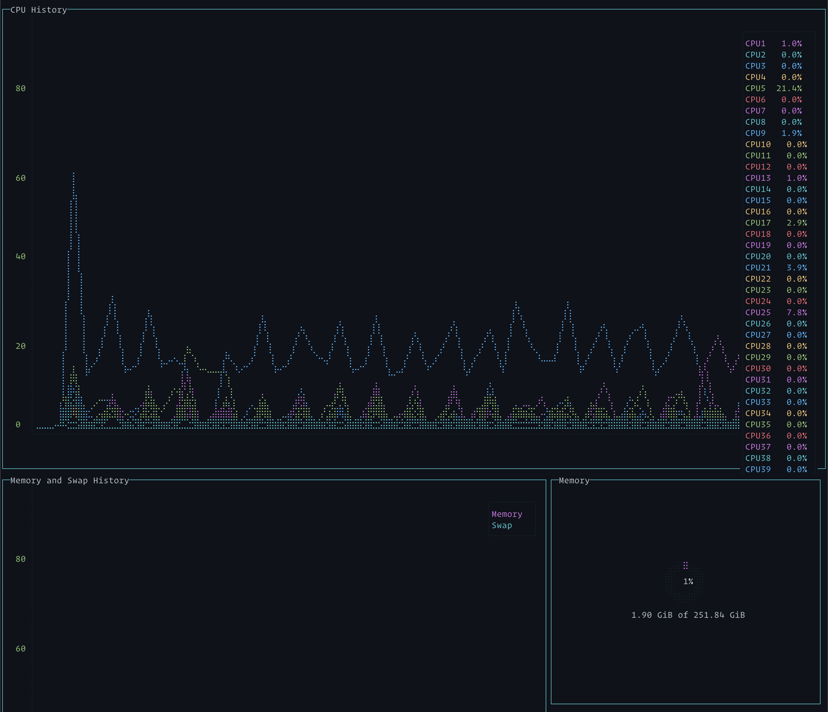
The system I am using (Packet's Type 2A, a 96-core ARMv8 system) has more cores in it than the gtop display can easily show. A screen shot illustrates:

It looks like if the "CPU" window were floated to the top it could display things better.
Hi @vielmetti
I don't know how intuitive to draw more than 8 cores in a terminal chart with really low resolution. It was my hobby hacking and I didn't foresee that somebody would actually run it on 96 core machine. :)
Initially, I needed the usage of each core to see how optimized my algorithm is or where I should make things multi thread etc.
I think, after a certain limit, it should only show total CPU percentage. What do you suggest?
Yeah, the terminal chart is fine, it's got enough resolution to pull out the detail I'm looking for. (It doesn't for some reason show 100% cores though very well).
I'm more thinking of the column on the far right hand side showing CPU number and %. I think there's room on the screen if that column gets longer to overlap it instead of having it go to the back.
I think there is a lot of value in having the usages available per core in percentage format even with absurdly-high core count, but perhaps not by default. I would say maybe a 'paging' hotkey to scroll through sets of 8 cores at a time would be good, or perhaps put them into their own column that spans two rows such that CPU History and CPU Utilization would be 2 columns on the first row, and Memory and Swap History, Memory, Swap, and CPU Utilization would be on the second row. I personally do a lot of bench-marking with multi-socket systems and pin processes to individual cores, and one of the first metrics I look at is CPU utilization for red-flags, and if the chart doesn't have a colored-Key for the chart representing each core, it would make it less apparent which cores are behaving strangely.
I’ve got the same problem on my 80 core Xeon based server, maybe it should just wrap?

Hi, @aksakalli and many cores guys
I has occur the same problem too with my RYZEN Threadripper 2990WX PC( it has 64 logical cores ).
I think, a paging idea is the simple and good solution. If you implement it then I want an auto paging feature and load sorting feature. A paging feature is switch a page automatic with a timer. And, a sorting feature is sort by an averaged load or a processor index.

Note: The screenshot was taken on wsltty / WSL / Windows10.
@aksakalli thanks.....I just have 12 cores...hope to display those.maybe 2 rows?
@aksakalli thanks.....I just have 12 cores...hope to display those.maybe 2 rows?
I ended up just moving to htop, shows all the cores
Would be really nice if this could show all 80 😭
I think a second or maybe even third row would be really useful!