 aeternity
bootstrapping ae-overscreen
task: buttons or other elements can be displayed over the top of other elements at the base of the screen or maybe at the top of the screen
@davidyuk
We need to come to terms with this component:
In general, this component has a lot of common functionality with AeBanner component, I think we should extract it.
AeBanner is being used currently, this component is a bit more minimal in scope, this will pull out of a screen every single element that is being FED! This means, we can include here:
- ae-button-group
- ae-modal (when we have one)
- AeBanne?
- any component that needs some kind of importance
So for me the only solution for this is to merge.
Do we have any actual designs that using this component? What means "element that is being fed"?
Do we have any actual designs that using this component?
This component has no visible visual styles (except for the shadow).
What means "element that is being fed"?
you feed it, as in you pass elements in the container:
<ae-overscreen>
  <ae-button />
</ae-overscreen>
Ok, I got it.
what should I do if I need this component but with different paddings?
what should I do if I need this component but with different paddings?
Here is the thing about components: They follow a style-guide, thats why @raymundjacobs has built a design-system so that components fit with each-other, without any external change. Kinda like Lego™, they fit with each-other and you can build quite a lot of stuff, but sometimes some Lego™ work in combination with only some other Lego™. The same thing applies for components.
For this case, this component the padding was designed on purpose. Solutions to how you can achieve it without padding or different paddings.
- Its child element can have the custom styles to fit its parent element. ex: negative margins on the side
- You can assign a css class to
ae-overscreenthat overwrites some specific rules
There's quite a lot of other solutions out there to fix this specific problem! What my concern is that we need reusable components, and we can't go by: it does not work for me in the base-app, then we don't need it
This component from old designs for the Base app and I have not seen something similar in applications that we developing currently. I'm just not sure that it will be used in the future.
Can you show me anything that explains why this component should have these specific paddings? Currently, I don't see consistency of paddings in our designs, I think it will help me.
One more question, for example, I have a markup:
<div>come content</div>
<ae-overscreen>...</ae-overscreen>
<modal>...</modal>
If I don't set z-index for the modal, AeOverscreen will be displayed above it, so this component make me to set z-index more than 5000 for modal.
Isn't better to don't set z-index in this component? Without z-index, AeOverscreen will be displayed above content, and the modal will be displayed above AeOverscreen because of their order in the markup.
Can you show me anything that explains why this component should have these specific paddings? Currently, I don't see consistency of paddings in our designs, I think it will help me.
Mostly all of the components that I've tried to write, have been following like the bible the designs from Rays sketch file.
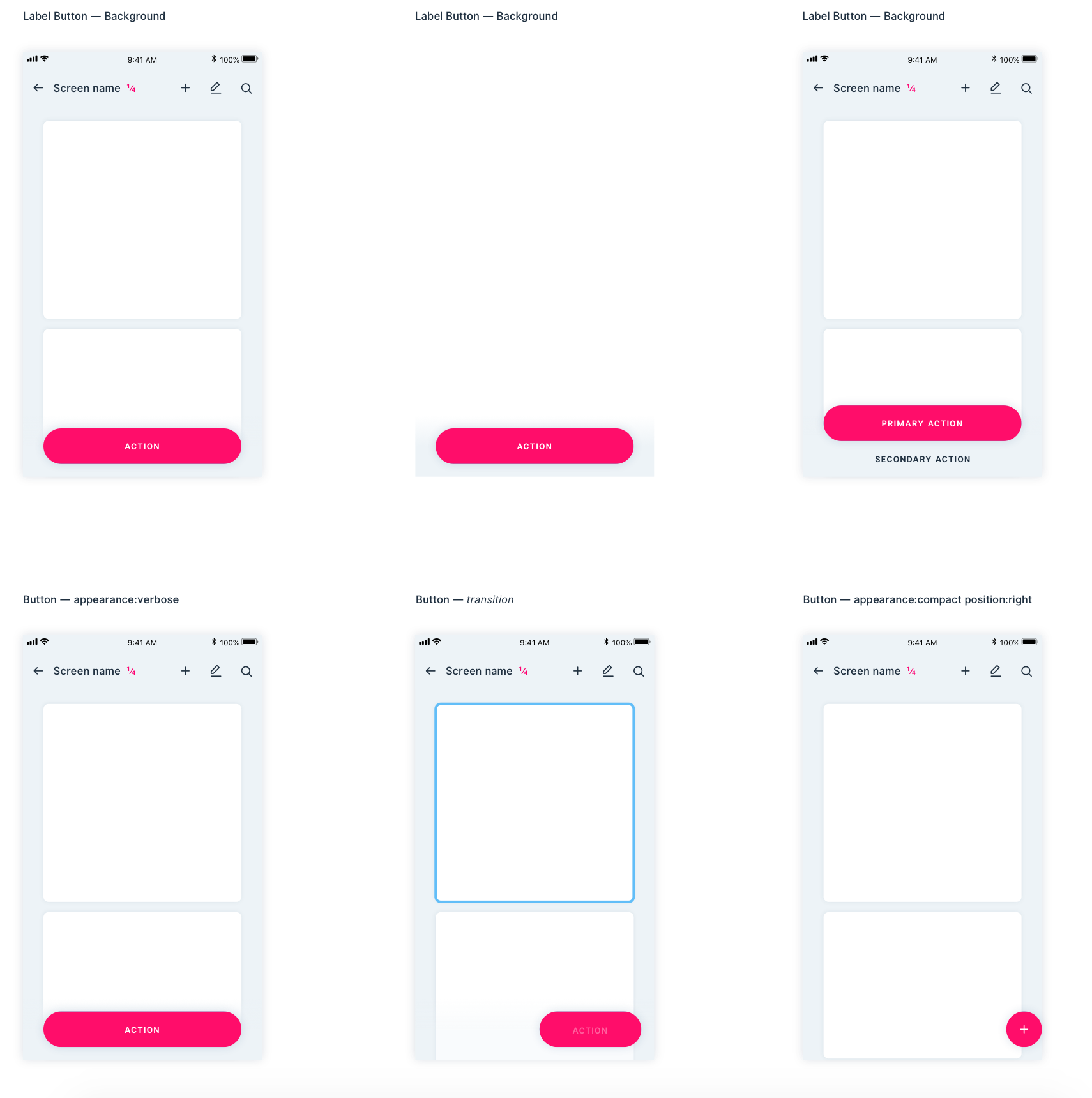
Here is a screenshot of the paddings for this specific functionality.
Now if we dissect the screenshot in there what it tells us is:
- There are different type of buttons that are being used in different manners.
- long buttons
- icon buttons (left, right)
- buttons groups (not in the screenshot, but in the designs)
- They stack on top of everything
- They are either transparent or have a shadow.
- And all of them appear to have the same spacing
- with spacing I mean paddings, which aligns with the header menu of the application
So from these points, I take it that this is mostly a functionality, because I can not embed this into a button component.
So, most of the time, I try to match designs with the proper spacing with other elements. Again, so in the end, your work will be easier, and you don't have to do any custom changes.
And If you've been following the designs, you won't need to do custom changes, because in the designs, things just fit! (sometimes they don't, but then that is not our mistake, like in this case, having two different paddings was not consistent, which as far as I remember I discussed this with @raymundjacobs a long time ago.)
If I don't set z-index for the modal, AeOverscreen will be displayed above it, so this component make me to set z-index more than 5000 for modal.
Isn't better to don't set z-index in this component? Without z-index, AeOverscreen will be displayed above content, and the modal will be displayed above AeOverscreen.
A modal, MUST always be displayed on top of everything, thus its stack level should be always higher. There are hierarchies on the layout. If you know how to use z-index (not as in technical usage, but more like where and when to use it) its a powerful tool.
AeOverScreen will be displayed over the content but the parent content in which it will be put! And in some cases, you might need to nest this item, and in that case will not work.
So in my case, I had to add z-index to modal? But why if we can just omit z-index on this component? Or you think it is not possible to make hierarchy by order of elements in html document instead of using z-index?
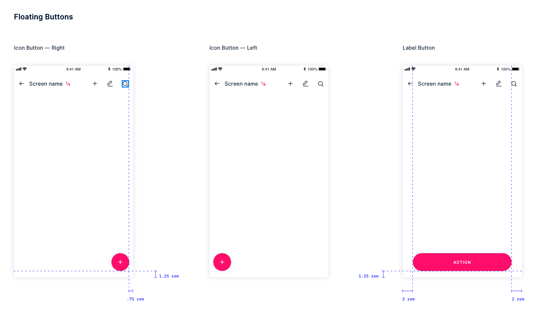
As I see from the screenshot above, horizontal paddings for icon buttons is .75 rem, but for long buttons it is 2 rems. This component can't handle it out of the box. Or you finally decided to use 2 rems in all cases?
Actually, for icon buttons this component is overkill, I can just write:
.ae-icon {
  position: fixed;
  right: .75rem;
  bottom: 1.25rem;
}
extra component is not needed in this case
So in my case, I had to add z-index to modal? But why if we can just omit z-index on this component? Or you think it is not possible to make hierarchy by order of elements in html document instead of using z-index?
It is possible to make the hierarchy through HTML, but then this increases the difficulty of actually making functionality. Because then you'll have to code HTML and CSS in a way that does not break the hierarchy! Thus, if you want to overwrite elements you'll need to nested them within other elements, and to some tricks, not a good idea longterm.
This component is needed as it will work in conjunction with other components:
- ae-banner will make use of this
- ae-button-group will make use of this
Other components will need upper screen level, and thus this component is needed! ae-splash might have been an extra nice thing to have, but this one is a functionality that will work with other components.
It is possible to make the hierarchy through HTML, but then this increases the difficulty of actually making functionality. Because then you'll have to code HTML and CSS in a way that does not break the hierarchy!
Actually, it is easier and more clear then to track ugly z-indexes like 99999. I think these components shouldn't force me to deal with them. If aepp developer wants to work with z-indexes, he can cover his code with them by himself.
Thus, if you want to overwrite elements you'll need to nested them within other elements, and to some tricks, not a good idea longterm.
What nesting are you talking about, can you provide an example?