react-spectrum
 react-spectrum copied to clipboard
 adobe
adobe
Implement StepList component
🙋 Feature Request
A StepList displays a list of steps in a multi-step form, with a visualization of the current step, completed steps, and incomplete future steps. Users can optionally click on completed steps to jump back to them, but advancing to the next step must be done through alternate means (e.g. a "Next" button).
💁 Possible Solution
The API should be something like the following. It follows the Collections API for defining the steps in the list, and single selection API to indicate the current step. However, since the user can go back to previously completed steps, there is also a lastCompletedStep prop to indicate the last step that the user can move forward to.
By default, the last completed step advances automatically as the selected step increases. If the user goes back, then it stays what it was. However, the application may wish to invalidate future steps based on changes to past steps, so they can do this with the lastCompletedStep prop. This prop is considered controlled – updating the selectedKey prop will not affect it, and the user must take care of updating it when they update selectedKey. There is also the defaultCompletedStep prop, which is the uncontrolled variant in case you just want to set the default completed step but not control it for future interactions. This would be useful, e.g. if coming back to a partially completed form.
interface StepListProps<T> extends CollectionBase<T>, SingleSelection {
  /** The key of the last completed step (controlled). */
  lastCompletedStep?: Key,
  /** The key of the initially last completed step (uncontrolled). */
  defaultCompletedStep?: Key,
  /** Whether the step list is disabled. Steps will not be focusable or interactive. */
  isDisabled?: boolean,
  /** Whether the step list is read only. Steps will be focusable but non-interactive. */
  isReadOnly?: boolean
}

interface AriaStepListProps<T> extends StepListProps<T>, AriaLabelingProps, DOMProps {}

interface SpectrumStepListProps<T> extends AriaStepListProps<T>, StyleProps {
  orientation?: Orientation,
  isEmphasized?: boolean,
  size: 'S' | 'M' | 'L' | 'XL'
}
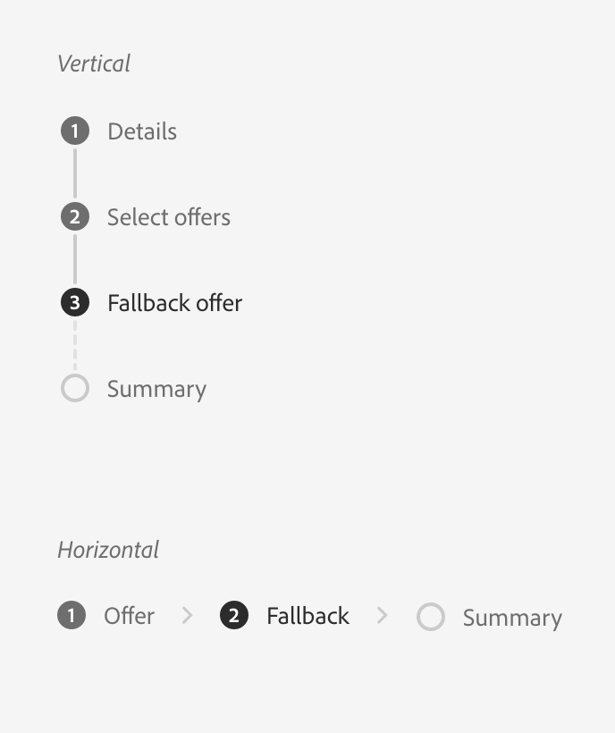
Example usage:
<StepList>
  <Item key="details">Details</Item>
  <Item key="offers">Select offers</Item>
  <Item key="fallback">Fallback offer</Item>
  <Item key="summary">Summary</Item>
</StepList>
Aria/Stately hooks
In terms of implementation, it should be similar to the way breadcrumbs is implemented.
interface StepListState<T> extends SingleSelectListState<T> {
  readonly lastCompletedStep?: Key,
  setLastCompletedStep(key: Key): void,
  isCompleted(key: Key): boolean
}

declare function useStepListState<T>(props: AriaStepListProps<T>): StepListState<T>;

interface StepListAria {
  listProps: HTMLAttributes<HTMLElement>
}

declare function useStepList<T>(props: StepListProps<T>, state: StepListState<T>): StepListAria;

interface StepListItemProps<T> {
  key: Key
}

interface StepListItemAria {
  /** Props for the step link element. */.
  linkProps: HTMLAttributes<HTMLElement>,
  /** Props for the visually hidden element indicating the step state. */
  stepStateProps: HTMLAttributes<HTMLElement>
}

declare function useStepListItem<T>(props: StepListItemProps<T>, state: StepListState<T>): StepListItemAria;
DOM structure
In general, we should follow the WAI multi-page forms tutorial (approach 4). That means it should be an ordered list of list items. If the user can However, there are a few improvements we can make.
- Use
aria-current="step"on the current item. - Add a visually hidden text to each step prefixing the text with
"not completed: ","current: "or"completed: "depending on the state of the item. We have translations for these across all supported locales. - Add
aria-live="assertive" aria-atomic="true" aria-relavent="text"to steps when they are focused. This will ensure that the state is announced when the user clicks to go to that step. (@majornista is this still needed? Saw this in your v2 PR.)
<ol aria-label="Step List">
  <li>
    <a role="link" tabIndex="0">
      <VisuallyHidden>Completed: </VisuallyHidden>
      Details
    </a>
  </li>
  <li>
    <a role="link" tabIndex="0">
      <VisuallyHidden>Completed: </VisuallyHidden>
      Select offers
    </a>
  </li>
  <li>
    <a role="link" aria-current="step">
      Details
    </a>
  </li>
  <li>
    <a role="link" aria-disabled="true">
      <VisuallyHidden>Not completed: </VisuallyHidden>
      Summary
    </a>
  </li>
</ol>
The links above are tabbable when they can be activated (steps up to lastCompletedStep). They include text to indicate whether the step is completed, current, or not completed yet. For the completed step this is duplicative of aria-current="step", so it is removed in that case. Uncompleted steps are marked with aria-disabled to indicate that they are not available to be clicked.
By default, the <ol> element itself has aria-label="Step List" (localized), but the user can also override this to a custom label.
🧢 Your Company/Team
RSP
@devongovett Opened a draft PR for @react-stately and @react-types, please have a look. Just want to make sure if I got the feature right. I will be adding aria/stories/test later.
Add aria-live="assertive" aria-atomic="true" aria-relavent="text" to steps when they are focused. This will ensure that the state is announced when the user clicks to go to that step. (@majornista is this still needed? Saw this in your v2 PR.)
I do think this is still necessary. We want to communicate the state change when the link state changes from "not completed" to "current".