source-han-sans
 source-han-sans copied to clipboard
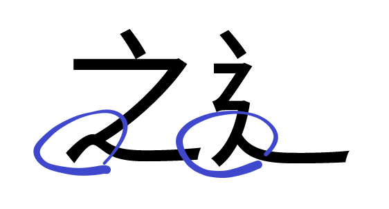
The TW/HK version of the 辶 component is more mismatched with the CN/TW/HK 之 component
The TW/HK version of the 辶 component is more mismatched with the CN/TW/HK 之 component:

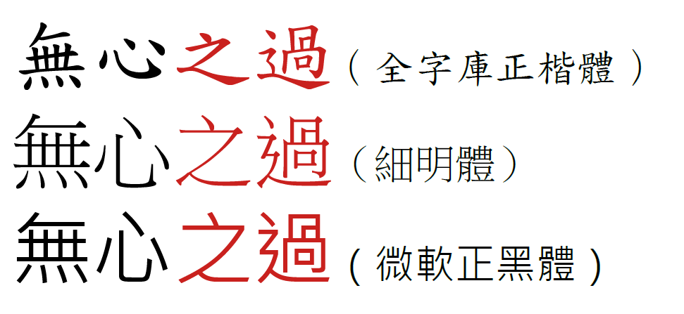
Here are the 之 and 辶 components in some fonts that adhere to the Taiwan MOE glyph standard:
 the 辶 component matches the 之 component in each font.
It seems related to #50.
Also official link of MOE here: https://language.moe.gov.tw/001/Upload/files/SITE_CONTENT/M0001/FANGTI/af1.htm
Screenshot of 「之」:

You are correct that the current design of 之 and 辶 is different. I am the one who asked for a design change of the 辶 component in #50, and I had no regret that I did so. The current design is definitely a facelift to the old one.
The difference in the design of 之 and 辶 is a side-effect of the above adjustment. Actually both designs can be found in the MoE document (the current design of 之 adheres to the SongTi (serif) form, while 辶 aheres to the HeiTi (sans/gothic) form. So to me, both designs should be MoE compliant, and if I am the designer I would choose the one that looks best, but not forcing them to be the same.
For 之, and just for sans-serif style, I do prefer the form shown on the MoE document. But I think it is not possible at the moment. Changing the design of the 之 component for TW/HK would mean that CN/TW/HK can no longer share the same glyph for characters having this component. This requires ~12 more extra glyph space, and Source Han Sans is already reaching its technical limit of having a max. of 65,535 glyphs. (For serif I even hope the san-serif form only be used for 辶, and leave 之 as-is)
BTW, you are probably aware that there are a number of commercially successful typefaces chose different approaches in designing the two components:

@tamcy As far as I know, the 辶 in any typeface which adhere to the MOE standard always matches the 之.
Some glyphs will be remove in the next major revision, so it is possible to create new glyphs in the future.
The characters which contained the 之 component for the TW/HK version:
- CNS 11643 Plane 1 and 2
| Code | Character |
|---|---|
| U+4E4B | 之 |
| U+4E4F | 乏 |
| U+6CDB | 泛 |
| U+7728 | 眨 |
| U+782D | 砭 |
| U+829D | 芝 |
| U+8CB6 | 貶 |
| U+62B8 | 抸 |
| U+67C9 | 柉 |
| U+75BA | 疺 |
| U+7A86 | 窆 |
| U+8982 | 覂 |
| U+9D14 | 鴔 |
- HKSCS-2016
| Code | Character |
|---|---|
| U+6918 | 椘 |