source-code-pro
 source-code-pro copied to clipboard
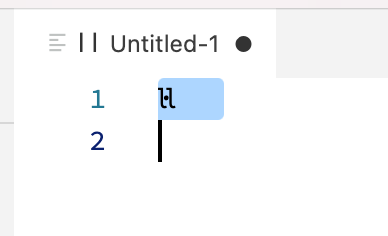
Problem with rendering "l l" in selection
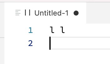
That’s a deliberate feature for a common Catalan combination. See also #192
IMHO that should be solved by VSCode by switching to the proper Unicode character, U+2027, instead of reusing U+00B7, which is an orthographic character in the Catalan language and other related Romance languages like Occitan. VSCode shouldn't ask font developers to make their fonts substandard in a human language to accomodate for their software's quirks.
I agree with the sentiment, but it’s also important to consider that no Catalan coder has yet voiced their opinion.
Perhaps they’d prefer l·l (spaced as three characters)?
One thing is for certain: it is confusing that display characters (which are not actually part of the text string) would be considered for text shaping.
I asked a Catalan Coder for his opinion:
The general discussion about ela geminada can be like falling in a rabbit hole. Its name ela geminada refers to the combination of all three elements l · l and ideally it was concieved on 1913 as a singular character to differenciate the sound of two els and the sound of a long el (with ela geminada).
Given this maybe unnecessary historical and linguistic intro (hah), I think there’s a massive gap between what “ideally” should be and what it is in the catalan language and its usage. Even the catalan TV doen’t write it correctly and a lot of speakers don’t use it correctly. Besides writing it incorrectly, people are used to see and read it as three different elements (even though ideally it shouldn’t be).
So going more specific into the thread, personally I would read it without any problem if each of the characters would take the monospaced space, that’s not a problem at all. However I would prefer to have it as a singular character and not using ldot + l in any case, but this last statement is more like a personal one I just find it’s half a solution that is not entirely working. I would either go for three characters or one singular one.
I think the best solution here is to make this behavior language specific to Catalan and to ask Microsoft to fix the bug in their software. I’ll add this to my list of things to do for the next update and may try to push a patched version sooner if I get time.
There is no single glyph for other Catalan digraphs like ll in the fonts, why is there one for l·l?
@moyogo when i went to AtypI in Barcelona in 2014, there was a presentation by Oriol Moret Viñals that explained the situation and they proposed that l-dot-l be treated as a single glyph, so I have tried to implement those suggestions in the Source fonts. the documentation is here: http://www.xn--ll-0ea.cat/info/la-ela-geminada
It’s also not a single glyph. It’s a ccmp combo of three glyphs.
My stance is that text editors should not treat their character for "invisible" display of spaces as being part of the text.
From what I understand, l·l should have the same width as or a similiar width to ll, and L·L should do the same with LL. The single glyphs lcat and Lcat in Source Code Pro are narrower than ll and LL that are two glyphs each.
If the end result was as wide as ll and LL, that would still be problematic for Netbeans and VSCode users of course, but the issue is probably in what those apps do, as you say.