covid
 covid copied to clipboard
Add mortality statistics
This project is my goto information source about the outbreak. The FHM press briefings does not say as much as the data presented here.
Sweden is seeing an increased mortality during the covid-19 outbreak. It seems like elderly are not prioritised for ICU spots and are left untested in their home.
Would it be interesting to add a diagram over the increased mortality in Sweden to compare to the reported cases?
https://scb.se/hitta-statistik/statistik-efter-amne/befolkning/befolkningens-sammansattning/befolkningsstatistik/pong/tabell-och-diagram/preliminar-statistik-over-doda/
Yes most def! I've been planning to add it for a week, just havent had the time... :)
I have started to take a look at the data from SCB, haven't made much of this yet.
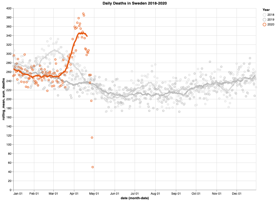
Here are death statistics from 2015-2020. 2015-2019 are shown in grey and 2020 in orange. Lines are a 20 day rolling mean.

I put up a repo with two Python notebooks on: https://github.com/morberg/covid-notebook
@morberg very interesting chat. As I understood bold grey series is something like
(mean20days_2015(t) + ... + mean20days_2019(t)) / 5
But I guess it could be very informative also draw some "bounding series", like
max(mean20days_2015(t) + ... + mean20days_2019(t))) and
min(mean20days_2015(t) + ... + mean20days_2019(t)))
So it could be more expressive in terms of seeing overall local extremes in previous years.
@pitber549 This version only shows history for 2018 and 2019, but with individual rolling means for the two years. (I think the peak in March 2018 is the flu season.)
I think this shows patterns from previous years a bit more clearly than my previous version. I'm open to suggestions if you have more ideas.
Another way is to just plot the weekly numbers, they don't fluctuate as much as the daily numbers.

@adamaltmejd let us know if we should move the discussion elsewhere, I don't want to spam your issue tracker.
No this is really interesting. And since I'm planning to make a plot like yours its gonna be helpful too :)
SCB provides historical data since 2015 for total deaths, so you can also generate the same graph going back to 2015:

Stockholm seems to have been hit quite hard so far which can be seen if we exclude Stockholm from the total numbers. Data with county resolution is only available since 2018 from SCB.

I think it would be interesting to combine the stats from SCB with those from FHM. Here's a graph (something is wrong on April 11, haven't looked into why yet) using both datasets. 'normal' should probably be called 'not covid' and is calculated by subtracting the reported covid deaths from SCB statistics.


@morberg very interesting charts. For me it was also interesting to calculate 31-days rolling sums for the following reason. After seeing more recent date from SCB which clearly shows that this outbreak is higher then on at 2018 I would like to verify whether Eurostat data actually matches SCB data all (since I'v made my conclusions partially basing on Eurostat numbers).
Actually closer look reviled that Eurostat's "Deaths (total) by month" does not matches to SCB (Excel) "directly" (SCB sum for MAR-01 till MAR-31) hover observing rolling 31 days sums I did find the match Eurostat Sweden 2018-MAR : 9 437 <==> SCB 2018-MAR-21 to 2018-FEB-19 : 9 469 Eurostat Sweden 2017-JAN : 9 282 <==> SCB 2018-JAN-23 to 2017-DEC-24 : 9 226 So this match is not perfect, but at list it gave some ground to believe that SCB and Eurostat dose not cheat data ("alot"), discrepancies could be explained by "imperfect window" of reporting for Eurostat.
Actually all that calculation I've made in Excell file (on top of official SCB data). Results of that exercise is attached below. 2020-05-15 2020-05-29-preliminar_statistik_over_doda_inkl_eng+(31-rolling).xlsx
Also in some articles I saw some ides that cumulative totals charts could be more informative to aware "how many days ahead" this year runs, comparing to previous years.
So again, to evaluate this idea I've build some chart for previous years (2015 - 2019 ) with the means of Excel file


But it turns out that for example 2018 and 2015 are almost indistinguishable on that chat (while in 2018 it is observed 31 day peek of 9 469, in comparison with 31 days peek in 2015 which is 9 082). Maybe plotting diff between "average year" and other years could be more expressive (or it could be partitioned to 12 separate charts). Also there is considerable jump at the end - corresponding to "Okänd dödsdag" (near 2 000 in average) - so it looks like "untaged" mortality equals up to 10 days at "regular rate" (assuming mean daily rate at 200 to 300). By the way 2020 also has some non-zero (826) value in that row.
Also I was looking at last charts in spreadsheet
https://colab.research.google.com/github/morberg/covid-notebook/blob/master/county-data.ipynb
and visually it looks like Stockholm contributed the most in exceeding death rate comparing to previous years, is it correct understanding ?
By the way, briefly looking at SCB Excel table Tabell 4 I could see that cumulatively (from the year beginning till the end of APR) it shows: (=SUM(E58:P58) etc)
Stockholm 2018 (selected range): 2 335
Stockholm 2019 (selected range): 2 177
Stockholm 2020 (selected range): 2 972
So that diff between 2020 and 2019 is 637
Remarkable that in resource
https://ltccovid.org/wp-content/uploads/2020/05/Mortality-associated-with-COVID-3-May-final-2.pdf
(in the table at the very bottom of that document) stated that
"Number of deaths of care home residents linked to COVID-19" - "Sweden (Stockholm region)" - 30/04/2020 - equals to 630
So actually while this number perfectly matches to that perverse diif between 2020 and 2019 it leads to another question: Are there any official statistics about deaths in care home residents in Sweden ?
@morberg unfortunately they've provided only chart without numbers. But even from that chart it is clearly seen that until 2020-05-03 (end of week 18) it was at least "500+" cases, so that number 630 looks quite believable ...
@morberg Your link gave me some food for thoughts, but eventually I still could not find fine grained (by time) statistic which was used to plot that "covid in care homes" chart from those official report.
However I was able to find cumulative (by time) official statistics about COVID-19 in care homes https://www.socialstyrelsen.se/statistik-och-data/statistik/statistik-om-covid-19/statistik-om-covid-19-bland-aldre-efter-boendeform/ https://www.socialstyrelsen.se/globalassets/1-globalt/covid-19-statistik/statistik-om-covid-19-bland-aldre-efter-boendeform/statistik-covid19-70-ar-och-aldre.xlsx
Other available article shows 5 years weekly statistic (all cases) in care homes https://www.socialstyrelsen.se/statistik-och-data/statistik/statistik-om-covid-19/statistik-relaterad-till-covid-19/ https://www.socialstyrelsen.se/globalassets/1-globalt/covid-19-statistik/statistik-relaterad-till-covid-19/dodlighet-aldre-med-sarskilt-boende-eller-hemtjanst.xlsx
Also there are some other Excel documents with weekly all cases statistics per region, so by switching the tabs one can easily see which regions cope well outback and which one had higher levels then in 2018 https://www.socialstyrelsen.se/globalassets/1-globalt/covid-19-statistik/statistik-relaterad-till-covid-19/antal-doda--per-lan-och-vecka-2015-v1-2020.xlsx https://www.socialstyrelsen.se/globalassets/1-globalt/covid-19-statistik/statistik-relaterad-till-covid-19/antal-doda-per-100000-per-alderskategori-och-vecka-2015-v1-2020.xlsx
Here is unmodified version of that files, which I had a chance to download. (Provide them here for historical reason, as far as they could be constantly updating) 2020-06-05-preliminar_statistik_over_doda_inkl_eng.xlsx antal-doda-per-100000-per-alderskategori-och-vecka-2015-v1-2020.xlsx antal-doda--per-lan-och-vecka-2015-v1-2020.xlsx dodlighet-aldre-med-sarskilt-boende-eller-hemtjanst.xlsx statistik-covid19-70-ar-och-aldre.xlsx
For me it was extremely interesting to understated relation between exceeding mortality in care homes and abroad (especially for Stockholm region, which seemingly had most "suffering" care homes)
Actually first of all I've made comparison between SCB
https://www.scb.se/hitta-statistik/statistik-efter-amne/befolkning/befolkningens-sammansattning/befolkningsstatistik/pong/tabell-och-diagram/preliminar-statistik-over-doda/
and Socialstyrelsen
https://www.socialstyrelsen.se/globalassets/1-globalt/covid-19-statistik/statistik-relaterad-till-covid-19/dodlighet-aldre-med-sarskilt-boende-eller-hemtjanst.xlsx
For comparison I'v taken long intervals near 2-month (9 weeks) spanning 2018 peek and 2020 peak:
05-FEB-2018 ... 08-APR-2018 (w6 ... w14) and 16-MAR-2020 ... 17-MAY-2020 (w12 ... w20)
Totals from SCB
2018: 18536 ; 2020: 19978 ; diff: 1442
Numbers from Socialstyrelsen (for ages 70+):
(1) within care-home:
2018: 5702 ; 2020: 6304 ; diff: 602 (=SUM($'Särskilt boende, antal'.D10:D18) , =SUM($'Särskilt boende, antal'.F16:F24))
(2) under home help service:
2018: 4508 : 2020: 4690 ; diff: 182 (=SUM($'Hemtjänst, antal'.D10:D18) , =SUM($'Hemtjänst, antal'.F16:F24))
not under any care service:
(3) 2018: 5386 ; 2020: 6013 ; diff: 627 (=SUM($'Ej särskbo_hemtj, antal'.D10:D18), =SUM($'Ej särskbo_hemtj, antal'.F16:F24))
sum_diff: 602 + 182 + 627 = 1411
So from this perspective, on entire country level it just seen that care homes residents and elderly people who was NOT under care service had approximately the same exceeding mortality rate. And also of-course that shows that exceeding mortality comparing year 2020 with year 2018 almost solely attributed with age group 70+ (overall: 1442 vs 70+ age: 1411)
To dig little bit deeper, I'v tried to drill into Stockholm data and make comparison of https://www.socialstyrelsen.se/globalassets/1-globalt/covid-19-statistik/statistik-om-covid-19-bland-aldre-efter-boendeform/statistik-covid19-70-ar-och-aldre.xlsx and https://www.socialstyrelsen.se/globalassets/1-globalt/covid-19-statistik/statistik-relaterad-till-covid-19/antal-doda--per-lan-och-vecka-2015-v1-2020.xlsx
First Excel file provides covid attributed mortality for Stockholm
70+ Totalt: 1804 (=$'Avlidna - insats - län'.B9)
care homes: 950 (=$'Avlidna - insats - län'.D9)
under home help service: 492 (=$'Avlidna - insats - län'.F9)
Second Excel file could provide excessive mortality (calculating from beginning of year - week 1 till week 26, skipping very last w27 sample of highly preliminary data)
So we have:
2018: 6943 : 2020: 8746 ; diff: 1803 ( =SUM($Stockholm.E6:E26) , =SUM($Stockholm.G6:G26) )
And it just shows that exceeding mortality in Stockholm in year 2020, comparing to year 2018 could be solely "explained" by COVID in age group 70+ (70+ Stockholm COVID: 1804 VS yearly_exceeding(Stockholm,2018,2019): 1803)
What actually makes me suspicions about that data is that ACCURACY with which that "explanation" could be provided 1804 VS 1803 As far as I know in real world numbers could hardly coincide with that level of preciseness, so it looks bit strange ...
In my opinion, now, to more or less validate reality of that data (to justify it's real but not artificial origin) it would be definitely interesting to see more fine grained statistic, something like pre-aggregated dump of form of batch of lines:
((year_week, region, age_gender_group, care_resident, covid_positive), aggregated_number)
Estimated number of rows will be: (5.5 years * 53 weeks) * (22 regions) * (8 age_gender_groups) * (3 care_statuses) * (1+e covid_yes_no) = 153912+e
So in form of zipped csv file 150+ K lines should NOT take a lot of space (I guess for such list of columns it should be far below then 5 MB)
Official authorities defiantly have that data, and maybe even already provided that data to public somewhere. Anyway it would be really interesting to look at such kind of data if they are already available.