acl-anthology
 acl-anthology copied to clipboard
Published
20 hours ago •
 acl-org
Proposal: don't center SIGs in the main table
trafficstars
If you look at the main Anthology page, the table row with all SIGs is getting too wide to read without scrolling:
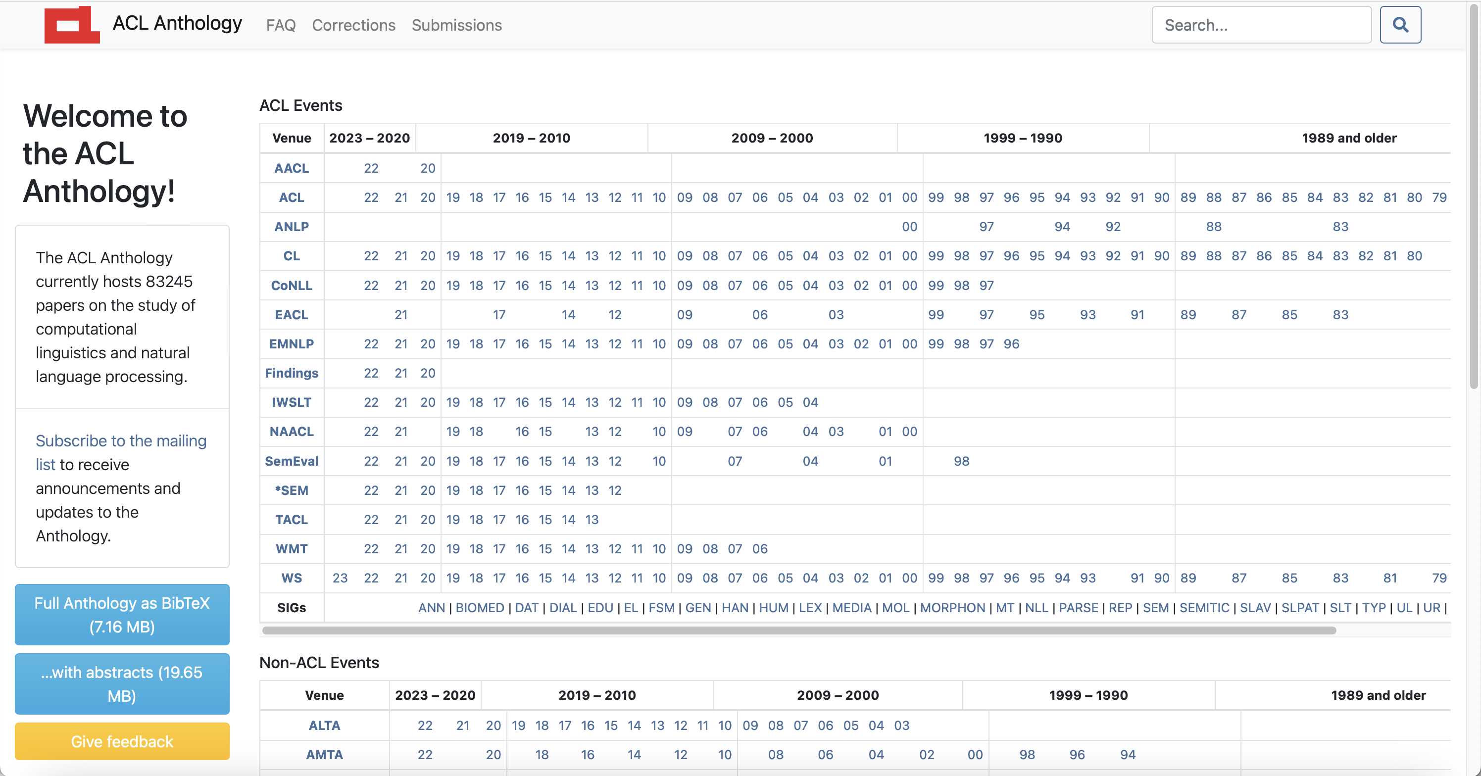
An easy fix would be to not center the list of SIGs and just left-align it. I just removed "text-center" from the list of classes in the relevant table row, making the table look like this:
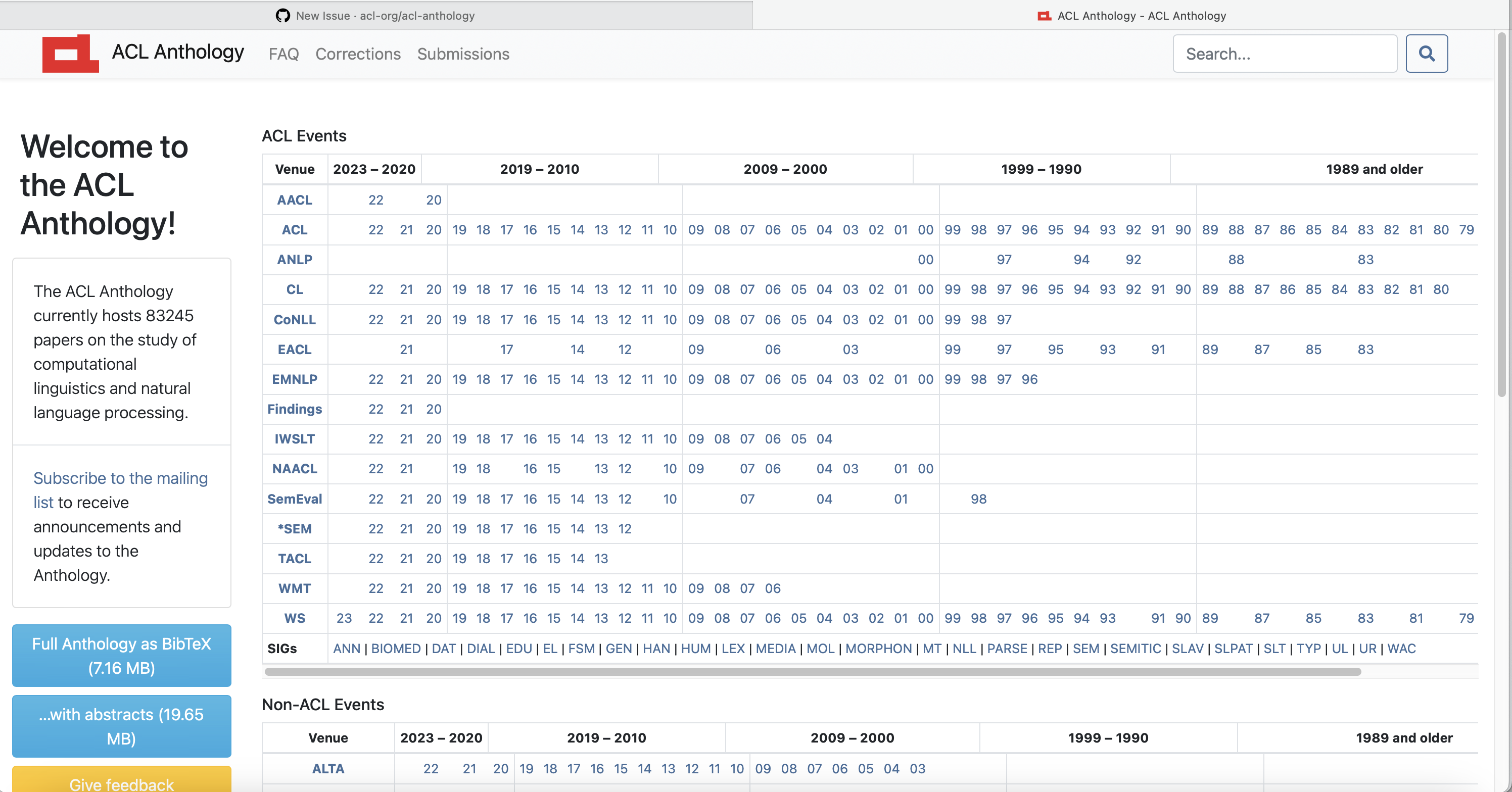
Maybe it could be more visually appealing if the text started at the same indentation level as the years above the text (23 in this case), but this at least saves people from needlessly scrolling to the right.