UI Simplification/Small Screen Optimizations
One of the issues I am running into in making it macOS compatible is the simplicity.
macOS has a strong focus on simplicity and intuition in their guidelines:
"People expect macOS apps to be intuitive, while at the same time being adaptable to their workflow needs through customization and flexibility." – macOS Human Interface Guidelines
Microsoft says a similar thing:
"A great desktop application is powerful and, at the same time, simple." – Windows Design Principles
GNOME also agrees:
"…[O]nly include essential controls and information in your application interface. When adding a new control or piece of information, always take a moment to question whether it is necessary." – GNOME Design Principles
Xcode is one of my favorite examples of the "powerful yet simple" concept:

It is one of the few IDEs that still looks good and doesn't ever feel cramped or cluttered on my 13.3" screen, unlike some of the other ones. (Not giving any names)
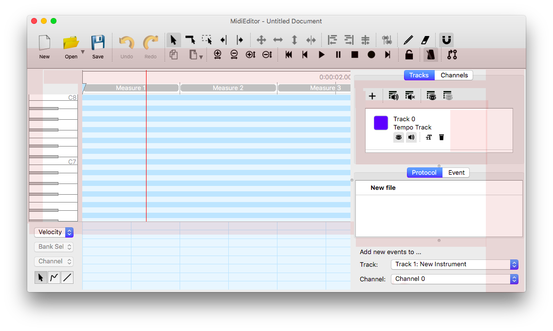
MidiEditor is somewhat complicated and takes a long time to learn. Not as complicated as, say, Anvil Studio, but it still has a learning curve.
 Here, I marked what is important and extremely unimportant.
This could be simplified a lot. The play and pause button could automatically switch, we don't need most of those buttons, and if we have to, the tools could be a panel or a drop-down.
One of the things I like to do is design for the smallest screens found today: About 1024x600, netbook size. (800x600 is pretty much obsolete; we don't need to support it)

MidiEditor does not look good in my Mac's smallest resolution, 1024x600, with the Menu Bar and Dock showing.
The area allowed for the canvas is about 25% of the window (excluding the titlebar); which is hardly usable.
 Compare this to Xcode which, while a little cramped, is still very usable.
Obviously, this is a long-term goal.
I really wish we could get Markus here.
About the small screen: Here are some places where there is an excess of whitespace, padding, or unoptimized placement, in my opinion.
I assume that we will eventually switch to a single row toolbar.
I say that we should aim for 40-50% usable space, with both panels showing.