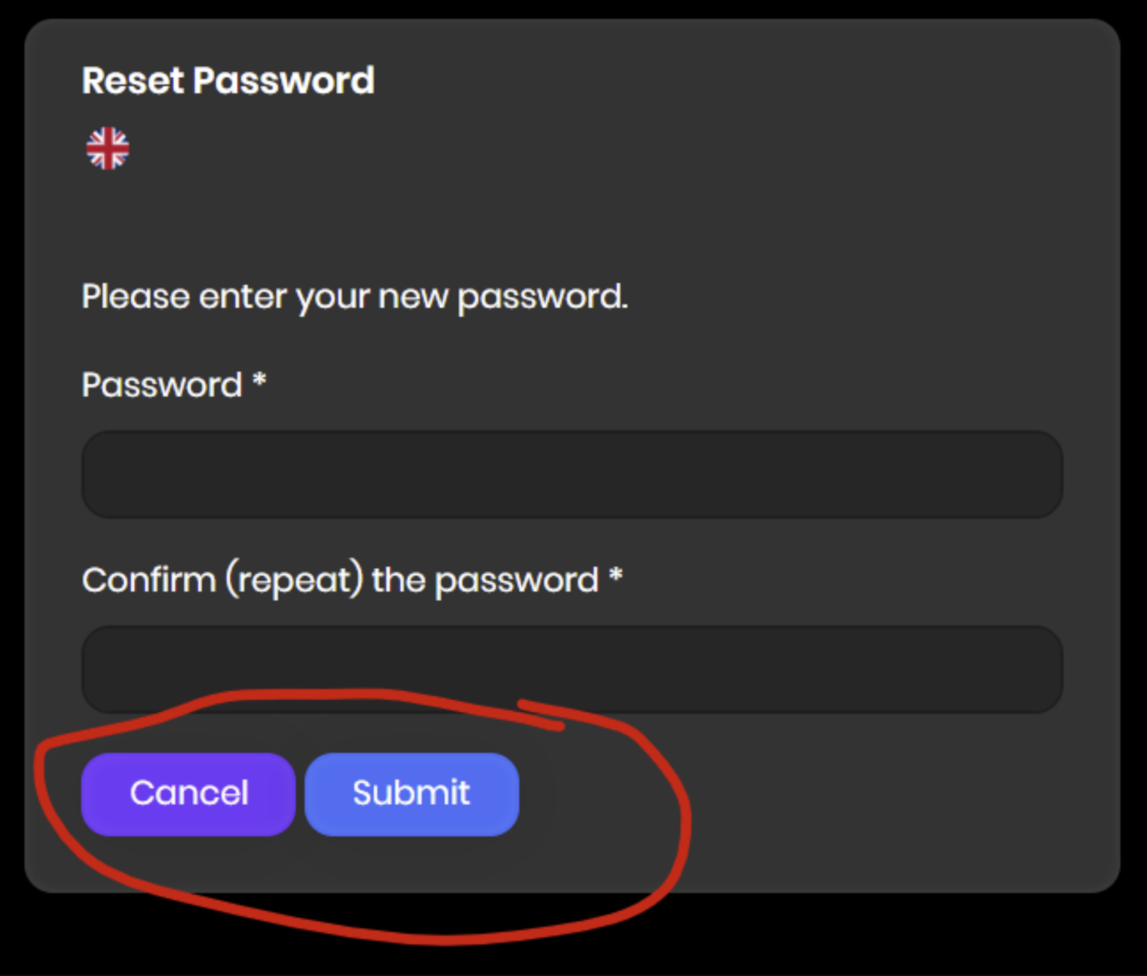
UI updates needed for the reset password window
Cancel is usually at the right not let.
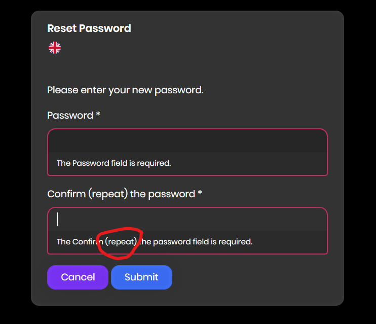
and simplify the message. It should be simple and clear e.g., Confirm Password
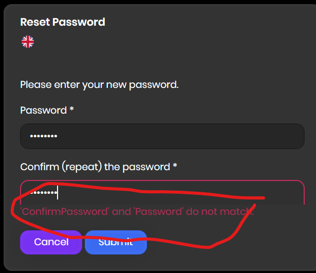
and message should be changed to Passwords do not match
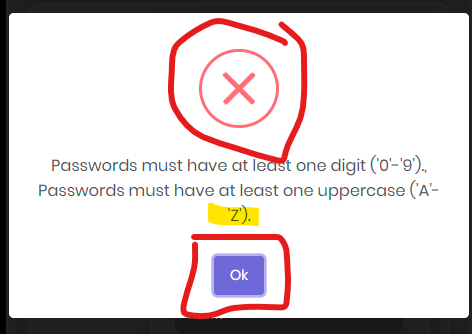
missing space after ":" and re-try is one word

Can we try to fit this text on the next line in one single line? Also, the close message button is bigger than the Ok button. Because the close message button is capturing the attention rather than the Ok button.
@EngincanV just checking if these suggestions were addressed or just forgotten? This UI is a hot mess :-)
@maliming or somebody, has any of these issues been considered internally?
Hi @sturlath, I've assigned this issue to myself and will take care of it. Thanks for the suggestions.