xrpl-dev-portal
 xrpl-dev-portal copied to clipboard
Comparing Emission Data - Hard to understand energy usage with relation to others
I was having a look around your website and noticed that this webpage does not do an ideal comparison between various currencies. I'm going to split this issue in to three sections, Crypto, Credit Cards, and Cash.
Crypto
For this comparison is does a decent job on reflecting the energy usage by using Portugal's energy consumption as a range, however, when you place the slider on or above 60M, the BTC energy usage completely fills up Portugals geographical region which it makes it difficult to see the scale and size of 80M and 100M values. A simple chart or pictograph can do a better job at representing energy usage with respect to each currency. Further, the coloured circles used to show the ETH's and XRP's energy usage is hard to see due to having a similar colour with the rest of the image. I thought maybe changing the site to light mode would show a better contrast but it doesn't, in fact the circle used to show XRP's energy usage can't even be seen (at least to me).
Credit Cards
Comparing the energy usage here using the chosen method is not suitable because all three circles are soo small no matter where the slider is placed, its's difficult to get an idea. While, XRP does use more energy than VISA and Mastercard, which on first look might seem bad, you could explain how XRP is different and what it does that VISA and Mastercard don't. That way the energy usage by XRP seems more justifiable.

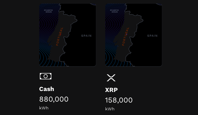
Cash
The same issues described above also is present here. Given that each cash transaction consumes 5.57 times more energy than an XRP transaction, the accompanying image doesn't even demonstrate the shear difference. All 5 slider values shows the same image displayed below.