Reorganise UI for component pages
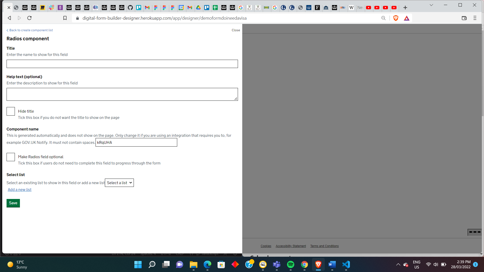
Is your feature request related to a problem? Please describe. At first glance, the page is a little hard to understand and takes some time working out what you need to do. The order of tasks on the page doesn't match the order that you need to complete the tasks. I also never noticed the warning at the top of the create component page regarding titles. It would be helpful to place this onto the component editing page underneath where the titles are shown. There is information on the page that is reserved for special use cases that could be hidden so as to not confuse the user (for example component name. I needed it explained to me that this was dev specific and I don't need to know about it as a designer). Some of the helper text copy isn't easy to understand at first. Ultimately all of these small things add up to more time spent trying to understand the page and less time completing the task.
Describe the solution you'd like
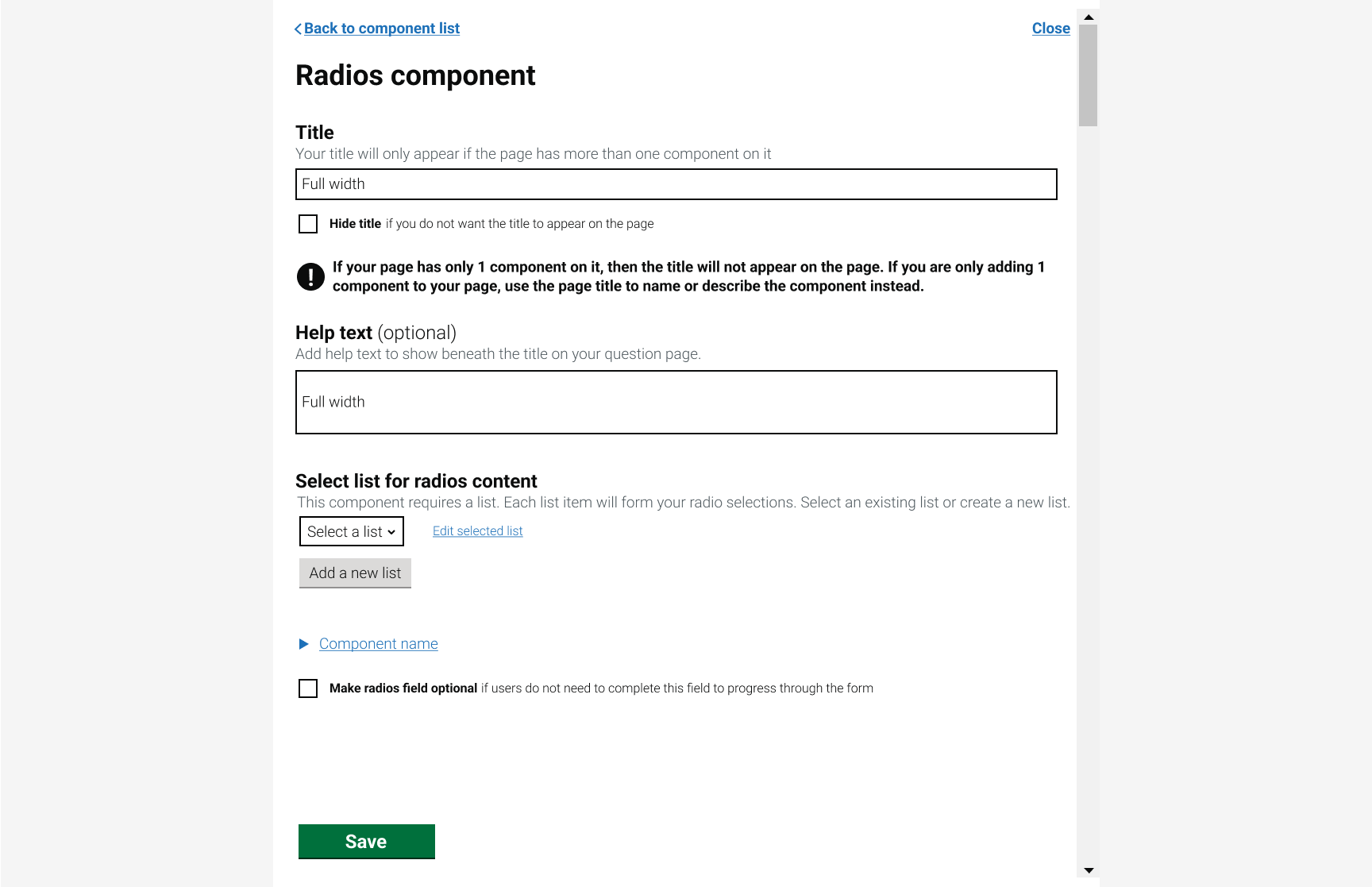
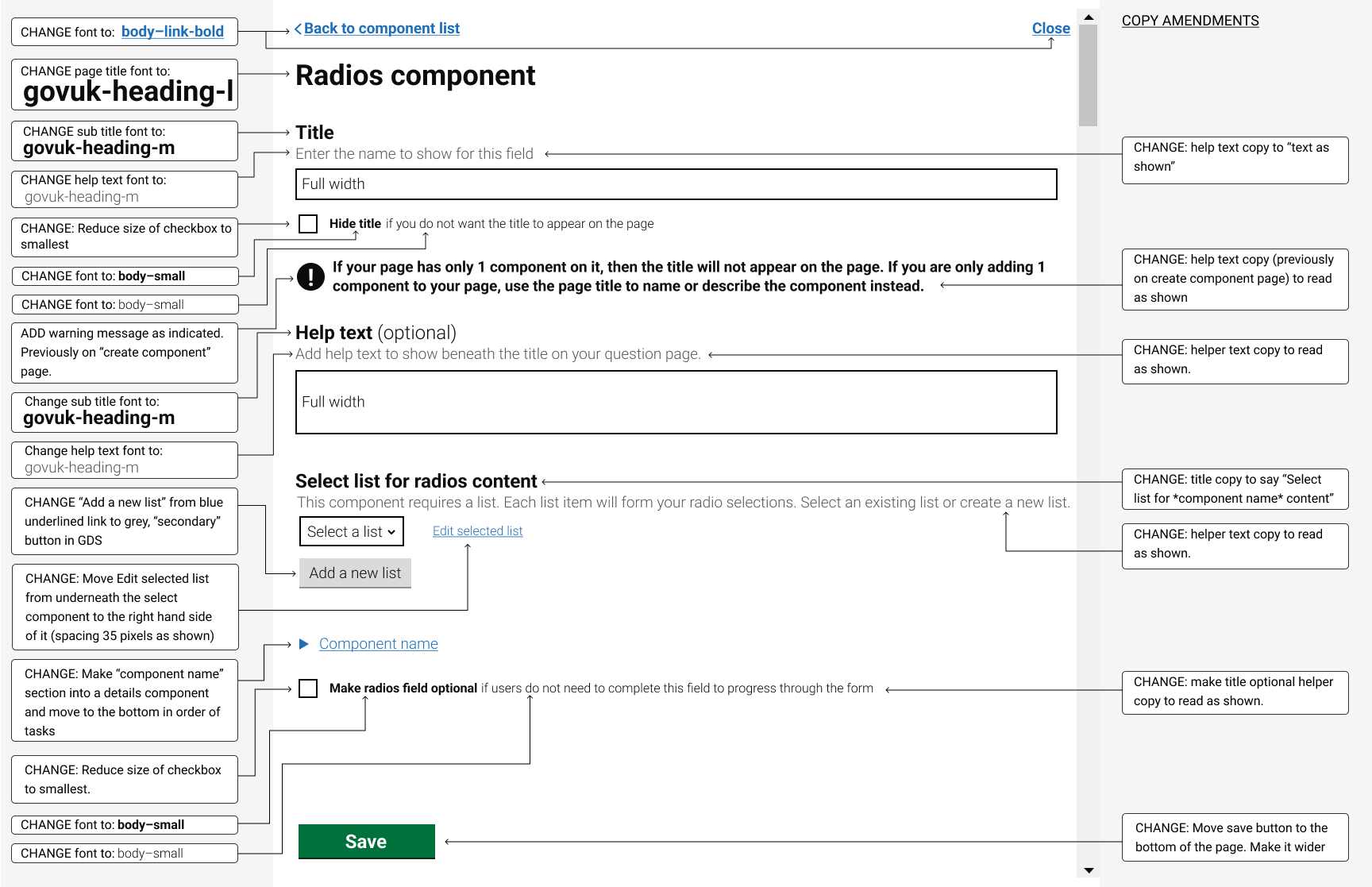
Organising tasks/input fields in order of use, including moving component name section into a details component since it isn't often used.
Moving the helper text about titles to the component editing page and making it visually distinct to help users understand an important constraint of adding titles.
Small adjustments to the UI, including title sizes to increase readability of the page at first glance.
Some changes to helper text copy.
See images for before and after, plus annotated image of the suggested changes.
Additional context
Before:
After:
Annotated:
Having a go at implementing some of this now ❤️
Thanks for the really clear and aesthetic suggestions, should be fun to work on! 💯
Having a go at implementing some of this now ❤️
Thanks for the really clear and aesthetic suggestions, should be fun to work on! 💯
That's great! Thank you! The radio page is just an example, but I think it more or less applies to each component page. I haven't been through each page yet though to see what is needed individually!