Try to improve default system font appearance on macOS
This PR attempts to address the concerns raised in https://github.com/WordPress/twentytwentythree/issues/1, without requiring a new theme.json setting for font-smoothing. I mainly want to demonstrate what is currently possible without font-smoothing.
In order to remove the need for any CSS (and therefore also the need for a functions.php to enqueue the stylesheet), I've applied a default font-weight of 300 to everything, which I think is as close as we can get using the current font stack compared to using font-smoothing.
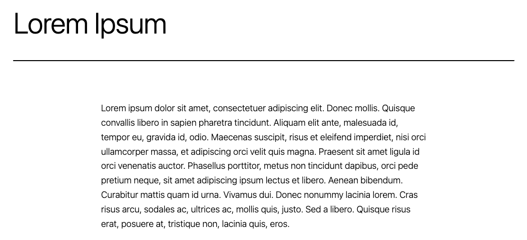
With font-smoothing (current implementation):

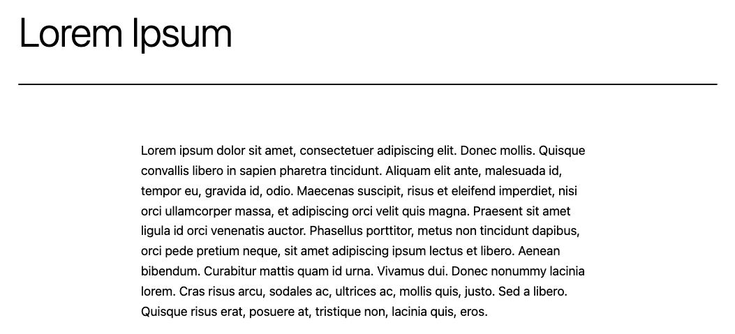
Without font-smoothing and with font-weight: 300 (this PR):
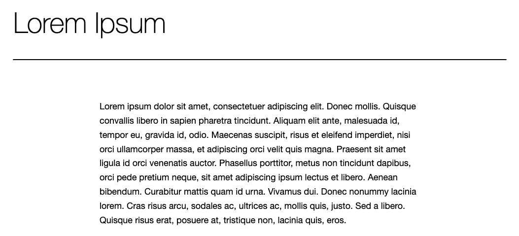
Without font-smoothing and a default font-weight (this is the original state that font-smoothing is addressing):
The work in this PR is just one attempt, here are some alternatives:
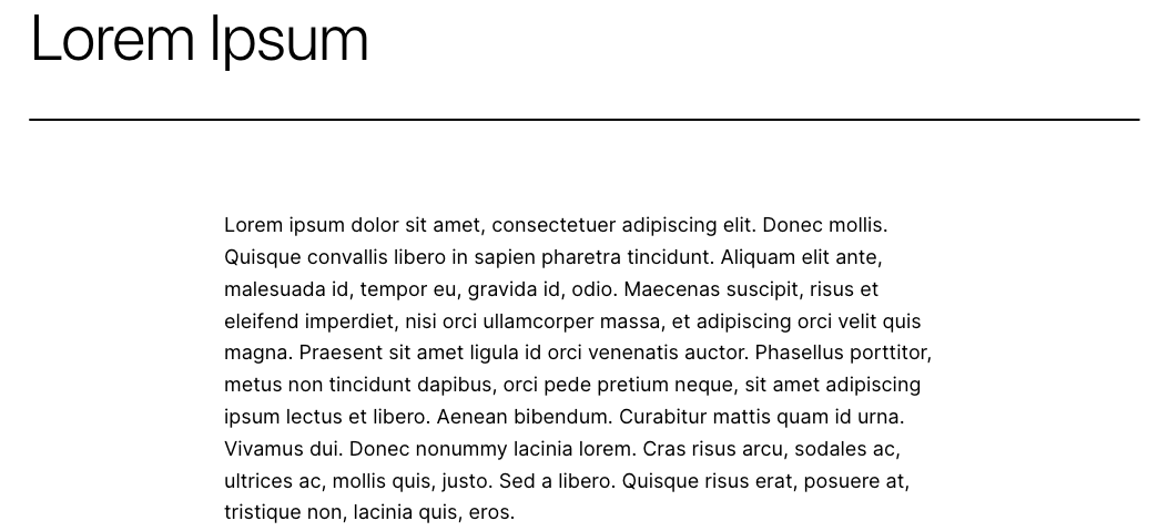
Remove -apple-system and BlinkMacSystemFont from the font stack
This means that on macOS, the font would default to 'Helvetica Neue':
Use Inter instead
@beafialho suggested Inter as an alternative font:
This looks great but would mean the theme would need to include additional font files. If we include all weights and styles, this is an additional file size of 805KB (based on TT2's Inter font file). Or, if we choose a subset of styles and weights, we could probably significantly reduce this file size (depending on what we choose). The draw-back of this solution is that it would mean there is no font option included in the theme that doesn't require font files to be loaded, which is a massive benefit to the current default font option.
I think there should be a system-only Font Family available. Including a "(System)" Font family doesn't cost any space. Maybe it's not the default and looks strikingly similar to 'Inter'. But It doesn't require font files and that might be an important option.
From all these alternatives, the ones that look better are Inter and the system font with font-smoothing.
"Without font-smoothing and a default font-weight" doesn't look great, and we should definitely rule out Helvetica.
It's definitely not an ideal solution, but if we need to compromise we could probably go with "Without font-smoothing and with font-weight: 300" but would need to adjust letter spacing as it looks tight.
Thanks @beafialho! That helps a lot, as I think that narrows our choices down to:
- System font with font-smoothing, as we have currently
- System font without font-smoothing, with a font-weight of 300 and adjustments to letter spacing
I'd love to be able to remove all CSS, but I understand it's not ideal. It would be great to hear some other opinions. I'm happy for this PR to stay open if we want to discuss this further, as I don't think the code changes will cause any complicated conflicts in the future (unless we add any more CSS!)
I'd love to be able to remove all CSS, but I understand it's not ideal. It would be great to hear some other opinions.
I'd love to hear other opinions as well!
I would vote that we just leave things as is for font-smoothing in style.css. I'm not a big fan of font-weight: 300 and less a fan of letter-spacing.
Mostly, my reasoning is that many developers look to core theme for best practices. Therefore, I would hate for font-weight: 300 to become some misunderstood best practice for all themes. 🤔
Of course, if we want to pursue this approach for the overall project then I would say breaking the font-smoothing out into a custom property in the theme.json would be ideal, and reference in the style.css. But, for the current project's infrastructure we can just avoid integrating custom property in theme.json.