Site Title Block: Add a toolbar shortcut to italicize the text
What problem does this address?
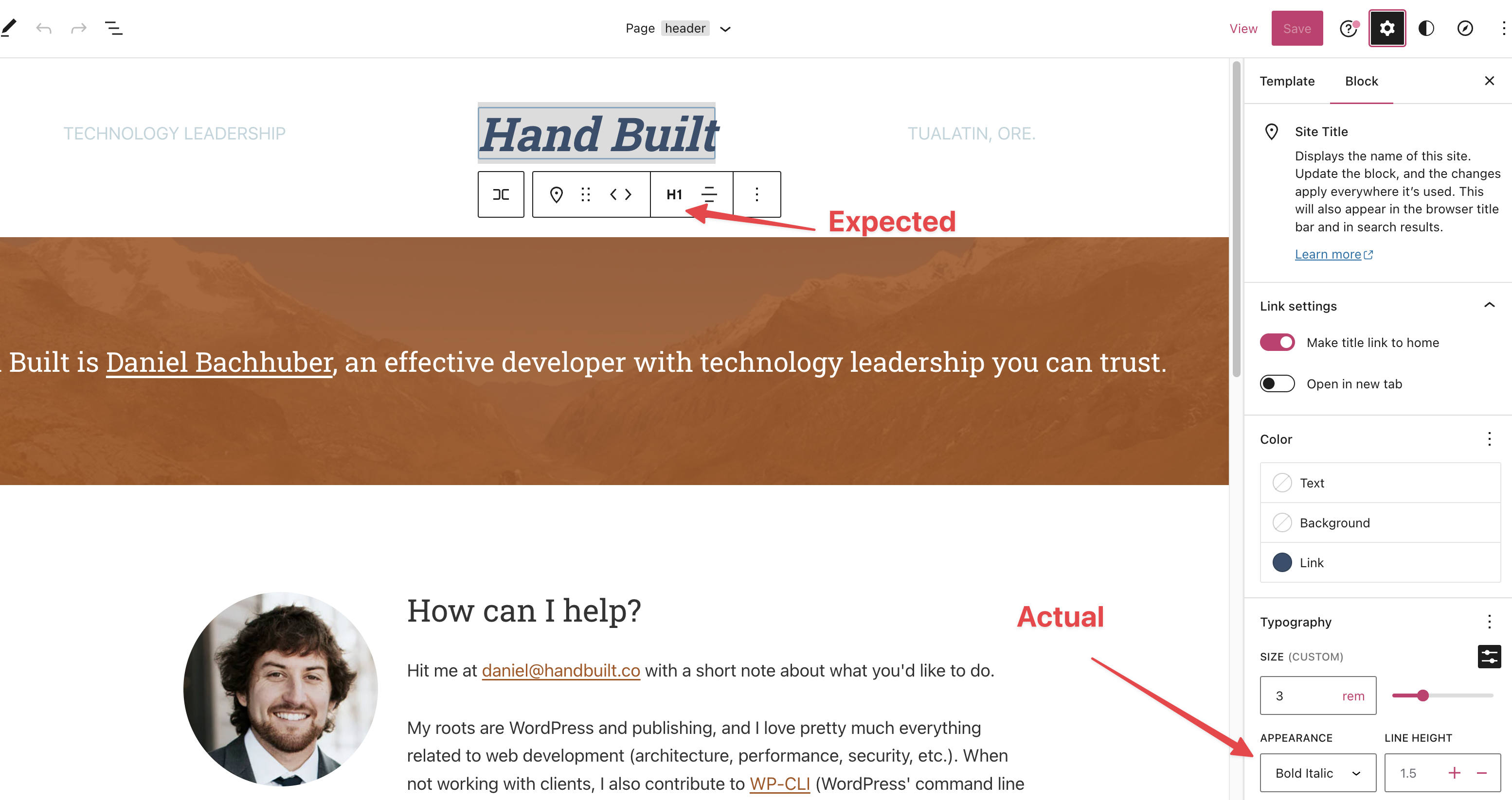
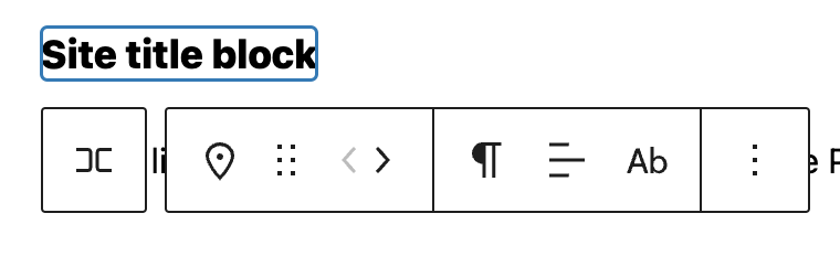
I recently recreated my brochure site using the Site Editor. On the original site, my 'Hand Built' site title was italicized:

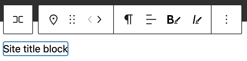
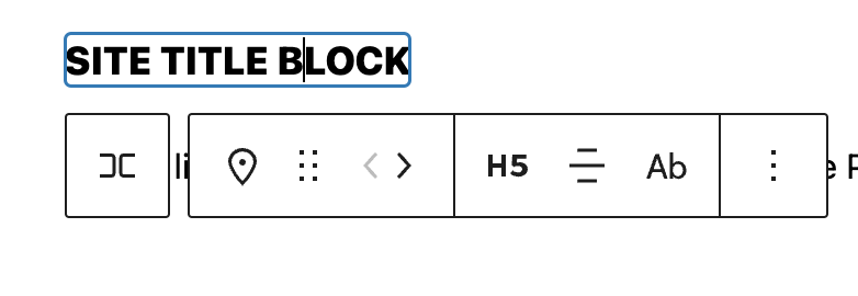
Because it looks like rich text, I expected to be able to italicize my site title from the contextual toolbar. I eventually figured out I could italicize it under "Appearance":
What is your proposed solution?
It would be nice to have a toolbar shortcut to italicize my site title. If it didn't open a can of worms, maybe Bold too?
Yep. Just tried it and `ctrl+i' doesn't work. I could see that 'bold' would also be a great option to have.
Shortcuts wold be fine to explore, but it should still be distinct from Rich Text since this is purely about appearance and carries no semantic weight.
I didn't mean to signal that I expect a shortcut. Sometime when you use the editor, normal text editor shortcuts work. But not so on the Site title block, so it makes sense to have a button in the block toolbar, along with a Bold button.
@bph with shortcuts I'm also assuming buttons in the toolbar (they are shortcuts to setting the Appearance attribute style). Still stands to reason that it should be different than rich text to not misled.
I've created this PR https://github.com/WordPress/gutenberg/pull/46489.
@danielbachhuber, Can you check if this would improve the experience?
Yep. Just tried it and `ctrl+i' doesn't work. I could see that 'bold' would also be a great option to have.
@bph, I've added shortcuts which improves the accessibility 🥳 . Thanks for the suggestion!
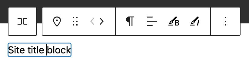
@mtias, the buttons are modifying the block style in the same way the current appearance selector does. I'm using the same Bold and Italic RichText icons. I'm happy to explore other options or add any changes. Thank you!
@sejas yeah, my point is that we shouldn't use the rich text icons because the implication is different — you are not doing inline semantic formatting.
@mtias , what if we add the brush icon next to the letters? What do you think?
Other options I've been considering are:
- Asterisks: B* I*
- Using two letters together
- Appearance: AB AI.
- Style: SB SI
- Brush and the letter:
Requested design input on the icons https://wordpress.slack.com/archives/C02QB2JS7/p1672921120174529
@WordPress/gutenberg-design Could we get some design direction on the icons? ^ We're happy to do some leg work if you want to point us where to look.
Alternatively, should we ship the PR (https://github.com/WordPress/gutenberg/pull/46489) and apply the icons later?
Just to clarify, the distinction here is that the control only changes the font, and doesn't add strong, em tags?
Tangentially, it's only possible to affect the entire site title, IE you cannot select one word in a multi-word title and make it bold.
This being the case I'd be tempted to steer clear of the B I icons altogether as their conventional behaviour is not applied here, and lean more into the "Font Style" angle. Maybe something like this:
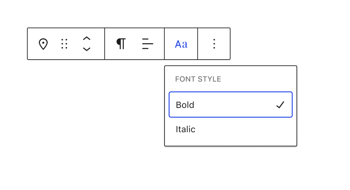
@jameskoster, I love your approach. Let's do that.
Just to clarify, the distinction here is that the control only changes the font, and doesn't add strong, em tags?
Yes! exactly. I like the idea of differentiating the UI buttons. And we could add more Font styles in the future 👌 .
Glad y'all like the idea. Important to note it's only one option. I'd still love to get more input from @WordPress/gutenberg-design.
I like that your style looks distinctly different from the bold and italic icons, Jay, and still looks compressed and decorative. That's exactly key with regards to denoting this as just that, decorative, vs. the semantic tags that the two other buttons add.
The terms "Bold" and "Italic" are also technically decorative terms (as opposed to "Strong" and "Emphasis", which are the semantic tags), but even so, those terms still steer my mind back towards those buttons. I wonder if we need some smarts there. I.e. maybe they should say "Bold 700" and "Regular 400 Italic"? And in pursuing this train of thought it also becomes clear that these buttons very likely need to know whether the particular font weight is even available in whatever font is being used. Something to think about.
Yes, if there's a literal connection between 'style' options and font variants then it'd make sense to include more detail in the label. Would that mean providing a dedicated "Bold & Italic" option as well? 🤔
Is that definitely how this works though? Or is inline css to set the weight or style applied regardless?
Would that mean providing a dedicated "Bold & Italic" option as well? 🤔
Can you clarify this? I'm missing some nuance.
Typefaces generally include dedicated variants for style+weight combos e.g. bold + italic. But I suppose the user doesn't need to know that, if they select bold + italic the correct variant would be used automatically. Ignore me :)
@jameskoster design there is what I had in mind as well — treating it as font appearance.
Right, essentially this:
I guess the bold + italic conversation is moot. The menu would be populated with whatever variants are included in the font manager (https://github.com/WordPress/gutenberg/issues/45271).
The menu would be populated with whatever variants are included in the font manager
Do we really need all of the options though? I don't think an entire list of options is really a "shortcut".
Perhaps not, but I'm not sure why you'd limit the options here. Isn't the shortcut element provided by circumventing the Inspector? I don't think including more options really affects that. Indeed it might be strange to see different options sets in the different contexts.
Perhaps not, but I'm not sure why you'd limit the options here.
@jameskoster I understand the semantic argument against, but I just want the B and I buttons 😁
I don't think it makes sense to duplicate the Typography controls into the Toolbar. If we wanted to move all Typography controls into the toolbar though...
@sejas Sorry for the rabbit hole on your first Gutenberg contribution! What opinions do you have? Any other ideas worth considering?
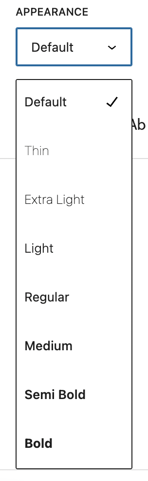
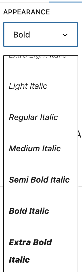
The current appearance allows to choose only one value, and the menu is too long, showing all the possible combinations between font-weight and font-style:
I suggest displaying only two options for Bold and Italic, and allowing multiple selections. These options are the most commonly used, so it would be more efficient for the user. We could include a text or button that informs the user that additional options are available in the "More settings" sidebar.
Another missing piece is, how we will inform the user an option is selected when the menu is hidden. Paragraphs and Text Alignment show the icon of the current value. Should we show a slightly different icon when an option is selected?
| Default values | Heading and alignment selected |
|---|---|
 |
 |
but I just want the B and I buttons
But that isn't the behavior here. We shouldn't use the same UI for entirely different behaviors as it degrades the overall UX.
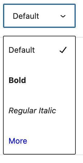
If the long list is a concern, we could potentially truncate it here with a More option:
But if you think about this as an affordance to create a logotype, it really doesn't make sense to arbitrarily remove options.
it really doesn't make sense to arbitrarily remove options.
It's not arbitrary? Regular bold and regular italic are far more common than the other options.
It is arbitrary from the perspective of designing a logotype. Bold and Italic are most common for regular text I agree, but this is not regular text. The Site Title is one of the special cases where you'd want access to the full font family for maximum expression.
Hi, @jameskoster, The best solution from my point of view is what we've commented here: https://github.com/WordPress/gutenberg/issues/45854#issuecomment-1377482361
This being the case I'd be tempted to steer clear of the
BIicons altogether as their conventional behaviour is not applied here, and lean more into the "Font Style" angle. Maybe something like this:
I've updated the code with that suggested design:
- https://github.com/WordPress/gutenberg/pull/46489
I preferred to name it Font appearance instead of Font style.
Here is a preview of this solution:
https://user-images.githubusercontent.com/779993/220179687-b4318241-1223-4a13-b037-a31b6bd841ce.mp4
This looks like it has some designs so let's move to just having the label for feedback to focus that for now. We can always change labels at some point.