chu material difference
Kanji and number? Something like 歩+3? Will not make sense for players using international sets tho.
lol, "debatable".
I don't know how much work it is, but is it possible to turn the international pieces into a font? Kinda like how on Lishogi, you can switch from letters to symbolic pieces for notation
lol, "debatable".
Not sure if worth spending time on. Where to display it, lichess used to have it only in games not in analysis, but I guess it's better to have it everywhere, but there is no really good place for it with coordinates outside...
I don't know how much work it is, but is it possible to turn the international pieces into a font? Kinda like how on Lishogi, you can switch from letters to symbolic pieces for notation
Definitely possible, kinda tedious with that many pieces tho and another font would need to be loaded, preference relevant only to chushogi added and not sure how distinguishable would the symbols be, if they were that small, especially the generals.
Another option might be to use the notation the player uses so - P for western notations, 歩 for KK and Japanese. Still not sure about the format, but I guess we can figure that one later:
- P+3 G+2
- P(+3), G(+2)
- P + 3; G + 2
- ...
I like this one
P(+3), G(+2) 歩(+3), 金(+2)
The parentheses would make more clutter when there's a lot of trades so it's better without parentheses.
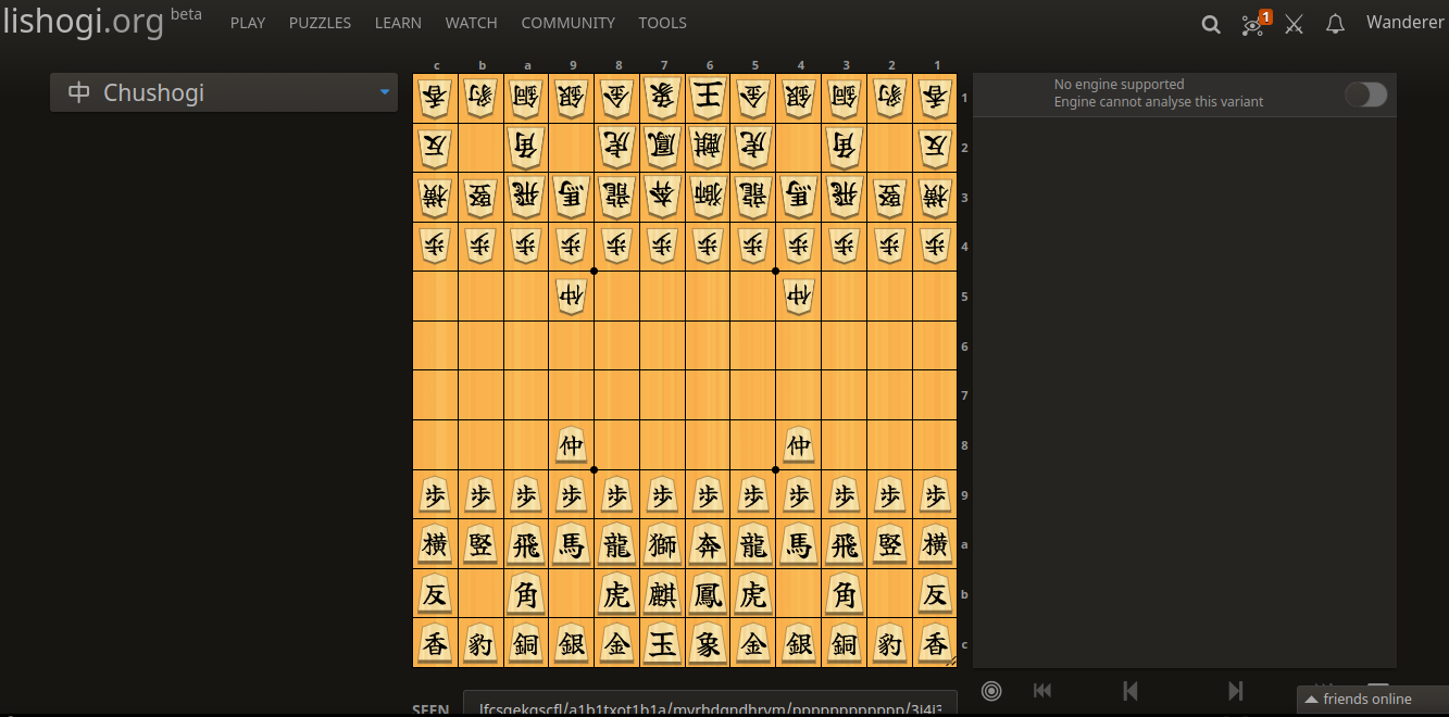
Where do we want to put it? In the obvious space, where lichess has it, it's gonna interfere with the coordinates. The entire string can also be pretty long with this many pieces... Lichess now enforces inner coords when material diff is shown (https://github.com/lichess-org/lila/commit/943d8cee3ace75ddf8bd29ab8a3bf95c18834dcb), not sure if that's what we want, might be fine just for chushogi...
Compact:

Side:
The parentheses would make more clutter when there's a lot of trades so it's better without parentheses.
Parentheses help to visually indicate the information. Personally for me P+3, G+2, VM+1, ... if being a large text, would be looking like unformatted plain text, and that's hard to quickly read and analyze that info.
If material difference info distracts you, you probably want to turn it off.
Its chu shogi you don't need to read quickly everyone plays correspondence. I guess the only time you would need to read quickly is vs ai if you set time control thats not super long and you get in time trouble.
Chu Shogi is played with real-time clocks as well, not only correspondence games.
And even if I'm not limited by thinking time, I still prefer having the possibility to read and scan it really quickly at a glance than having the necessity to read it hard and slowly.
Parentheses in displaying material difference help to emphasize attention to numbers inside it, making it easier to catch the info quickly.
If you still don't like this format, we could suggest making this format adjustable in settings. What exactly format do you prefer?
If you still don't like this format, we could suggest making this format adjustable in settings. What exactly format do you prefer?
I don't really want to clutter the preferences with a setting related to a single variant, that most players won't even touch. I feel like I'm already adding too many adjustable settings. More is sometimes less and the paradox of choice and stuff...
About the position - what about instead of adding two separate elements (one for the player and one for the opponent), we add only one to the bottom, relative to the player or bottom color. So instead of having P(+2) at the top, where there is no place, we would have P(-2) at the bottom. The alternatives are probably just forcing coords inside the board or hiding the information behind a hover/click somwhere.
Let's try both variants P+2 and P(+2) and display them somewhere as a test.
Then show us screenshots and let us see, how that would look like, and evaluate what is better.
The P(+2) variant I imagined to be displayed in the sidebar (where coordinates are displayed usually, there are plenty of space).
Maybe, if displaying it under the coordinates, it would really look cluttered, and better to use P+2