[VDG] Display fee rate & estimated time constantly instead of tooltip
Fixes #6980
Credit goes to @ichthus1604 for writing this code which was reverted by https://github.com/zkSNACKs/WalletWasabi/commit/07e1755b032fd729673f7695f104c2ac6b57b778 in #7212
Why was it downvoted? IMO given that the fee graph window is for advanced users it makes more sense to display those value constantly rather than requiring the user to hover over the slider to see them.
This has been automatically marked as stale because it has not had recent activity. It will be closed if no further activity occurs. Thank you for your contributions.
This has been automatically marked as stale because it has not had recent activity. It will be closed if no further activity occurs. Thank you for your contributions.
Hey, I found this one and it looks there were a consensus to not accept these changes. Please, keep or close this PR since it was stale.
Hey, I found this one and it looks there were a consensus to not accept these changes.
What was the reason to not accept these changes?
As I stated above the fee graph is for advanced users anyway so it makes sense to display the fee rate values and the estimation time constantly.
@yahiheb I'm closing this PR due to reasons previously stated. There is consensus to not introduce these changes.
@ichthus1604 I still don't know what are the reasons to not accept these changes, and the comment you linked simply says that Dan asked to revert those changes but without any explanation.
@yahiheb the idea was not to visually highlight or put the fee rate into a position where it can grab too much user attention.
@yahiheb the idea was not to visually highlight or put the fee rate into a position where it can grab too much user attention.
Is the fee graph in the normal send work flow? I guess the answer to that is no. If a user gets to the fee graph dialog it means that they are willing to adjust the fee rate manually so we can assume that they know what they are doing.
And as I said repeatedly before the fee graph is for advanced users and it makes sense to display the fee rate values constantly instead of having to hover over the slider to get that.
This PR addresses one of the issues mentioned in #10488.
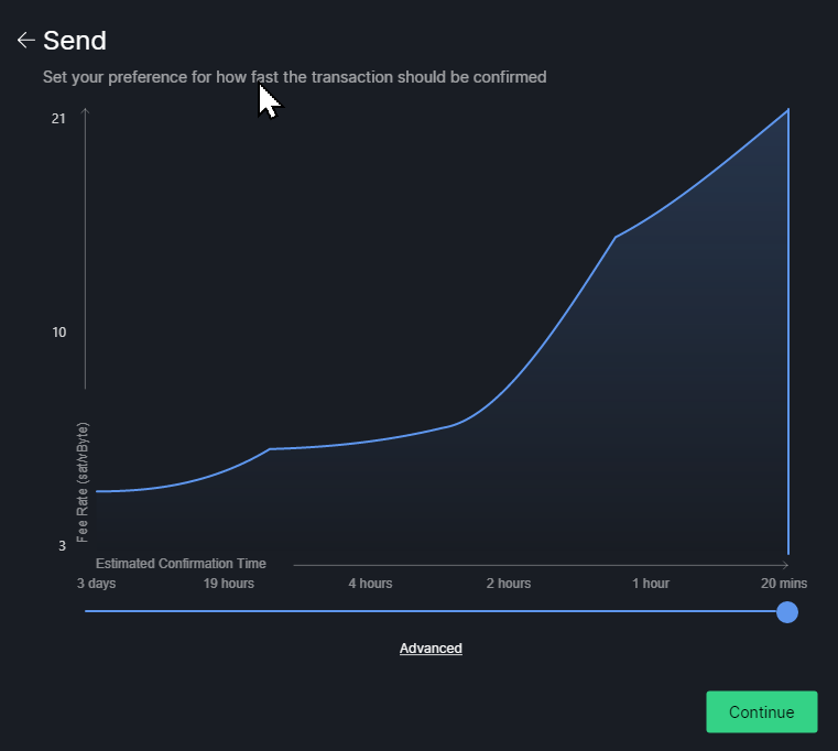
Even on that next page it's not obvious at all what the fee is, We need to know to read the chart along the Y axis to see what fee is.
but please someone give a reason why is this needed.
Just a reminder, Almost every business use a payment processor that show a recommended fee in sat/bytes. #10488
This is horrible from UI perspective.
Why is that? Currently it is horrible from UX perspective as mentioned here:
Even on that next page it's not obvious at all what the fee is, We need to know to read the chart along the Y axis to see what fee is.
I am not nACKing the concept... but please someone give a reason why is this needed.
For a better UX. To allow users to see that information easily without hovering over the slider to get that.
Why is that?
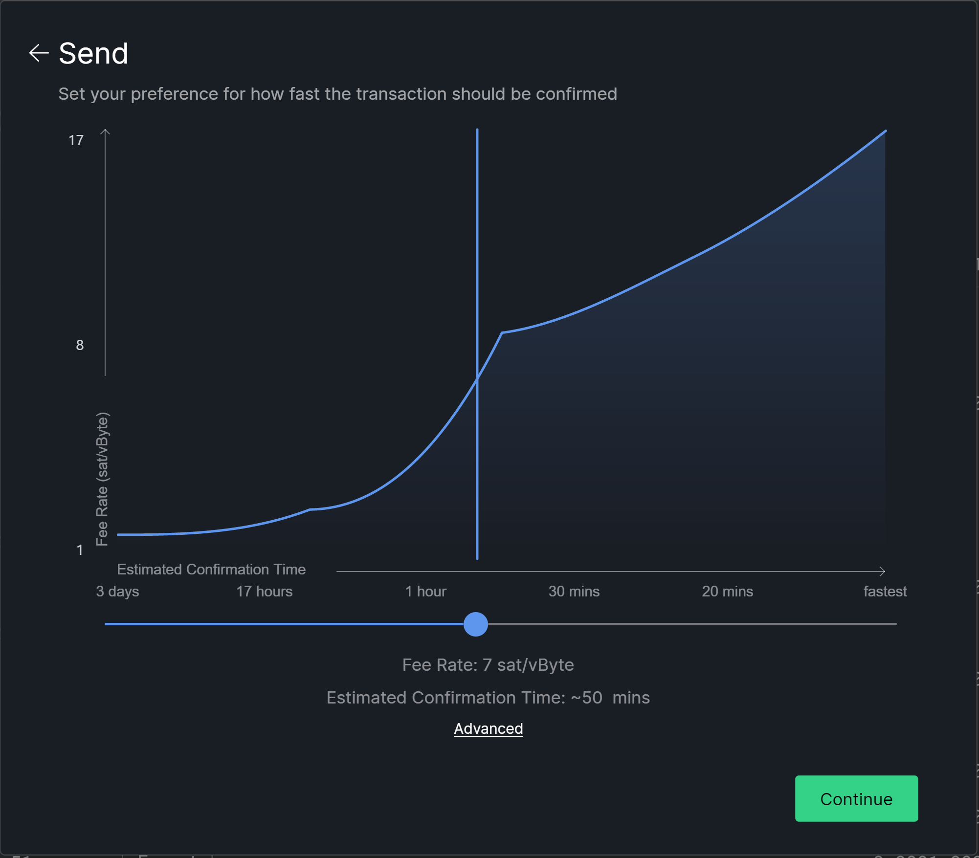
They are just put there and centralized.
Normally the values should be aligned in a column like:
                   Fee Rate: 7 sat/vbyte
Estimated Confirmation Time: ~50 mins
And put them somewhere inside the chart to avoid the crowded bottom part and have the chart on almost full dialog size.
Why is that?
They are just put there and centralized.
Normally the values should be aligned in a column like:
                   Fee Rate: 7 sat/vbyte
Estimated Confirmation Time: ~50 mins
And put them somewhere inside the chart to avoid the crowded bottom part and have the chart on almost full dialog size.
Agree they should be put inside chart to save vertical space and will look much better.
@soosr @wieslawsoltes I agree, but I do not know how to do it, so please feel free to take this and do that.
@wieslawsoltes Should we add it to the chart directly, or just put an overlay on the chart? (assume to the chart would be the proper solution, if there is no obvious objection due to complexity)
@wieslawsoltes Should we add it to the chart directly, or just put an overlay on the chart? (assume to the chart would be the proper solution, if there is no obvious objection due to complexity)
Overlay, adding to chart adds unnecessary complexity.
This has been automatically marked as stale because it has not had recent activity. It will be closed if no further activity occurs. Thank you for your contributions.
This has been automatically marked as stale because it has not had recent activity. It will be closed if no further activity occurs. Thank you for your contributions.
Can we at least add the feerate used here? Auto selected to let user override it without requiring more clicks.
Having to move the slider to know this information is really weird and quite annoying.
The chart dialog is not displayed in the default workflow, and some argue it is for advanced users so I think this is good enough for now, and later on the UX can be improved more.