obsidian-git
 obsidian-git copied to clipboard
[Bug]: Source control view is broken on mobile
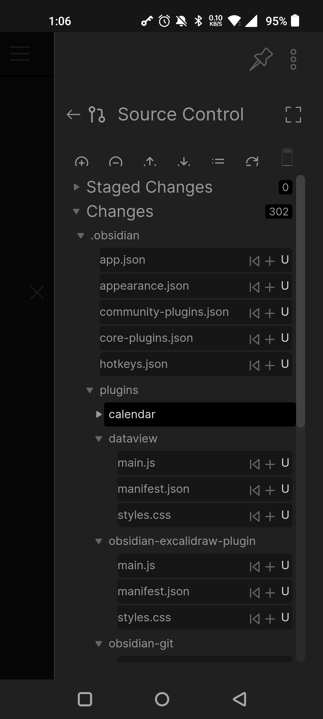
Describe the bug
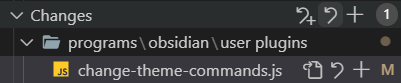
When I open up changes sometimes all, sometimes half the buttons are covered. The thing next to the refresh button looks and behaves weirdly (I have commit message set to {{date}}, that shows up there in desktop.)
Relevant errors (if available)
No response
Steps to reproduce
Have varying amount of changes, open source control view, fold folders.
Expected Behavior
No response
Addition context
No response
Operating system
Android
Plugin version
2.0.3
The view design should be improved on desktop as well and will fix issues on mobile too then.
Is there a general source view ticket?
Some nice to haves for that:
- the add
+buttons on files are really small on Android. - a stage and unstage button for folders, and a stage and unstage all button, like in VSCode

- indentation guides that are styleable with the new CSS variables
- collapse nested folders if there are no files in their siblings, like it is in VSCode
I've done all these features now locally. I've aligned it to the file view in Obsidian and used their css classes etc. But it's looks weird on < v0.16 of Obsidian. And I don't want to make all future releases 0.16 only, so I'll wait until Obsidian 0.16 is public.
I just published the redesign. It's not focused on mobile, but I think it still got easier to press the buttons.
Thanks!
My existing CSS customizations work right out of the box 😁

I found some hitches however.
-
The corner of the commit message input box thing looks weird on mobile. It has a scrollbar when there's only one line. And there's that thing in the corner. I have no idea what it does and it looks uglier than on PC.

-
There's this jittering when refreshing on mobile.
https://user-images.githubusercontent.com/5298006/195646178-2e8f2741-1483-40f1-9556-958bfe30c15b.mp4
-
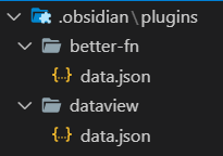
"nesting" folders misbehaves, doesn't go as deep as it could
-
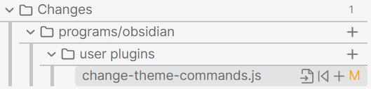
and with the plus buttons on folders, it would make sense to have an add all, discard all button for the root on the fold of "changes" and "staged changes", like there is in VSCode
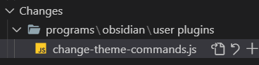
I've changed the height of the textarea to behave like in vscode. So you can't resize it manually anymore, just by adding/removing a line. Looks like I only tested 2 depth folders. Both not released yet.
I thought about adding the stage/unstage button to the category as well, but I thought it would make the ui cleaner not adding another button there, but keeping it at the top. What do you think?
If files and folders have the button, I think the root (changes, staged changed) should have it too. There's nothing else where it would go anyway, I don't think it would be cluttered. But don't base this just on me.
Also, I just noticed, there's no discard button on folders under changes, which would also be handy.