style-guide-twig
 style-guide-twig copied to clipboard
 Upstatement
Style Guide Template for Twig/Timber
Upstatement Style Guide
Template for Twig/Timber
What Is This?
A style guide starter theme that helps display typography, objects, and other design patterns. It’s templated using Twig & Timber for easy inclusion in our WordPress projects.
The Style Guide is designed for easy use by our clients. It lets the designer name components and write notes about when to use them. It gives the client code snips that make it easy to copy, paste, and replicate our work.
Check out this live example of the Style Guide in action for The Harvard Law Review.
How Does it Work?
This package ships with some standard patterns (buttons, text styles, section headers, etc.) to help you get started. But nothing is set in stone. Delete anything you don’t want, replace anything the needs changing, and add custom components for your project.
Installation
-
Get the Style Guide Download the zip file for this repo
-
Add To Your Project Place the folder in top level of your theme, this will be something like
wp-content/themes/[your theme name] -
Install Dependencies Navigate to the folder in terminal. Run
bower install -
Process CSS Navigate to the folder in terminal. Run
compass watch -
Render the Style Guide WordPress needs to know the Style Guide exists in order to render it. You’ll need to point WP to the two twig templates that show the Style Guide,
page-style-guide.twigandpage-style-guide-source.twig. These can be found at the top level of this repository. To do this, you have to take two steps.-
First, move the
page-style-guide.twigandpage-style-guide-source.twigfiles to a directory where WordPress will find thepage-prefix and render pages. This is commonly a folder namedviewsortemplatesand probably contains several other pages with the same prefix. -
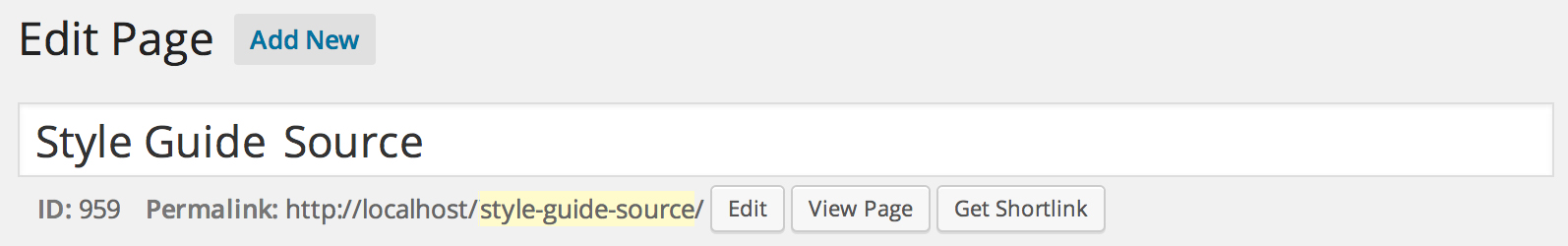
Second, create the pages in the WordPress Pages menu. The pages should be named Style Guide and Style Guide Source. It’s important that their permalinks exactly match the name of the files between the
page-prefix and.twigsuffix. Here’s what it should look like …
Style Guide

Style Guide Source
-
How To Use
After you’ve installed and confirmed that WordPress is rendering the Style Guide, you’ll want to customize it. Here’s how.
Naming
First, you’ll want to personalize your new Style Guide with the project name. Do this via the client variable on line 3 of style-guide.twig.
{% set client = ‘Your Client Name’ %}
You’ll also want to set a relative path so all the base style guide components (CSS, JS, etc.) will link correctly. You can do this all from the path variable on line 4 of style-guide.twig
{% set path = '/wp-content/themes/your_theme’ %}
Add Custom Code
Add the appropriate Fonts, CSS, JS, etc. for your project. You’ll do this in the file named page-style-guide-source.twig.
Use the header_scripts and footer_scripts blocks to add your custom elements and have them load at the top or bottom of the page, respectively.
{% block header_scripts %}
   {# Your Fonts, CSS, JS, etc. go here #}
{% endblock header_scripts %}

{% block footer_scripts %}
   {# Your Fonts, CSS, JS, etc. go here #}
{% endblock footer_scripts %}
Add Your Elements
You’ll want to augment the Style Guide with your own HTML components — typography, teases, buttons, etc. Do this in file named page-style-guide-source.twig.
Basic Style Example The template accepts raw HTML as well as Twig includes. In the most basic template, you can simply name your component and add the appropriate HTML.
{#
~ ~ ~ ~ ~ ~ ~ ~ ~ ~ ~ ~ ~
Headlines
~ ~ ~ ~ ~ ~ ~ ~ ~ ~ ~ ~ ~
#}
{% embed style_mod
   with { title:'Headlines' } %}

  {% block markup %}
    <h1 class="h1">Headline Level 1</h1>
    <h2 class="h2">Headline Level 2</h2>
		<h3 class="h3">Headline Level 3</h3>
	{% endblock markup %}

{% endembed %}
Adding Descriptions
You can also add a description of the component and give advice for when to use it in the design using the descriptions variable.
{#
~ ~ ~ ~ ~ ~ ~ ~ ~ ~ ~ ~ ~
Section Headers
~ ~ ~ ~ ~ ~ ~ ~ ~ ~ ~ ~ ~
#}
{% embed style_mod
	 with { title:'Section Headers' } %}

  {% set descriptions = [
     'Describes the contents of a section (for instance, Must Reads)',
		 'Fancy h3 should be used sparingly'
		]
  %}

  {% block markup %}
	  <h1 class="section-h1"><i class="section-txt">Section h1</i></h1>
	  <h2 class="section-h2">Section h2</h2>
	  <h3 class="section-h3">Section h3</h3>
	  <h4 class="section-h4">Section h4</h4>
	{% endblock markup %}

{% endembed %}
Adding Custom Classes
Each style mod receives a unique class to help you style overrides when necessary. You can also add your own custom class to the style-mod container that wraps your HTML via the class variable, passed using the with directive on the style_mod embed. Here’s an example in use.
{#
~ ~ ~ ~ ~ ~ ~ ~ ~ ~ ~ ~ ~
Article Pullquote
~ ~ ~ ~ ~ ~ ~ ~ ~ ~ ~ ~ ~
#}
{% embed style_mod
   with { title:'Article Pullquote',
          class: 'no-dropcap’
} %}

  {% block markup %}
    <div class="article-txt">
      <p class="pullquote">Assume that no search for this weapon was underway; our best guess is that even <em>Sherlock Holmes</em> never would have found it in the absence of the confession.</p>
      </div> <!-- /article-txt -->
  {% endblock markup %}

{% endembed %}
Overrides
Sometimes when you add project HTML, you’ll want to customize certain design attributes for the Style Guide alone. Make any necessary overrides in sass/style-guide-overrides.scss
Dependencies
- NPM - Install NPM
- Bower - Install Bower
- Compass - Install Compass
What’s Included?
The files and what each one does.
-
Style Guide style-guide.twig
Base template. Set client name here. -
Style Guide Source page-style-guide-source.twig
Contains This is where you’ll do most of your work. -
Style Guide Container page-style-guide.twig
There should be no need to touch this file.
 Upstatement