rework "the big bar" (momentum/charge)
This bar suffer several problems:
- hard to see in some cases, see #559
- used to display unrelated infos at the same time (luci/pounce charge, building cooldown, momentum) by overwriting (that is, charge/cooldown replaces the momentum info)
- momentum shows icons at wrong place (tyrant is shown at the complete end, while unlocked a lot before, it does not have the "step" marker)
- lucifer cannon have a "LCANNON_CHARGE_TIME_MIN" property (looks like it's how many milli-seconds you need to charge to deliver a blast, not sure if it has other effects), but the bar have there are no visualisation of those except for the maximum value (warning does have a sound emitted though)
If we do that, in the current state, we would have an empty bar background. Maybe we can have something like this
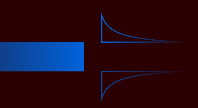
or with some kind of background, somewhat like this

Here the file, renamed to a .txt because GitHub is annoying again. drawing.svg.txt
The (lack of) background thing is an issue, clearly, but the easy might be relatively easy: draw a full bar at all time. And while at it, draw it in another colour, so that it acts as outline, and helps with the issue I linked.
momentum shows icons at wrong place (tyrant is shown at the complete end, while unlocked a lot before, it does not have the "step" marker)
This part has been fixed.