 Uninett
Standardize look of widgets in various screen sizes
As we add support for smaller screens, we have ended up with several ways of doing the same thing:
- Whether to have always have a button to create something, or only on small screens
- Where the create button is located
- What the create button looks like
- no doubt etc. etc.
This should be standardized.
- [x] Document what varieties we have, old frontend
- [x] Document what varieties we have, new frontend
- [x] Choose what to standardize on, see #1519
- [ ] Document in a styleguide: Finish #1519
- [ ] Implement
Varieties should be documented here so we can pick and choose, ditto mocks if we choose something not already implemented. Once we know what to do we can have one or more issues for tracking implementations.
Create-/Add buttons
- "Create New Timeslot"

- Displays an otherwise-hidden form
- Visible on xs and sm screens
- Is replaced with "Collapse" after click
- Contains MUI Create icon
- Alignment: center
- "Create New Profile"

- Displays an otherwise-hidden form
- Visible on all screen sizes
- Is removed after click (re-appears on page-refresh only)
- Contains MUI Add icon and button name
- Alignment: right
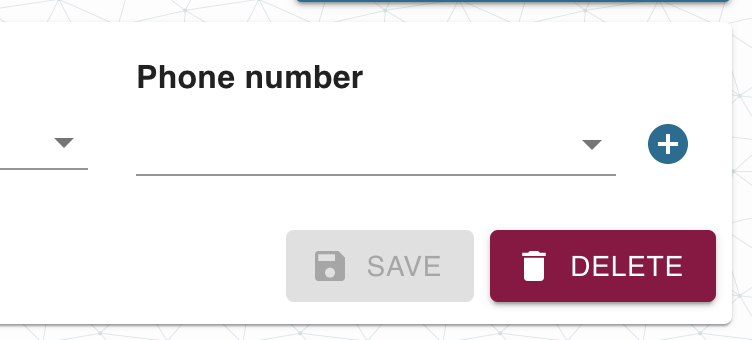
- "Add Phone Number"

- Opens a dialog
- Visible on all screen sizes
- Contains MUI Add icon
- Background: primary color
- "Create Filter"

- Opens a dialog
- Visible on all screen sizes
- Contains MUI Add icon (font-size: small)
- Background: transparent
Selectors with chips
-
Incident Filter selectors

- Normal label text
- Outlined input field
- No end adornment
- Contains helper text
-
Notification Profile selectors
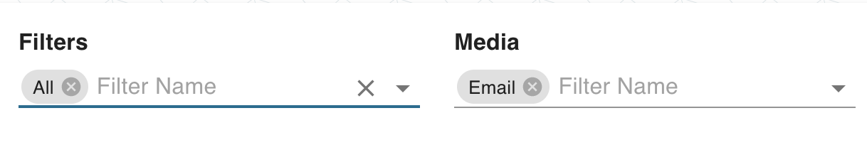
- Bold label text
- Standard input field
- End adornment contains a dropdown icon, and a MUI Clear icon (if input contains chips and field is focused)
- No helper text
Button Groups in Forms
-
Create/Update Timeslot Form
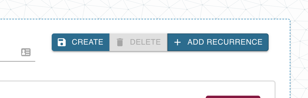

- Position: top right corner
- No space between buttons
-
Create/Update Notification Profile Form

- Position: bottom right corner
- Space between buttons
Buttons
- Padding, font style, font size, height varies from page to page
Login-page, argus-theme:
After filling in the fields (censored):
Button: on hover, gets darker. on click: shrinks as long as the mouse button is held
New destination box
With nothing filled in:
With something filled in:
Note double border on field with input.
Destination-page: All buttons get darker when hovered over, clicked button becomes smaller when clicked, pops back to normal after click.
Preferences-page, "update interval" has hover:
"Update interval" is active:
"30s" has hover:
"30s" has both hover an active, there's a shrinking animation:
User menu dropdown:
Nothing selected.
Hover, top level:
Hover, sublevel:
ACtive (on click), sublevel, color is the same for top level:
When selecting from drop down acts like preferences, except it has the grey background in the overview screenshot instead of white.
Incidents page, argus theme
- Stats widget
- Stats widget showing open drop"up"
-
Table pagination
with hover over button
-
Table:
with table row hovered over:
-
Checkbox:
checked:
-
Multiple select:
with options selected:
-
Free solo input field:
with input field being active:
with input provided:
-
Range slider:
on hover:
-
Select:
-
Button:
on hover:
-
Small button:
on hover:
-
Modal:
-
Text input field:
with input provided:
-
Error alert:
with hover over close button:
-
Success alert:
Incidents-page: All clicked buttons become smaller when clicked, pop back to normal after click.
Profiles page: looks almost like destinations...
Note no yellow buttons, the shadow is different. The box looks like it is hovering instead of being cut out.
On click only the "Name" and "Timeslot" input fields get the double border.
When filled in, "Active" is white on black:
Timeslots page, argus theme
-
New timeslot box:
It has shadow, same as on the profiles page
-
Existing timeslot:
It has shadow, same as on the profiles page
-
Text input field:
when in focus:
with input provided:
-
Delete checkbox and day checkboxes have different border width:
-
All inputs have double border when active
-
No yellow buttons
-
Border around the "Unsaved" recurrence has unique color: