Regarding the `ScaleBitmapUniform` method
First of all, thank you very, very much @TheJoeFin for taking the time to develop and make this code available to us all.
Now, I've noticed you are enlarging the bitmap with ScaleBitmapUniform (when it makes sense). Could you please explain why 1.5 and not larger? What I mean is, why 1.5? Is this a shot in the dark to improve OCR accuracy or have you done any benchmarking and this is as good as it gets?
Thanks again.
@LaraSQP glad you hear you are finding Text Grab useful!
For the 1.5x scale of the bitmap, that was determined after some experimentation. If the scale is too large OCR does not preform well, so since 1.5 was working well in my testing I went with it.
I am happy to take another look a that area of Text Grab if you think there are some improvements which can be made.
The quick reply is appreciated.
Could you please explain what you mean by "perform well"? Do you mean the capacity of the OCR to extract the text correctly or the time it takes to enlarge + OCR the image?
I am interested in increasing the former. Have you also played with, for example, filters such as sharpening, edge finding, etc? Again, the objective is to improve OCR accuracy.
Ah yeah, "perform well" is pretty vague. I meant the accuracy of the OCR on smaller text benefits when the 1.5 scaling was applied. As I have been building Text Grab, the OCR has always been very fast, however I have not tested against super high resolution images, so maybe there is a point where Text Grab becomes slow.
As for using techniques like filtering, sharpening, edge finding, etc. I have not tried them but I was planning on doing some experiments soon. I have another app which uses the .NET package of ImageMagick and I will be using that to do my imaging improvements before trying to process OCR.
If you have tricky sample images or situations to test against feel free to post them on this issue, or email joe at textgrab dot net and I can let you know how it goes.
I've noticed your use of Magick.NET in other projects (icon making, etc) and have learned quite a bit from it.
Collecting sample images is my next step. I will let you know.
You rock, sir.
Hello again @LaraSQP I have been doing some experiments with what an "ideal line height" would be and how to best improve the image to get the best OCR possible.
If you check out branch Line-Height-Experiments it shows how I determined the ideal heights and it also shows how I scale the image to achieve that height. Let me know what you think.
Much appreciated.
Cannot do much right now (illness).
You might want to know that I have come across code to generate images from text and it is not that complex. It should help with testing.
Apologies, my mind is foggy.
I have generated and ocr'ed several hundred images with various fonts, sizes, line heights, fore and back colors.
The engine is remarkably accurate. I have not even adjusted for dpi or scaled in any way.
Here are a couple of the images that have given incorrect results.
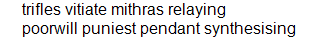
poorwill was ocr'ed as poonvill

dinnerwares was ocr'ed as dinnenvares
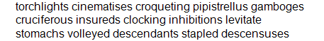
gamboges was ocr'ed as gamt"3ges
All other words in those images were ocr'ed correctly.
Anyway, let me know if any of this interests you.
And, again, thanks for making this code available.
@LaraSQP this is very interesting stuff! Since there is no way to directly change the underlying OCR engine, do you have any suggestions for processing the images before passing them to the OCR engine to improve results?
This is what I have learned so far after having generated and ocr'ed tens of thousands of images:
-
Scaling is the effect that matters the most, even as little as 1.1 is a boon, but anything greater than 2 tends to be counterproductive.
-
Contrast is the second most useful effect and can help with some images if the fore/back colors somehow clash.
-
Sharpness pays the least and is the most processing intensive. Still, some stubborn images respond to it.
The biggest obstacles for the OCR engine that I have found are font size and family. If the font is too small (<8), there isn't much that can be done. Also, some types of fonts are difficult (e.g., Garamond, which I find inexplicable) while others are completely impossible (e.g., cursives, which I can understand).
You should also know that I have not used an image library but developed my own code instead for contrast and sharpness. This might be something to keep in mind.
@LaraSQP I think it would be interesting if the Grab Frame had more tools to manipulate the image and try to improve recognition. Some of these things you mention here could be a part of those tools. I would love to collaborate on this feature let me know if this is something you would be interested in.