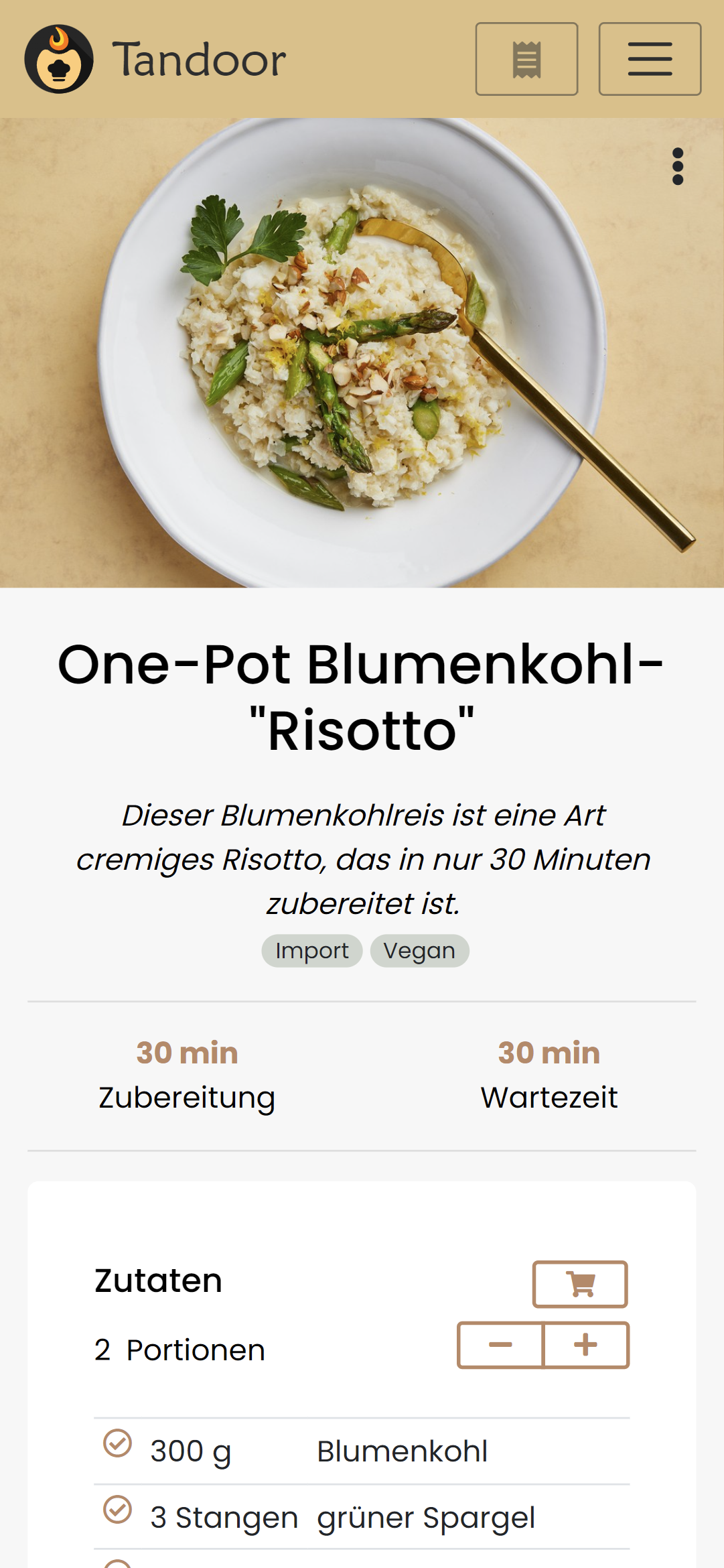
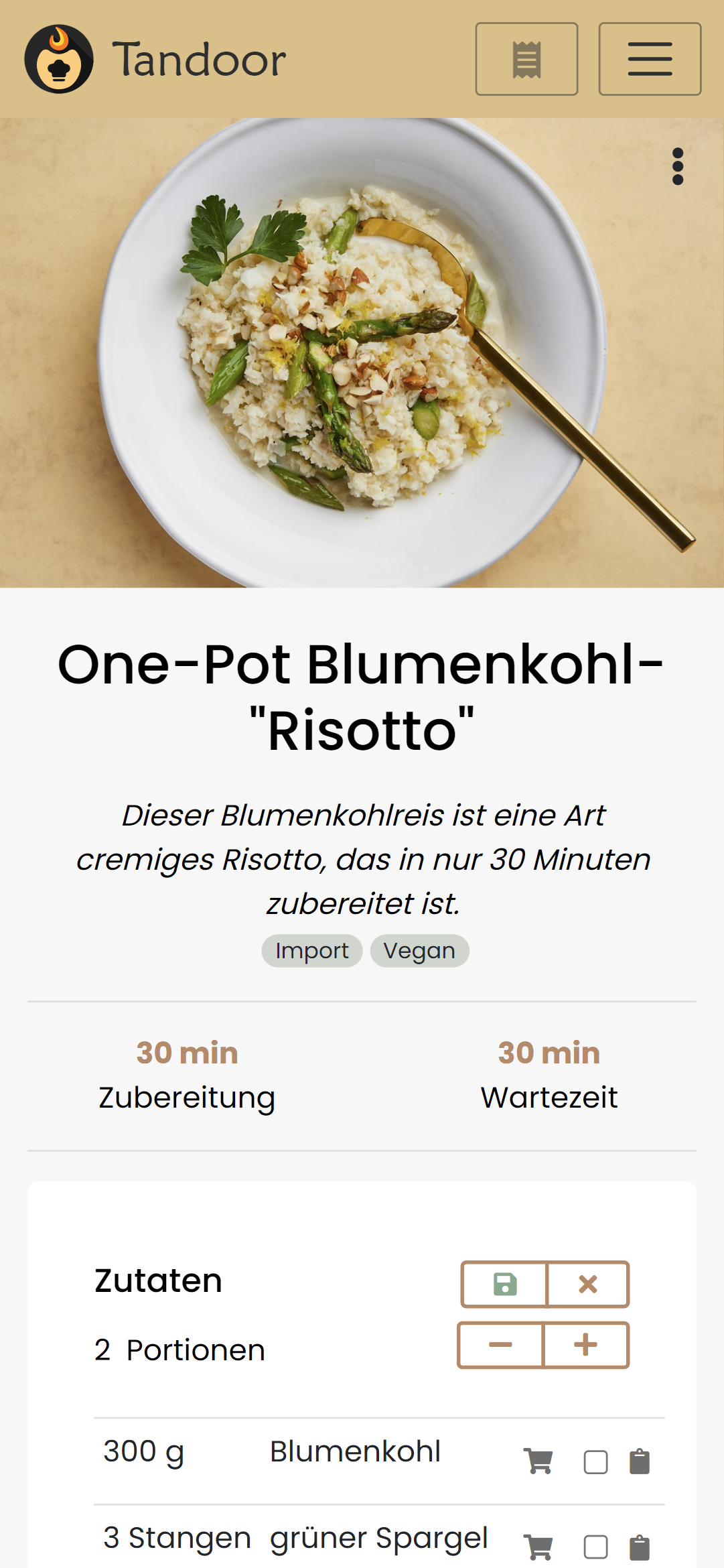
Recipe view layout
Is your feature request related to a problem? Please describe.
Two things:
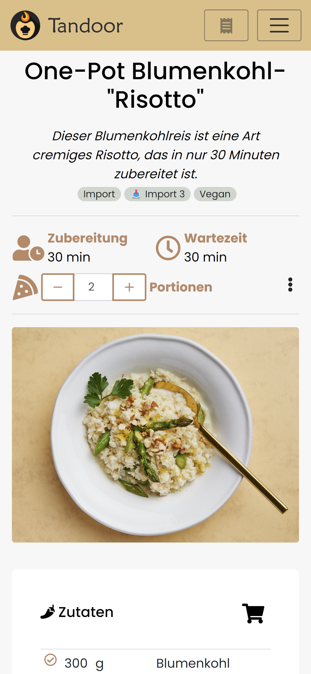
- In my opinion the recipe view look very cramped on mobile. Especially the duration and servings section.
- The ingedients card/table has an extra column for amount and unit. This looks a little bit too scientifical and makes reading it kinda unpleasent imo.
Describe the solution you'd like
I did a few things already that I think would fix this (imo) problems and make it look a little bit more structured.
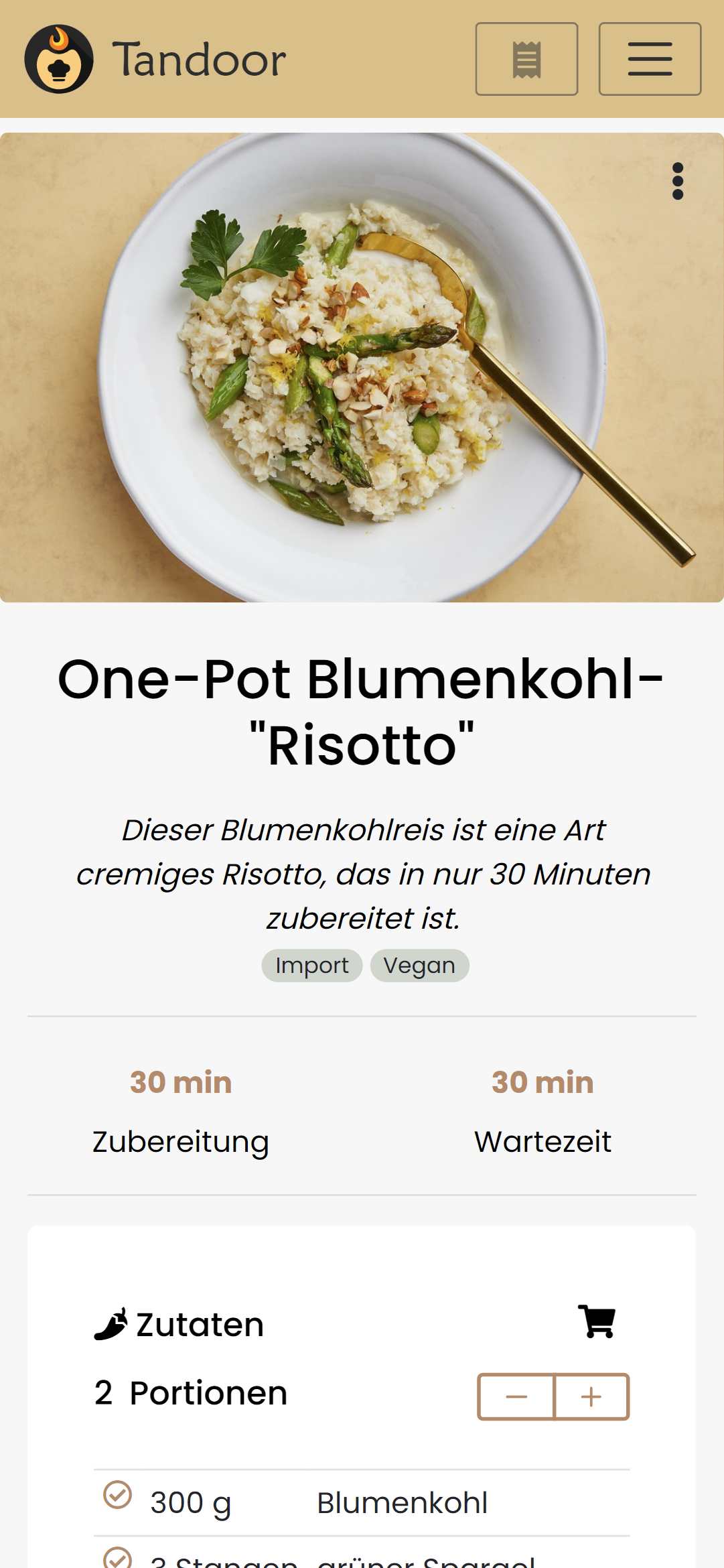
- move the image including the 3-dot menu to the top
- remove icons for durations so it looks more symetrical (not 100% sure about that since i like icons in general :p)
- move servings spinner to the ingredients card, since this is the only thing affected when changing the amount of servings.
- place amount and unit in one coumn so it looks more like a recipe in a book rather than a scientifical datatable.
Additional context
You can look at the changes I made here: https://github.com/hendrikbl/recipes/tree/feature/recipe-view-overhaul
The formatting is totally different than what you did before. I left it like that since I couldn't find any standard inside the project related to formatting template and script in .vue files
Describe alternatives you've considered
Screenshots
Old
New
To clarify: This is meant as a base for discussion. I know style/layout is always a matter of taste :)
really cool, thanks for the suggestions and also really helpful that you already implemented it, as you say a picture is worth a thousand words this really shows here.
I personally suck at design so i always love some input, a few thoughts of myself
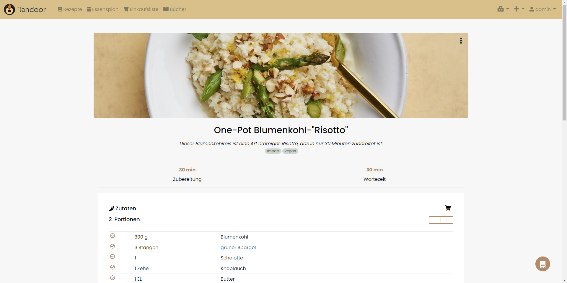
- on desktop/large screens the times are very far apart and take up lots of space, still they look much better than before,
- the heder "Zutaten" (ingredients) is rather close to the portion text which kinda looks very similar in markup. Maybe having those next to the times on desktop again or just differentiate the styling (or maybe just leave the header from the ingredients)
We will also need to check this with the different kinds of recipe structures (1 step only one ingredient list, multi steps with splitted ingredients, multi step with only one step ingredients), i guess i should add the setting thats been long requested together with this UI overhaul.
I would love to give the user some more choice about the layout or implement some "smartness" in the formatting depending on how the user inputs data.
Really good starting point definitely.
I'm not a design pro either. Most of the time I can tell you that somethings looks "not good" but I have no idea how to make it look better :D
I made some changes to the things you mentioned:
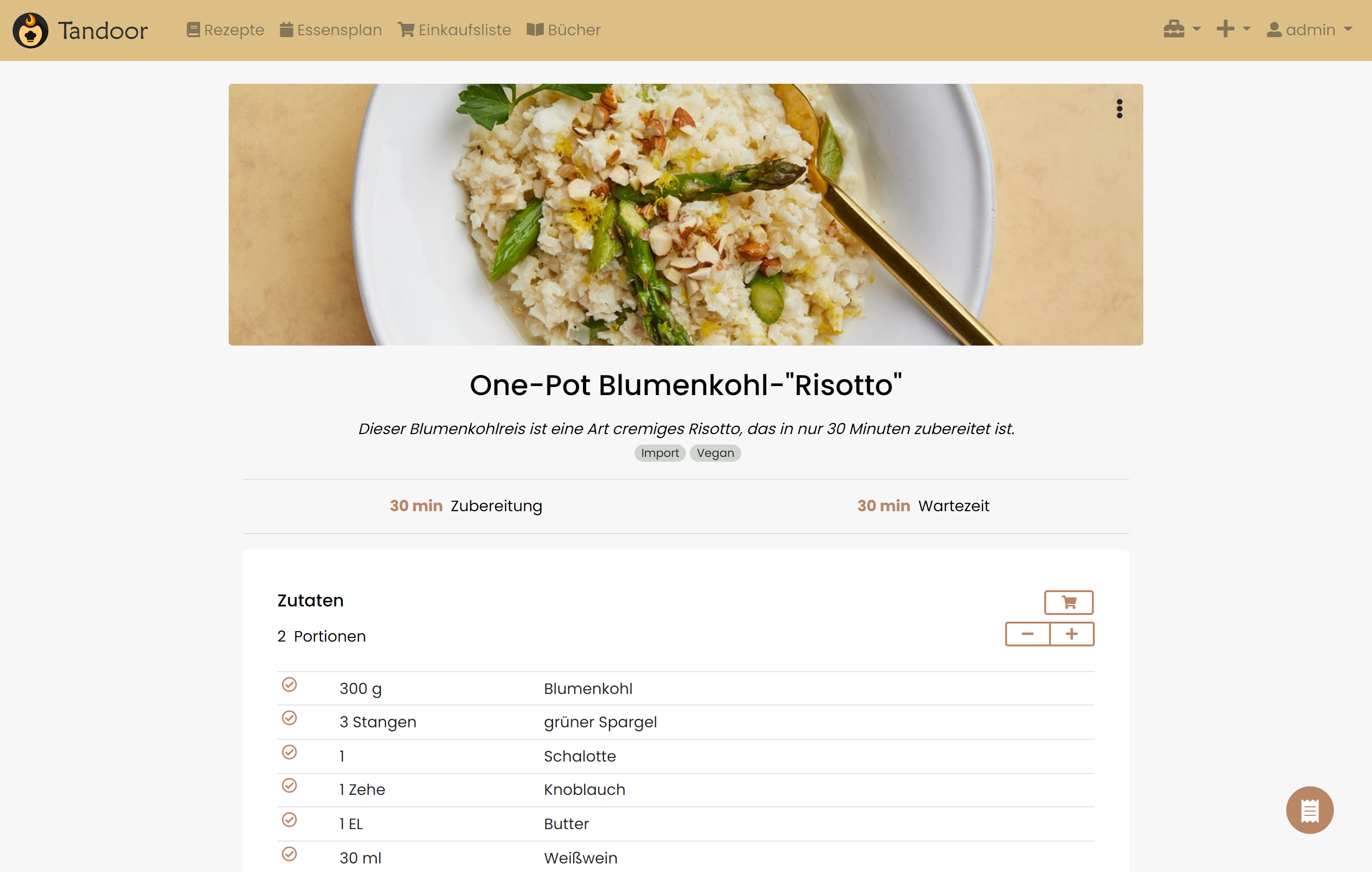
- the times now only wrap on small screens so it's a little bot more space efficient on bigger screens. I'm not 100% satisfied with that but it looks better than before :)
- I changed the ingredients header so the servings are are more distinct from the actual header. I also changed the "add to shopping list" button to look more like a button.
I tested this with all the use cases you mentioned and it looked all good imo.
The only thing I noticed just now is the nutrition card looks off with the changed I made. I will see if I can fix this :)
As always, the changes are on my fork. Let me know what you think :)
Images
This looks very very interesting to me! Already much better than the current Version. Feel free to play around a bit more but I am already pretty happy with that.
@smilerz does the add to shopping on top of the ingredient list do anything the modal cant do? Because if not we could likely reduce that conplexity and only use the modal.
The underlying components are the same,, but the interaction might be slightly different.
The shopping toggle was put in to also manage “on hand” as you used a recipe, so that capability would be missing.
But you can also manage on hand trough the modal cant you? If not I think it might be better adding it to the modal and having it standardized in one place might be beneficial.
Yes, you can, though might be a little unintuitive. Not arguing against it.
ok, thanks, i must say that i personally always use the modal and was, at the time that you added the in line editor very confused when i first saw it. Maybe some users reading this can give feedback here, are you prefering the in line or the modal editor ?
I'm currently using the inline one but only because it's quickly available from the ingredients list. If the shopping cart button would open the modal I would certainly use the modal and never look back.
@hendrikbl is it ok if I implement this based on the changes you have made in your repository ?
@hendrikbl is it ok if I implement this based on the changes you have made in your repository ?
@vabene1111 sure, go ahead :) I played around with some mobile menu stuff with the last commit though, so maybe ignore that :p
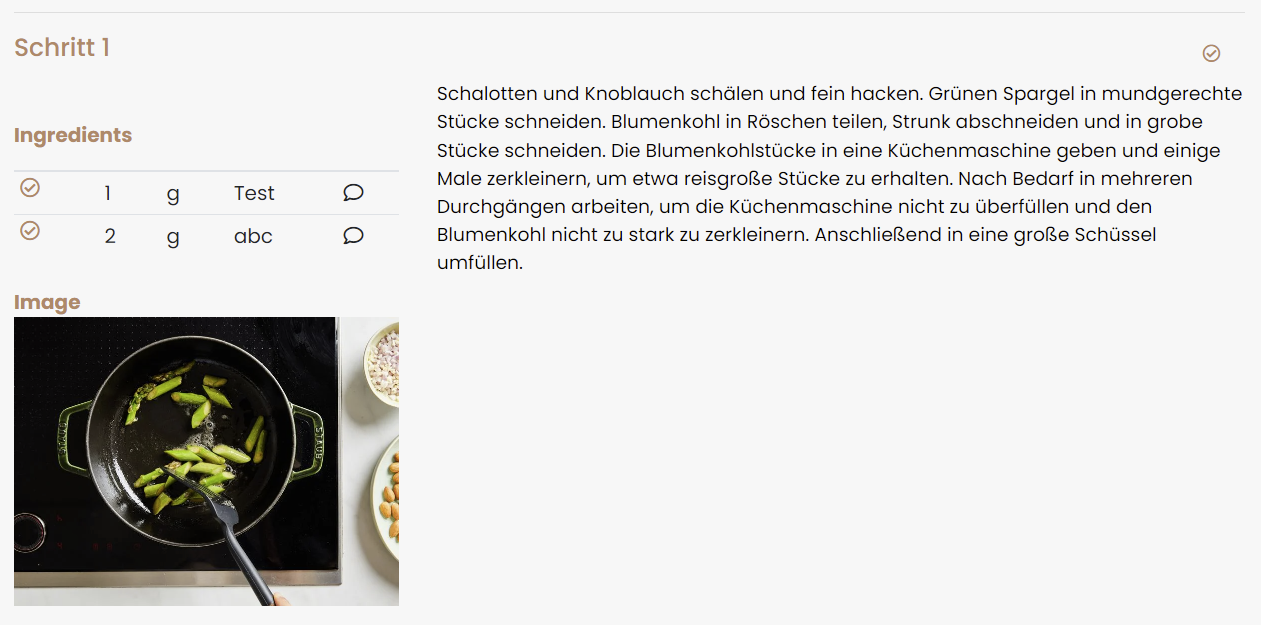
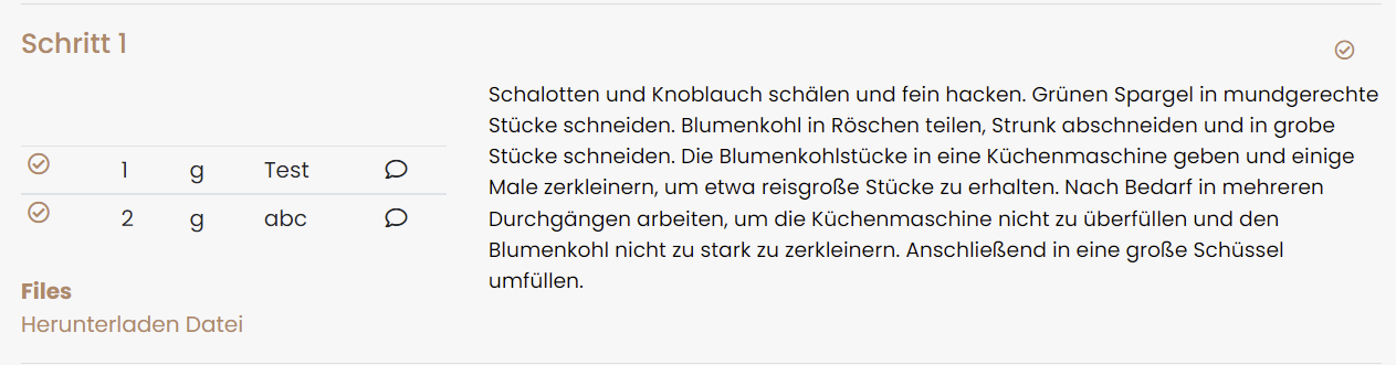
@hendrikbl does this change the layout of the images in a step?
Current
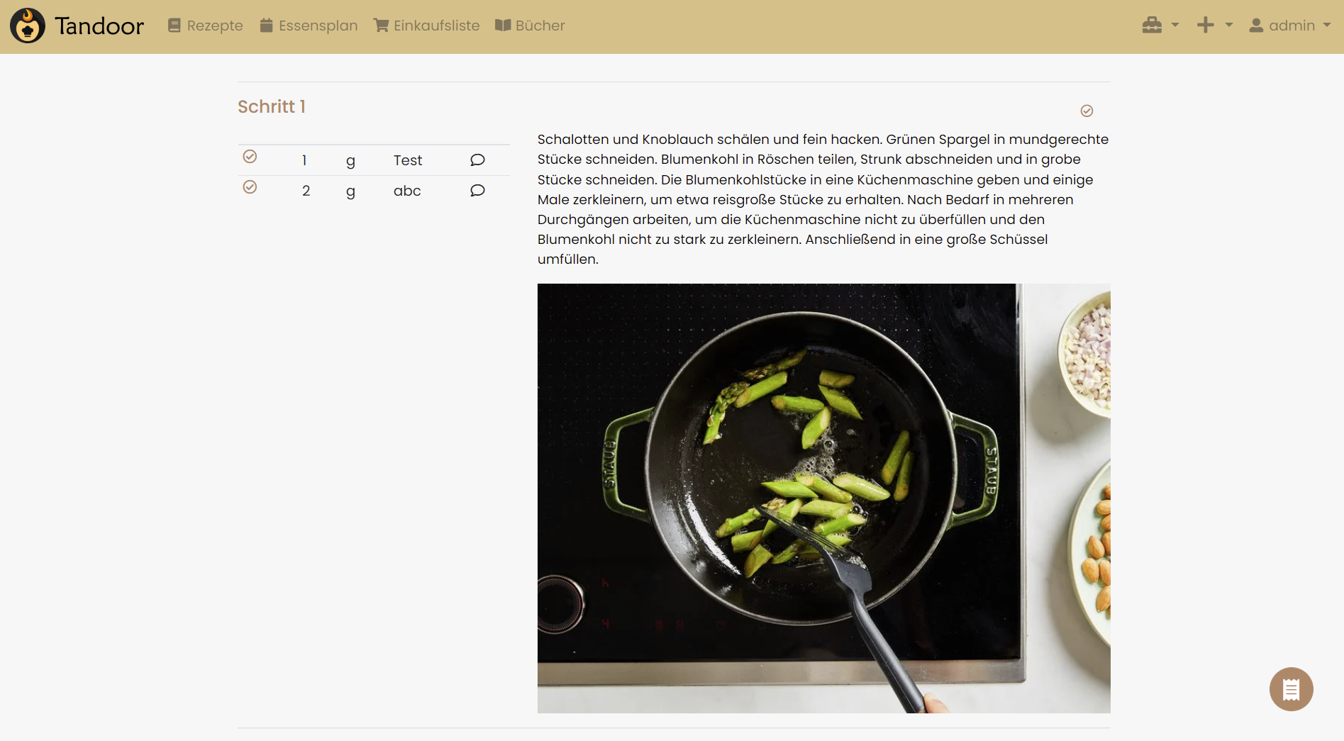
If not, what do you think about moving the "big" image to left column (and... if needed add lightbox for "onClick()")?
@vigri the changes shouldn't affect the images inside a step. I haven't tested it though.
To be honest, I'm not quite sure what you mean by moving the big images to the left. You mean eg the image in your screenshot to the left beneathe the ingedients for "Schritt 1"?
@hendrikbl yes :)
Something like this
Same could be done for downloadable files:
As you said, style/layout is a matter of taste. So we could add a new option in the preferences:
Display of step attachments
- left column
- below text (classic)
If you and @vabene1111 are "okay" with that idea and think it is out of scope of this issue i can create a new one with a PR. Just let me know.
I prefer images inline but as you said, it all comes down to preference. As long as it is optional I am fine with it :)
As long as it is optional I am fine with it :)
Perfect! :)
I'll then make the changes and submit a PR.
@vabene1111 do you want me to create the PR in this repository or in the one from @hendrikbl ?
honestly i prefer the "in line" solution of the image as well and I dont really want to add another option as the editor is already overloaded with checkboxes and options that are not well enought integrated for a normal user to understand them. So for now i would like to leave the image in the center, maybe later we could add some options for style like "large" "medium" "small" "left column".
Are there any updates on this? I really like these proposed design changes.
i would love to implement them but I simply lack the time to implement them. If anyone wants to prepare a PR with the changes that would be awesome.