[#11791] Instructor: Add option to show MCQ question to a session as dropdown
Fixes #11791. Part of #11791.
Credits to @parthnatu for the most part.
Outline of Solution
This PR gives instructors the option to add a MCQ question with an option to show it as a dropdown list rather than radio buttons.
Also, it includes updating the UI for the student's perspective when they see such a question that uses dropdown list instead radio buttons.
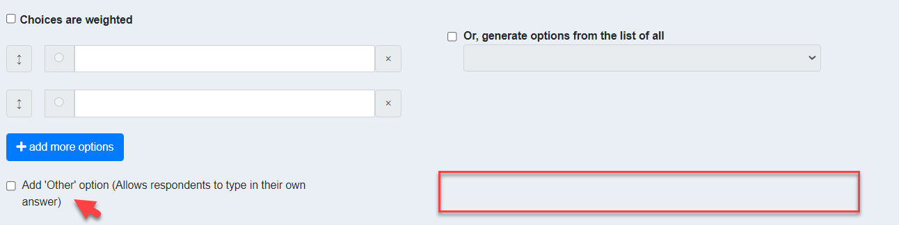
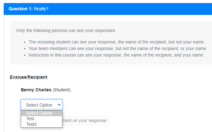
Previously, for an instructor adding a MCQ question:
This is what it looks like now
Previously, from a student's perspective, the MCQ question will be as such:

This is what it looks like now
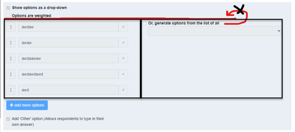
@damithc Hello prof or any maintainer/main contributor, I referred to part 1 PR of this issue and the issue itself and saw your suggestion on the UI. So far, it looks as such. Not sure if it's okay. A little confused on the UI.

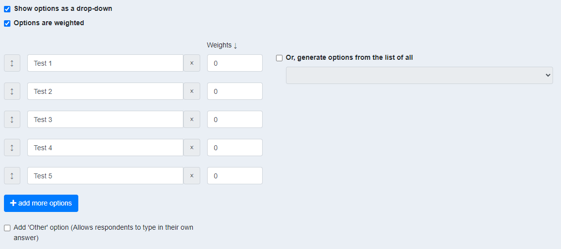
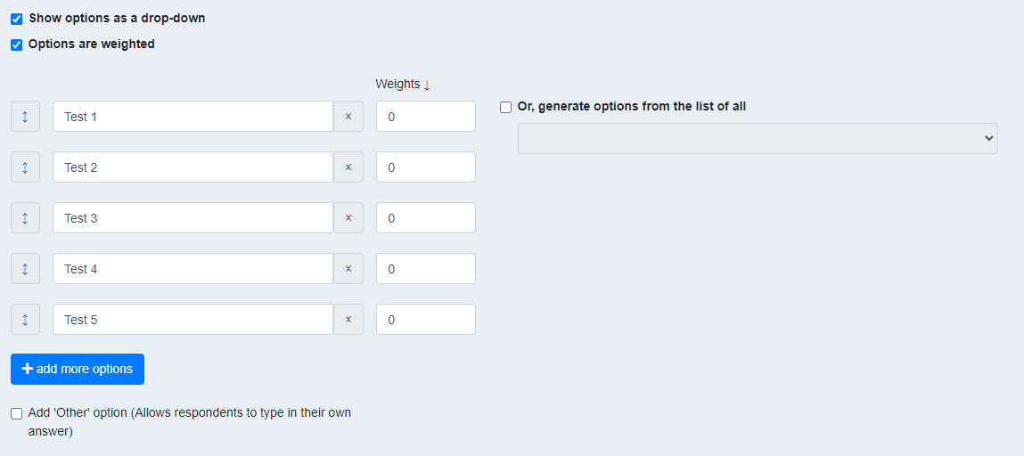
And I think the UI layout for this is quite awkward as it's fixed by using self-written styling. I will want to try and make use of bootstrap CSS classes to amend the layout. The weight looks off too (please refer to the 2nd image).
Another suggestion, when the user checks the option Or, generate options from the list of all, we could maybe shift the entire component up to be aligned with Show options as a drop-down?

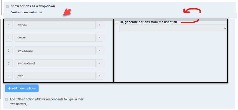
The two black boxes are alternatives and should appear side-by-side, at the same level.
 The above placement is correct. If anything, I would insert a bit of blank space above the boxes, like so:
@damithc hello again prof, I have added your suggestion.
Will make any further change later in the afternoon as I have to go. Thank you!

@domlimm looks good. Although only tangentially relevant to this PR, since you are tweaking that code in that vicinity, these are other tweaks you can consider.
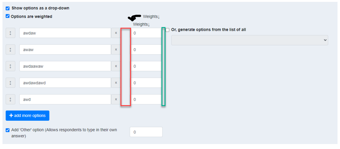
- Reduce width of the red box and increase the width of the green box, until green box is wider than the red box. Reason: place related things closer than unrelated things.
- Align
weightsand0s - Put the
weightslabel lower, closer to the input boxes (not aligned with the . The label describes what's in the text box, not the check box.
@damithc hello prof, sorry to trouble you again. is this alright?
side question: just curious, when we're working on the UI for teammates, are we building it web or mobile first?
thank you!
@damithc hello prof, sorry to trouble you again. is this alright?
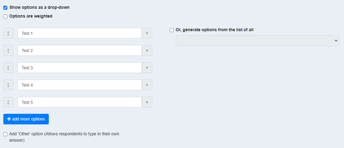
@domlimm looks good. Can you show a screenshot for when options are not weighted?
side question: just curious, when we're working on the UI for teammates, are we building it web or mobile first?
I don't think we officially claim to be optimized for mobile use, but we try to be. I think most instructors are using regular-screen devices (I can't imagine many instructors setting up sessions using mobile phones) while a higher percentage of students (compared to instructors) could be using mobile devices to submit responses.
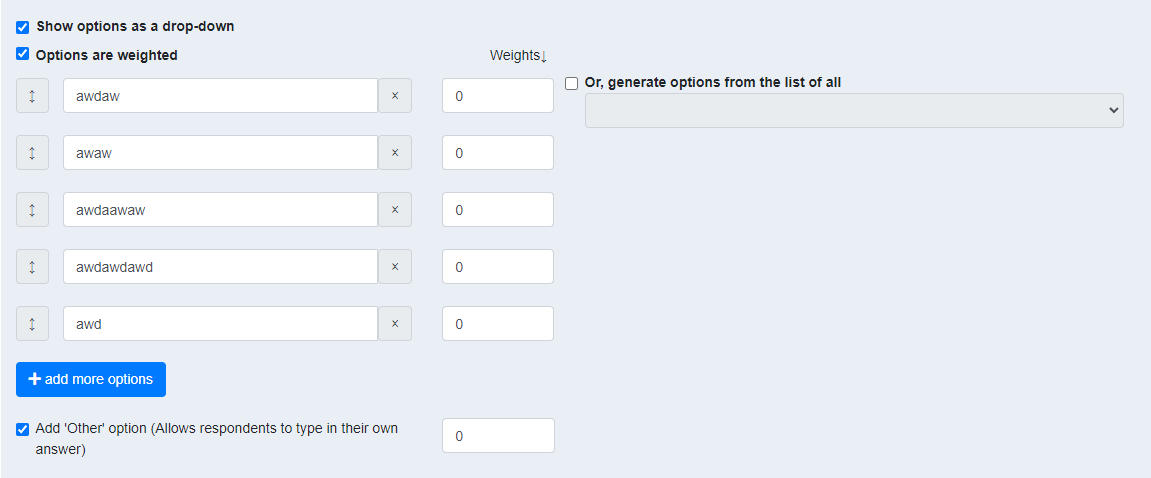
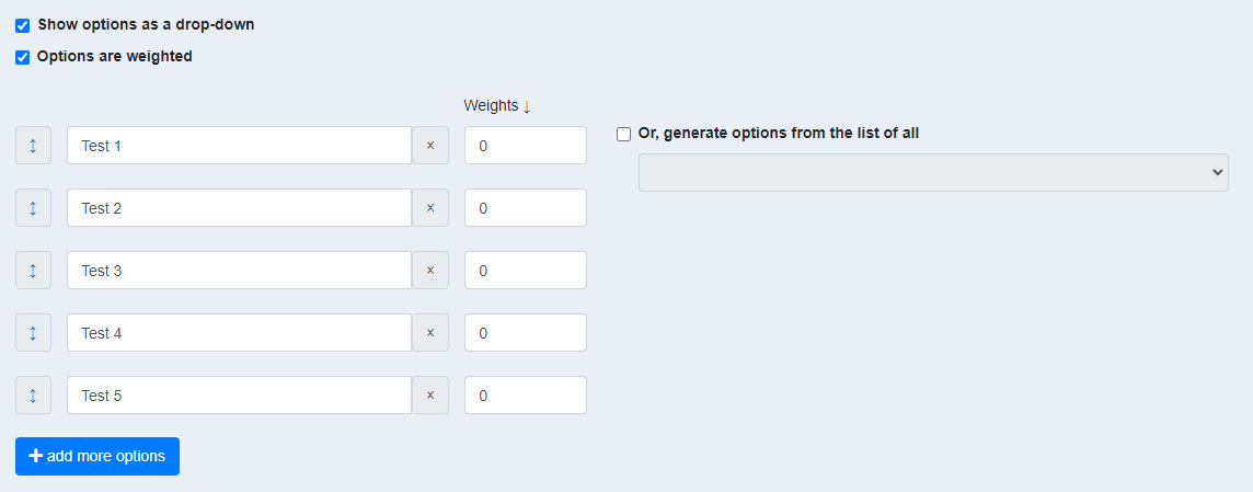
@damithc hello prof, here are the images (will add to this PR's description once it's ready for review):
With weights
Without weights
I understand. Totally agree that it's quite difficult for instructors to setup on other electronic devices other than a laptop/PC. Cool!
I am actually unsure if I'm missing anything for this issue/PR...
Thanks prof!
@domlimm I'm OK with the latest UI. Let's for for the dev team to review the code.
@ypinhsuan thanks for reviewing my PR! Will make the changes, and try to add the FE tests ASAP as well. 👍🏻
@ypinhsuan hello! Sorry for the delays... I have spent some time adding the frontend tests. However, I feel as though that it's insufficient. I have tried taking a look at other different components/pages but can't seem to figure if it's enough.
Would appreciate some suggestions please!
Hello, again thanks for your help @ypinhsuan! Currently, still working on the last bit of test for Whether the answer is updated when another dropdown option is selected.
I do have a suggestion that I'd like to share - do you think it will be good to set the default value to be Select Option?
Maybe could get prof's, or anyone else's input too.
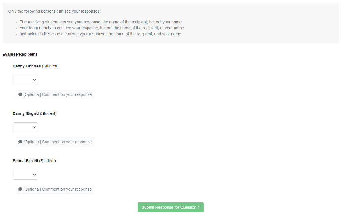
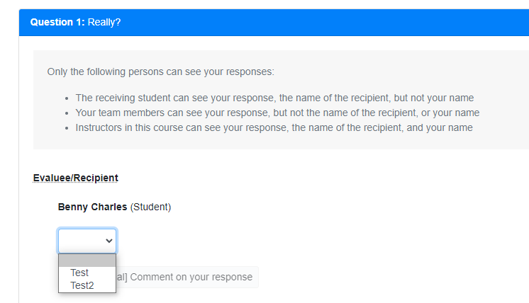
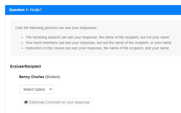
Right now it looks as such:
And the code (minified):
<select>
        <option [disabled]="!this.isOtherTicked" selected></option> <!-- This option has no innerText -->
        <option *ngFor="let num of questionDetails.mcqChoices; let i = index;"
                [value]="questionDetails.mcqChoices[i] | safeHtml"
                [selected]="isMcqOptionSelected[i]" [disabled]="isDisabled">{{ questionDetails.mcqChoices[i] }}</option>
</select>
Could do:
<select>
        <option [disabled]="!this.isOtherTicked" selected>Select Option</option>
        <option *ngFor="let num of questionDetails.mcqChoices; let i = index;"
                [value]="questionDetails.mcqChoices[i] | safeHtml"
                [selected]="isMcqOptionSelected[i]" [disabled]="isDisabled">{{ questionDetails.mcqChoices[i] }}</option>
</select>
Display:
Thanks!
I do have a suggestion that I'd like to share - do you think it will be good to set the default value to be
Select Option?
Probably empty is better? Reason: easier to spot unanswered questions when the selection is empty. When it is filled with some default text, the user has to read the text to figure out it is not selected yet.
@damithc I understand prof. Sorry was lacking a bit of understanding for this part. Thank you!
Guys, This PR seems to be stalling (no activities for the past 7 days). :snail: :cry: Hope someone can get it to move forward again soon...
@zhaojj2209 @samuelfangjw Would appreciate if any of you can do a final review.
Hello @zhaojj2209, thank you for reviewing! Yes, I am facing the same issues that you've stated.
- Unable to select an empty option
- Clicking on the submit button does nothing
- I suppose responses should have been cleared and not saved if the above does not work. Please correct me if I'm wrong!
Also, I suppose an empty value should be saved when the student submits his/her response? May I ask on the behaviour of an empty option selected, or rather the flow for a drop down list format compared to just radio buttons? I think it should be as simple as just selected an option and saving it, similar to the previous implementation.
So sorry about it and the late reply.. Will work on the fix now 👍🏻
EDIT: @zhaojj2209 hello! I have rolled out the fixes
@domlimm Response submission works now, thanks for the fix!
One suggestion UX-wise: if a question has both the dropdown and "Other" option, and the user selects "Other", the dropdown is disabled unless the user clicks the radio button again to deselect it. This may not be immediately obvious to users, and they may have the misconception that they are locked into the "Other" option.
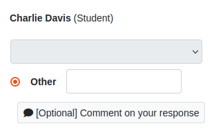
A possible improvement would be to leave the dropdown enabled if the user clicks on the "Other" option, but automatically deselect the "Other" option if the user selects an option from the dropdown list. This would make the behaviour similar to the radio buttons version.
@zhaojj2209 hello! thank you for reviewing again!
i agree with you on the UX improvement. will take a look at it and make the changes ASAP and ping you again.
thank you!