Update bookshelf using material design
I think the wooden wallpaper in library should be removed. Would also be an easy step toward material guidelines :)
I second this. I would also prefer a cleaner UI design (that includes new/simpler icons etc.).
I found DV has another interface doesn’t use wooden wallpapers, which should enabled in the settings. I think this interface can be modified to identical material guidelines.
Ah you're right, disabling "All Settings -> File Browser -> Use bookcase view" gives a list view instead of the bookcase. But I think it's still worth getting rid of the ugly wood texture anyway.
I think the wooden wallpaper can be keeped, because this is including an easter egg, which can appear when Christmas is coming.
What? I like the wooden bookcase view. I just wish I could create my own bookcases and rearrange the books so that I can access them by spatial memory instead of searching.
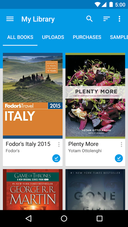
I dropped the wood wallpaper for now, here's what it currently looks like: IMHO it's cleaner, maybe too dark. Could use wood colours maybe? We don't have an app colour scheme currently.

After you dropped the wood wallpaper, you should remove the outline of thumbnails, replace it by shadow. BTW I think the wooden interface should be moved as alternative UI...
I agree with Krasnaya. Please keep the wooden interface as an option instead of completely dropping it. Thanks.
Ok, I'll restore it as an option.
I'd prefer to keep the new scrolling tabs I added though, what do you think of this screenshot? https://cloud.githubusercontent.com/assets/239161/18811338/bcf3f54e-8269-11e6-8307-445d96094632.png
IMO the scrolling tabs are a usability improvement over the old header with left/right buttons because you can see the neighbouring bookshelves.
re: the material design bookshelf, yeah, there is more work to do. It should either use the cards or grid list pattern, not sure which.
edit:
Grid list would look something like this, but I guess the tiles would be taller and book shaped. 
Thanks for restoring the wooden bookcase. I think the tabs are an improvement over the uninformative left/right arrows. (One can presumably still just swipe left and right anyhow, so the arrows are also functionally unnecessary).
In regards to grid list versus cards, can I presume you mean a card collection? If so, the material guidelines has a handy checklist:
"Use a card layout when displaying content that:
(1) As a collection, comprises multiple data types, such as images, movies, and text
(2) Does not require direct comparison (a user is not directly comparing images or text)
(3) Supports content of highly variable length, such as comments

(4) Contains interactive content, such as +1 buttons or comments, or

(5) Would otherwise be in a grid list but needs to display more content to supplement the image"
Of those considerations, I think probably #4 and #5 are most salient, but they really depends upon how you imagine people interacting with the book shelf.
Personally, I like the small grid like option currently in use as I can see more titles than a card collection. The only extra interactions I would want with the tiles would to be able to drag them to different positions, shelves, or trash.
Recently I found two libraries can be used to make some redesigns.
https://github.com/HeinrichReimer/material-drawer https://github.com/afollestad/material-dialogs
As a drawer I can recommend https://github.com/mikepenz/MaterialDrawer . We use it at Openkeychain and its updated regularly. For other things, http://www.android-arsenal.com is a great resource.
As a drawer I can recommend https://github.com/mikepenz/MaterialDrawer . We use it at Openkeychain and its updated regularly. For other things, http://www.android-arsenal.com is a great resource.
OK this is also a good library to get the Material design.