[UI/UX:Submission] Add Contrast to Submission Interface
Overview
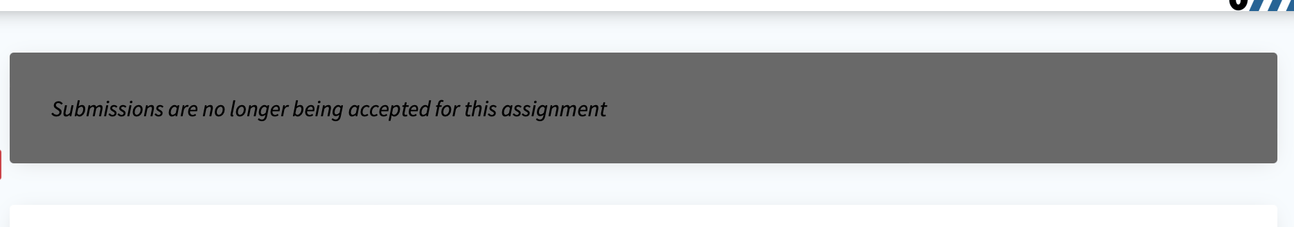
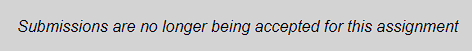
When an assignment is no longer open for submissions, the text color of the message is set to white to add contrast.
What is the current behavior?
Closes #8250
What is the new behavior?

Hi @Gage-Zahn Thanks for your contribution
However, we don't want to use raw rgb in the twig files, instead we want to use named colors from: ./site/public/css/colors.css
Also be sure to test both light mode & dark mode, this is where many of our contrast bugs arise.
I made a change so that it uses the colors in colors.css
In Light mode:
In Dark mode:

Codecov Report
Merging #8381 (7dd7040) into main (8e7bd28) will not change coverage. The diff coverage is
n/a.

@@            Coverage Diff            @@
##               main    #8381   +/-   ##
=========================================
  Coverage     22.41%   22.41%
  Complexity     7671     7671
=========================================
  Files           208      208
  Lines         24234    24234
  Branches         66       66
=========================================
  Hits           5432     5432
  Misses        18738    18738
  Partials         64       64
| Flag | Coverage Δ | |
|---|---|---|
| autograder | 20.46% <ø> (ø) |
|
| js | 28.74% <ø> (ø) |
|
| migrator | 99.20% <ø> (ø) |
|
| php | 20.53% <ø> (ø) |
|
| python_submitty_utils | 71.65% <ø> (ø) |
Flags with carried forward coverage won't be shown. Click here to find out more.
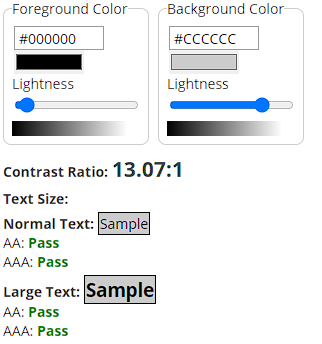
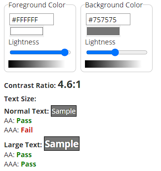
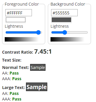
These changes look somewhat better. I recommend using WAVE (see here for more info) to make sure the contrast in dark mode and light mode is ok.
Before
Dark Mode
Light Mode
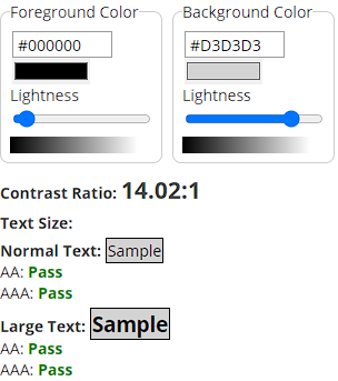
These both pass the minimum ratio of 4.5:1. Optimally Dark Mode would have better contrast.
After
Switching --standard-light-gray for --subtle-grey-background results in this:
Dark Mode
Light Mode