Last-Launcher
 Last-Launcher copied to clipboard
FR: Folders
Similar rationale as #3, i.e., to reduce clutter.
Grouping similar apps (like various settings, banking, games, etc.) can be inherently useful.
Besides that there are various things like "SIM Toolkit" or "YouTube" that I can't or don't want to disable, but don't normally want to see prominently in my primary view. Playing around with colors and sizes only helps a little; it won't help to reduce the primary display to just one screen for example.
I think an option to hide an app (from the home screen) and then show it again (from settings) would perhaps be more suitable. I feel like folders go against the KISS philosophy of this app.
A special-case hidden folder sounds a lot more complex to use and less useful to boot. Note that the ability to easily "hide" rarely used items (while still keeping them easily accessible!) is listed as a positive side effect of folders, not as the rationale.
In any case, #3 is more important. Certain names are just plain ridiculous, e.g., the uninformative Banking for the ING app and ludicrous lengths like Remote for VLC. With custom names one could already group banking apps (etc.) together with names like B.Arg and B.ING. Not ideal like a simple Bank folder would be, but it'd be a major improvement.
If you want to keep it simple, just don't do subfolders.
if folders are to be added, i would imagine it as something like a folder tree, where each folder is in one line unless specified otherwise, while the folder indicators still uses single chars like › and ‹ , or having the name enclosed in brackets or parenthesis like [folder]›.
an example would be like
Another thing Browser Chat Game Other thing Thing [folder]‹ Pictures Settings SettingApp
i guess the idea would need some polishing though.
what do you think? :3
A folder on one line sounds quite wasteful space-wise, possibly even defeating the point for me.
I don't envision it much differently than how it looks right now.
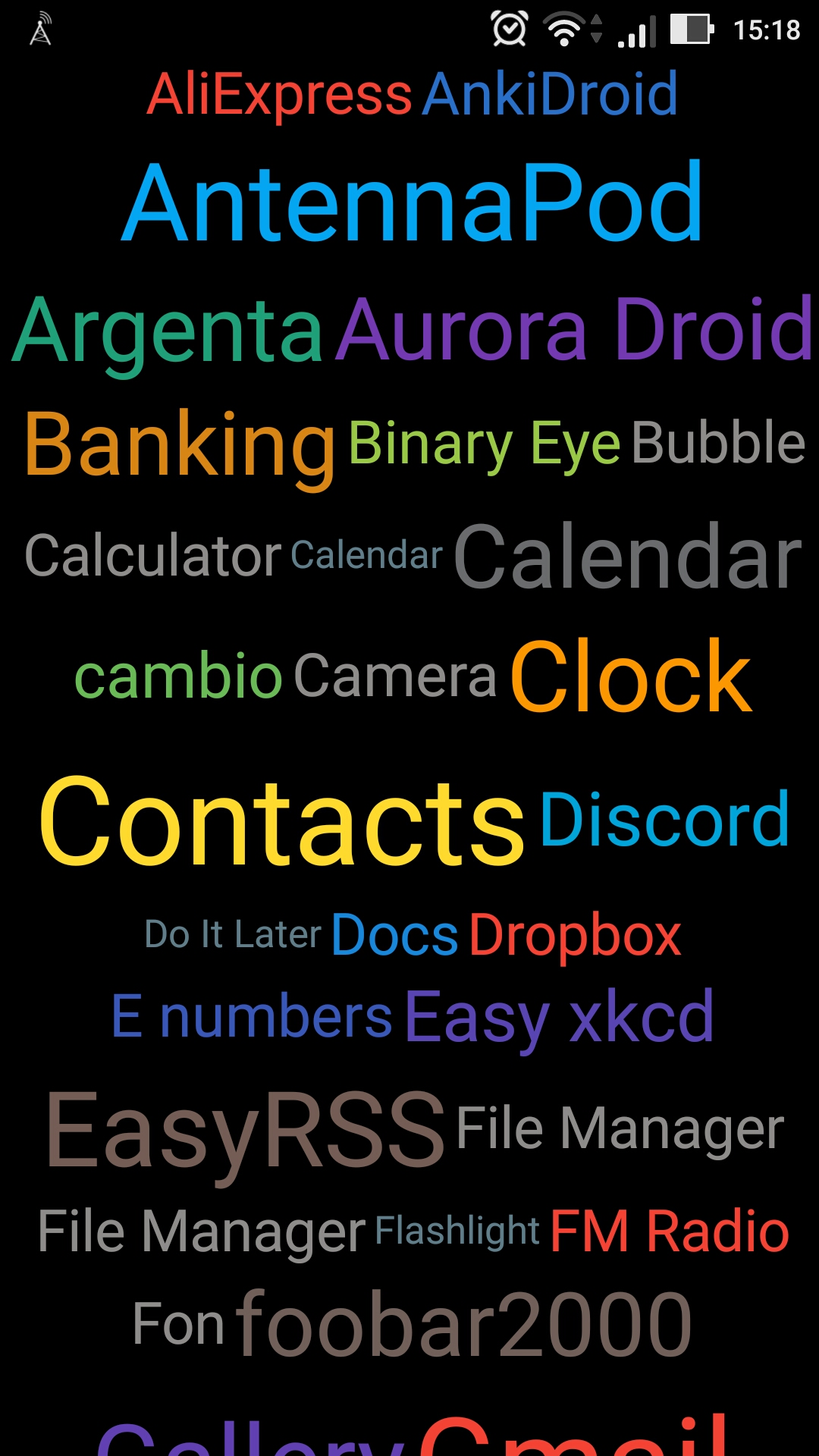
On that screenshot Banking is the ING app; instead it could be the Bank(ing) folder that contains the ING app, the Argenta app, and the Payconiq app. An indication that it's a folder through underlining or a right arrow seems of secondary concern. If a folder took up an entire line by default then I'd probably rather just organize two or three apps together on one line by renaming them (cf. #16).
I'd make the folder content itself the same as the main view, just with a folder name header on top.
Something like #14 would also work for my purposes. Basically I'd like to avoid having to scroll for my most frequently used apps. Whether I put my less-often used "Tools" in a tools folder or on the left/right in a tools workspace is of secondary concern. However, I think folders scale better. More than 3 workspaces would get awkward (but for me three workspaces should suffice).
I think a possibly better option than folders would be a “sort by color,” “sort by size,” and “sort by name” option.