WritingStyleGuide
 WritingStyleGuide copied to clipboard
Review splash page to make it more "Red Hatty"
The https://stylepedia.net splash page could do with a bit of refurbishment to bring it a bit more in line with other RH pages. I'm not thinking "like the Portal" but just updated graphics, layout, etc.
@sajith could you have a first look at this, and then when we get some more ideas going @niklucas can jump in with suggestions and maybe look at the CSS, etc.
@psharp FYI
I suppose I could have a look, but I have no idea what this is about. 🤔
This needs to be with Sajith in the first instance - I am decidedly not a designer. Happy to implement whatever is decided.
I'm sorry, I'm not the person to whom you meant to assign this.
So sorry @sajith!
@daobrien -- are you able to add people to projects? I don't think @seyamkuz has access to this repository at all.
yes, wrong Sajith. I've already sent him (the correct one) an invitation. I'll ping him as well. Apologies for the confusion.

Hi David,
Attaching the updated version of the Stylepedia Page inlines with RH Pages. Kindly review and let me know if I need to make any changes.
Regards, Sajith
Thanks Sajith. A couple of comments and questions:
- This is not an RHT+C style guide, it's a Red Hat (global) style guide. The only RHT+C-specific aspect is the DocBook Guide.
- Version 2.1 of the DocBook guide is being retired. Maybe @niklucas has some suggestions about how we can implement
latestandprevious versionlinks, etc. - What do you envisage for the links at the bottom of the page? Remember that this is a public and open source guide. What we have wrt "Terms of Use" are covered in each guide.
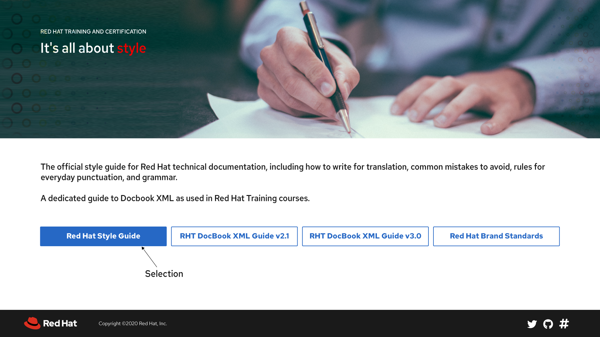
- The two paras at the top seem quite divorced from the buttons that appear below. There's no visual relationship between the related objects.
On a more subjective note, this doesn't yell out "Red Hat" as much as the original design does. I can't actually tell what that graphic represents. What's the design based on?
David

Hi David, Thanks for the feedback! Please check this new version and let me know if I need to make any changes.
@nmuller66 @sffrench Care to comment?
My current questions are similar to the previous version:
- This is not an RHT+C guide.
- The banner is not very "Red Hatty" but that's just my opinion. Someone else might love it :)
- The blue buttons... :shrug:
I don't want to dominate the discussion, so please speak up~!

Please check this latest version, I welcome your suggestions.

I'm certain that I was included on this email chain by mistake, however.... if it were to come to a vote, I would vote for this version of the page. it's very modern and looks good.
My only humble suggestion would be to have the red opacity of the background image (top), be a more purplish color :).. There is a lot of red and it seems a bit of overkill to drive that point home.
Everything else is spot on.
On Tue, Oct 20, 2020 at 5:44 AM Sajith Sugathan [email protected] wrote:
[image: Stylepedia-New2] https://user-images.githubusercontent.com/29087056/96581579-a63a6900-12f7-11eb-8cae-2bf318528b89.png
— You are receiving this because you were mentioned. Reply to this email directly, view it on GitHub https://github.com/StyleGuides/WritingStyleGuide/issues/209#issuecomment-712791474, or unsubscribe https://github.com/notifications/unsubscribe-auth/AAFCNX3C5JUTNLDFFUMAWN3SLVZ2RANCNFSM4SAI2VSQ .
-- "Once you eliminate the impossible, whatever remains, no matter how improbable, must be the truth." Sherlock Holmes (by Sir Arthur Conan Doyle, 1859-1930)
http://www.linkedin.com/in/patricksharp
@psharp why do there have to be multiple "psharp"'s? :( Apologies, but thanks for the input; very welcome. @PatSharp99 @dsacco15 welcome your input as well.
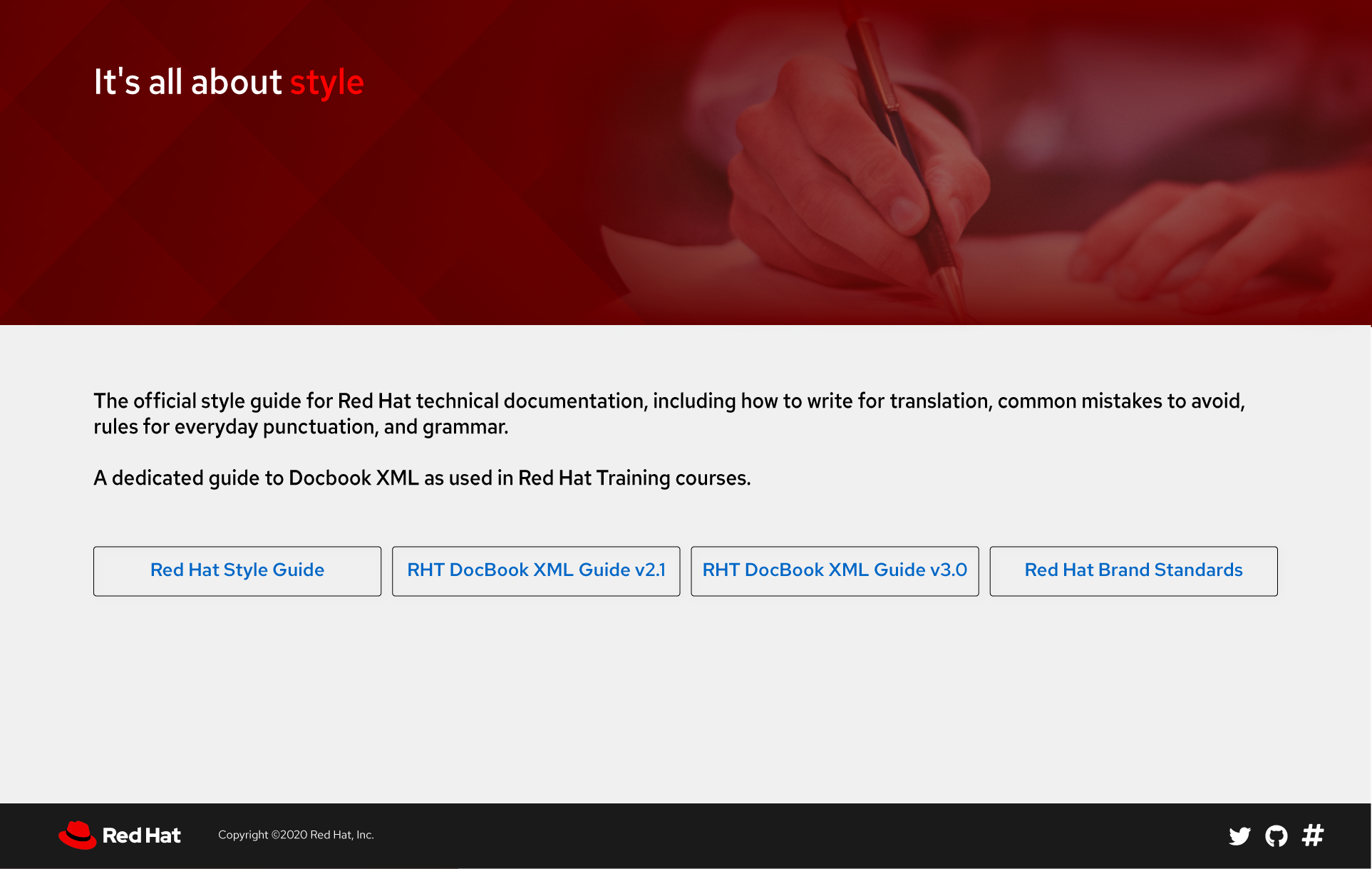
This explains why I hadn't seen this previously! I agree with the other PSharp and also like the last version, but I think the text is either overkill or incomplete. I think the selection buttons are clear without a statement, but if we want to keep the text then add a line to include the brand standard. @daobrien perhaps you could suggest the text and/or buttons to reflect what would communicate most clearly? Thanks!
@PatSharp99 The actual text we can tweak at any time; it's just part of the XML files. The "latest" version (with the big buttons) is not actually the latest. That version came before the version that just shows links, and which I like better. And yes, we need to include something about the link to our Brand standards.
I have two questions:
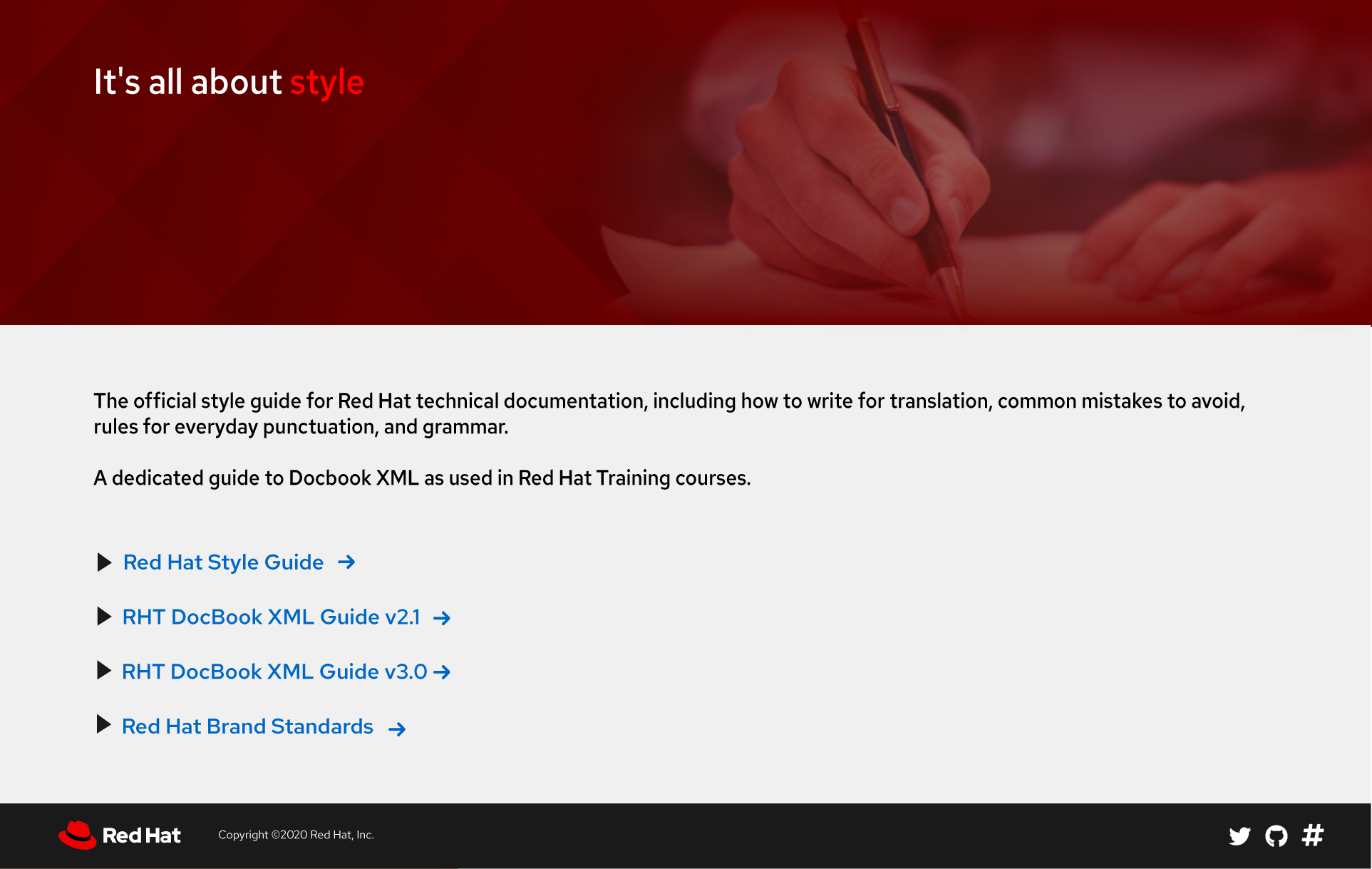
- Do we need both the twisties (the black arrow icons; technically not twisties because the don't expand) as well as the arrows to the right of the links?
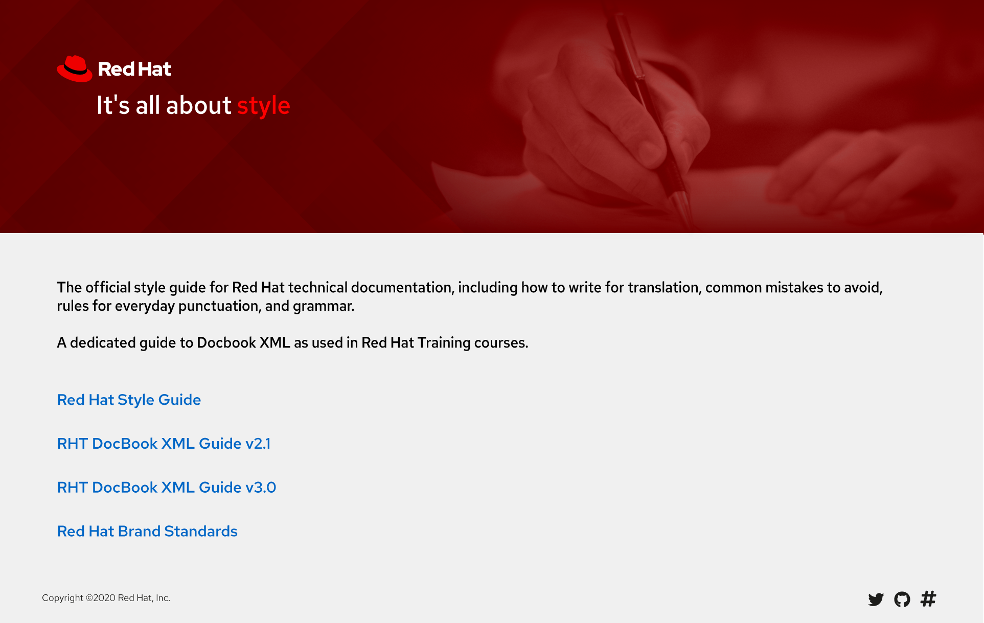
- Should we not include the actual RH name and logo at the top of the page? See stylepedia.net for example.
Got it. I think you have the answers in your questions, @daobrien :). I agree that no, the arrow/triangle icons are not necessary. Let Sajith know if you want a bullet or something else or no marker at all. Yes, add the logo. Thanks!

@daobrien @PatSharp99 Thanks for the feedback! Please check this version
@seyamkuz I'm good with this version if nobody else has any input. As mentioned, we can tweak the actual text at any time; I'm mainly interested in the design and layout aspects. Can you work with @niklucas to get the required material in place?
NB: this is not a high priority task so please don't stop other work to look at this. Thanks.
While we are at it, I noticed when I was updating the docbook guide to v3.1 that we had at some point changed it to just be v2 and v3 but didn't actually implement. But in retrospect, I like seeing the point releases here (though, agreed per our chat that we also should list the release value in the actual guide once you click this link)
Can we confirm on this page which we'd prefer and implement it all together?
I'm fine with that.
I was also thinking about putting the version on the front page of the guides themselves, and wondered if we could just extend the value of "Edition" to include the point release. IOW, v3.2 of the DocBook Guide would be listed as "Edition 3.2" at the top.
I haven't tested if this actually works, but I don't see why it wouldn't.
@niklucas are you in a position to start implementing this? tbh I'm not sure who needs to do which bits~! I'd very much like to get this out sooner rather than later. thanks
@seyamkuz Can you send me the .svg and any other image files and I'll have a go at implementing this. Thanks.

