Simple-SMS-Messenger

Simple-SMS-Messenger copied to clipboard
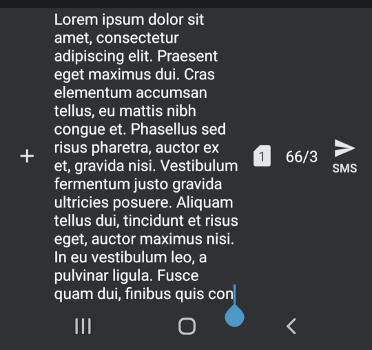
[Feature] Send button taking too much space
See screenshot below. It takes up a lot of space when writing longer messages, especially in combination with the "+" button on the left.
I would suggest that the send button (and the SIM # indicator, and char count) are at the bottom right corner, with the text overflowing around it. Maybe (?) also the same thing for the "+" button.
(I would also argue for a more compact message layout in general - regarding the bubble padding, indentation and timestamps - but that's probably just your style, so I'll respect that :slightly_smiling_face:)