[polaris.shopify.com] Sidebar navigation feedback
Hello Polaris team,
The new docs shines in many ways but there's one thing I miss from the old docs, and that's the ability to quickly view a group of components and see what was available for my use-case.
Right now, the sidebar is ordered alphabetically. This is tedious to read through and doesn't help as much as descriptive categories like "Actions" or "Structure".
The main layout has such categories but the images make this cumbersome to view. If I wanted to look at "Behaviour" components, or even see that such a category exists, I'd have to scroll all the way down, whereas before I already had a birdseye view of each category from the sidebar and what they included without scrolling.
If possible it'd be great to see the sidebar organized into collapsible sections in such a way that one could see every (or most) categories with a single glance (and without scrolling). I find it much easier to navigate by category first, then individual components within the category, rather than an alphabetical list.
I was just browsing the checkout ui component docs and I really liked how they laid out their components. It's similar to what I was thinking and I thought I'd just reference it here:
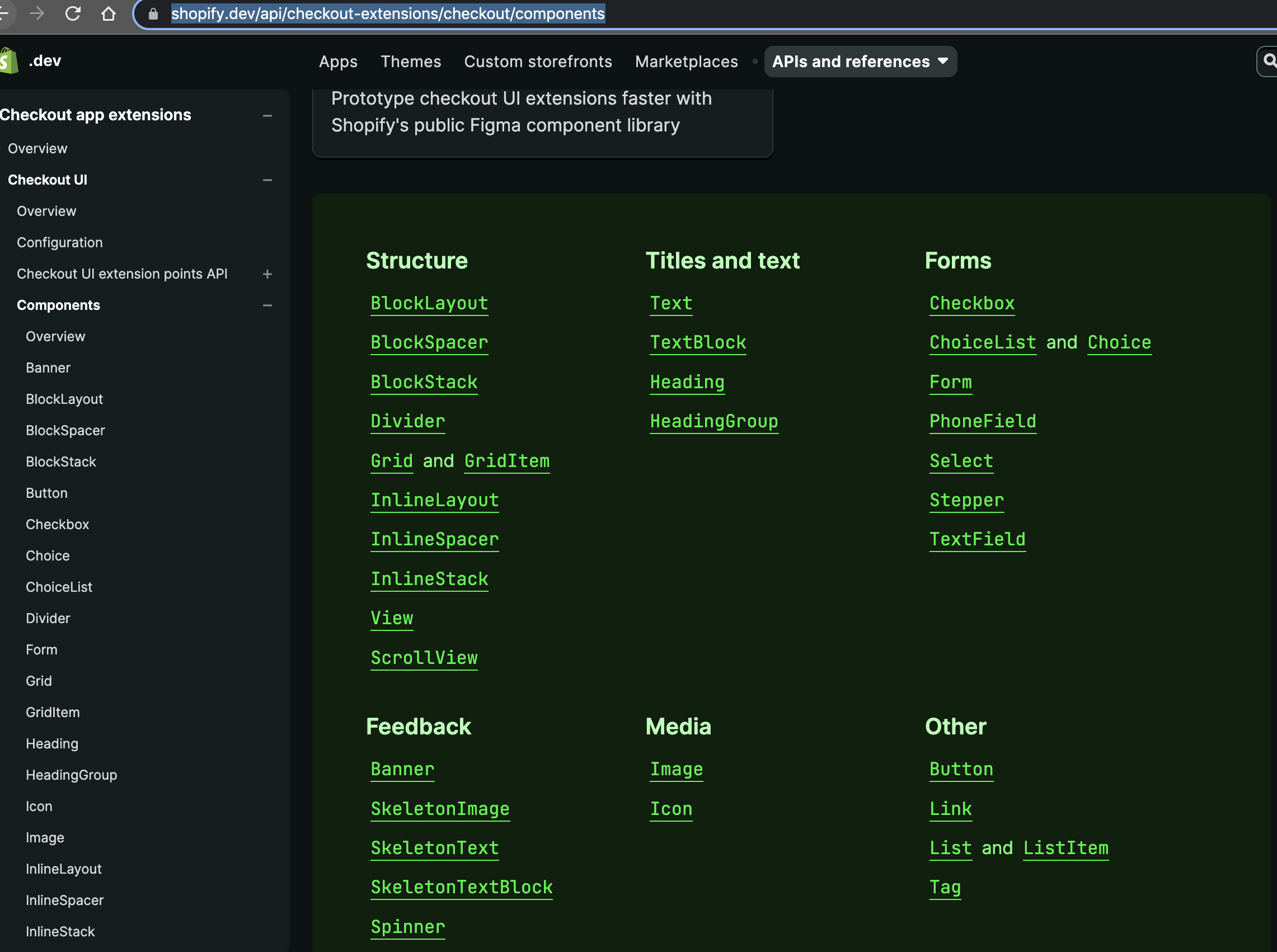
Hi! Thanks for taking the time to write up thoughtful feedback! 🥰
The users of the site seem divided into two groups:
- Prefers alphabetical. These users typically know the ins and out of Polaris and the exact name of the component they are looking for so for them, categories would just be mental overhead.
- Prefers categories. Typically users who are new(ish) to the system and want to explore what it offers. For these users, categories helps break things up nicely, similar to the screenshot you shared.
The split seems to be pretty even. Our takeaway from this is that neither grouping is optimal. Instead, we should rethink the page layout to give every user what they need — regardless of their experience with Polaris.
Our loose idea is to add:
- Quick filtering
- Option to sort alphabetically or by group
- Option for choosing how you want to view the results (list or card)
- Persist these settings in the users' browser
I hope this adds some context! I'll add this PR to the backlog so that we can refer to it when we tackle it later this year!
Thanks for providing context, it make a lot more sense now!
The new options sound great too, I'm looking forward to using them.
Also, if it's worth anything, I've been using Polaris since late 2019 and I still can't remember the name of most components :sweat_smile:. I feel towards the Polaris docs as I feel towards a cherished book–I remember the jist of certain passages but I find recall of them easier when chunked as parts of the narrative arc rather than chapter numbers.
I still can't remember the name of most components
Me too, tbh! Is it Select, Dropdown, Menu or something else?! 😄
Anyways, looking forward to fixing this in a couple of months!
Hi! We noticed there hasn’t been activity on this issue in a while. After 30 days, it will close automatically.
If it’s still relevant, or you have updates, comment and let us know. And don’t worry, you can always re-open later if needed.