serenity
 serenity copied to clipboard
LibMarkdown: Add a grey background in code blocks

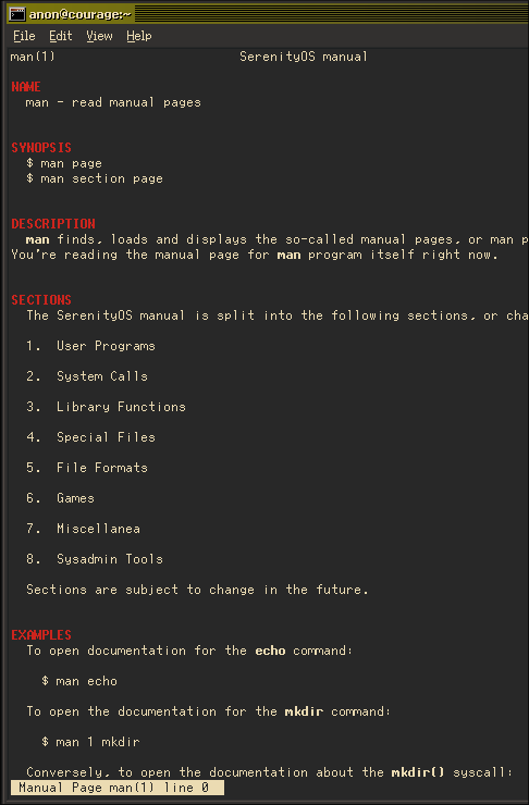
Some people don't like the grey background, so that might be removed from this PR. The synopsis shouldn't be indented, but that might require some more work.
There are probably better ways to do it, but there's now a special case for Headings where we set current_section when we see one, which we pass to CodeBlocks. This way we can check if the current section is not SYNOPSIS, and if so we add some indentation, making examples look good.
Also fixed a bug with less(1) where it wouldn't colorize the section name if it was at the very top.
Some people don't like the grey background, so that might be removed from this PR.
Could we do something more subtle, like make the font bold in these blocks? The white on gray is a bit isn't great for readability/accessibility.
Some people don't like the grey background, so that might be removed from this PR.
Could we do something more subtle, like make the font bold in these blocks? The white on gray is a bit isn't great for readability/accessibility.
That's how it looks like with bold:

Some people don't like the grey background, so that might be removed from this PR.
Could we do something more subtle, like make the font bold in these blocks? The white on gray is a bit isn't great for readability/accessibility.
That's how it looks like with bold:
I was suggesting dropping the gray background and instead only using bold for these areas.
That's already doable with **sh**