Sign up form input boxes are difficult to read
What would you like to be added:
Make the form fields more obvious that they are input boxes. I thought it was just text...
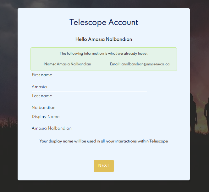
Why would you like this to be added: Difficult - extremely difficult to tell they are input boxes.
To make this issue hacktoberfest ready, the following needs to be improved:
- Where is this page/issue located? (link on the website; location in the code)
To make this issue hacktoberfest ready, the following needs to be improved:
- Where is this page/issue located? (link on the website; location in the code)
The fields to be changed are here: https://github.com/Seneca-CDOT/telescope/blob/90e0b053856d5f357c0c18aec4c81d3c74cdb732/src/web/app/src/components/SignUp/Forms/BasicInfo.tsx#L143
Please add some border to the class here: https://github.com/Seneca-CDOT/telescope/blob/90e0b053856d5f357c0c18aec4c81d3c74cdb732/src/web/app/src/components/SignUp/Forms/BasicInfo.tsx#L91
@dk3775 Are you working on this or do you have other stuff on your plate?