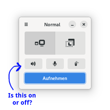
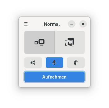
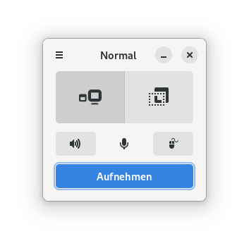
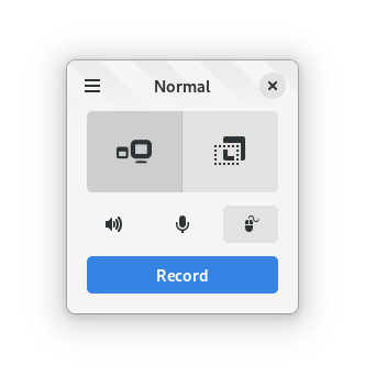
Toggle button state hard to discern
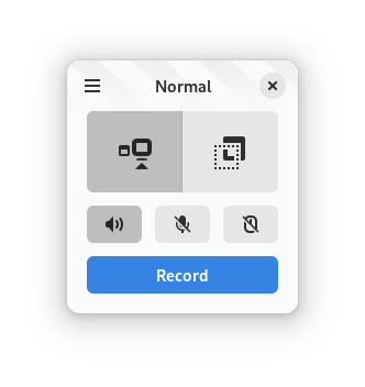
System Info
- Kooha version: 2.0.0
- Distro information: Fedora 34 Workstation
- Desktop Environment information and version: GNOME 40.4
- Display Server: wayland
- Flatpak: yes
Describe the bug
With the new adwaita theme the toggle button state is hard to see. Especially on bad displays.
To Reproduce
- Install 2.0
- toggle buttons
Expected behavior It should be very easy to see which state the buttons are in.
Suggestions
- Remove button outline when disabled (like with the 3 dashes button in the top left corner).
- Or change icon colour when enabled.
- Change button colour completely (not two different shades of the same colour.)
I do have the same problem, but I don't like changing the stylesheet much downstream. I think this should be fixed on the libadwaita itself. See https://gitlab.gnome.org/GNOME/libadwaita/-/issues/228 too
My temporary solution is to change the icon to show something like a slash when it is turned of, but not sure if it will look good.
I think removing the border may also be a solution
The latest release from libadwaita kinda fixes this by increasing the contrast diff between two states
It's honestly extremely hard to tell the difference between the two states still.