umbra-protocol

umbra-protocol copied to clipboard
Max Button Should Be Inside Input On Mobile
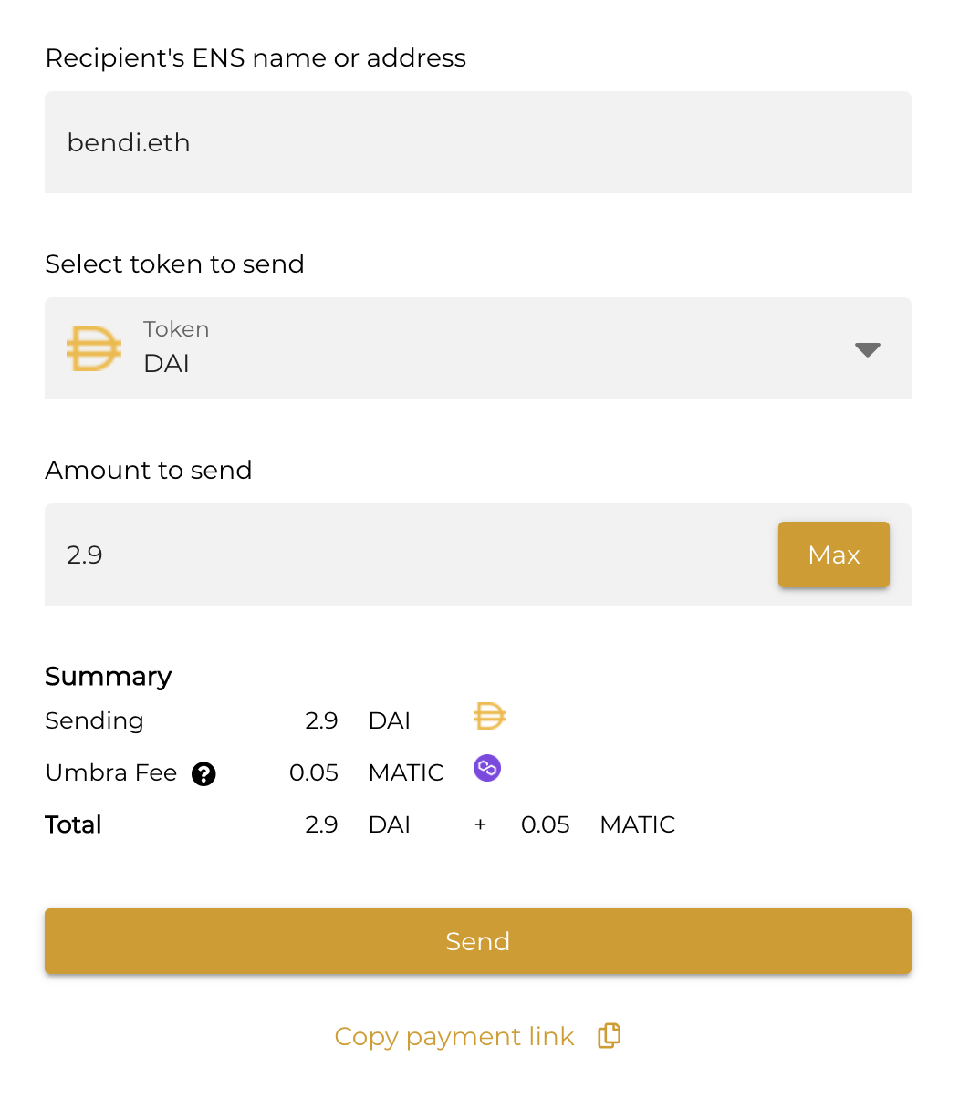
In normal desktop mode, the "Max" button on the send screen appears inside the Amount input:
However in the mobile layout, it appears as a separate button outside the input:
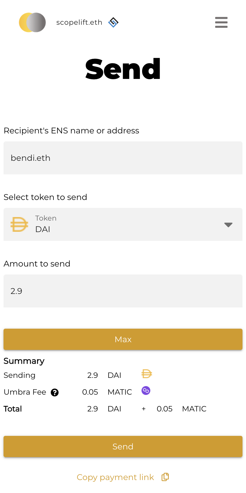
I think the Max button should remain inside the input even in mobile mode. It's a small button and should be easy enough to tap even in a smaller context. Having a it as a separate button could create some UX confusion between "Max" and "Send".
@saimaheshtaduri I've unassigned you since we haven't heard back, but if you still want to work on this let us know