Update README.md
Replacing black checkmarks with green ones. Green checkmarks are more visible on dark theme and it's easier to see if achievement is earnable or not.
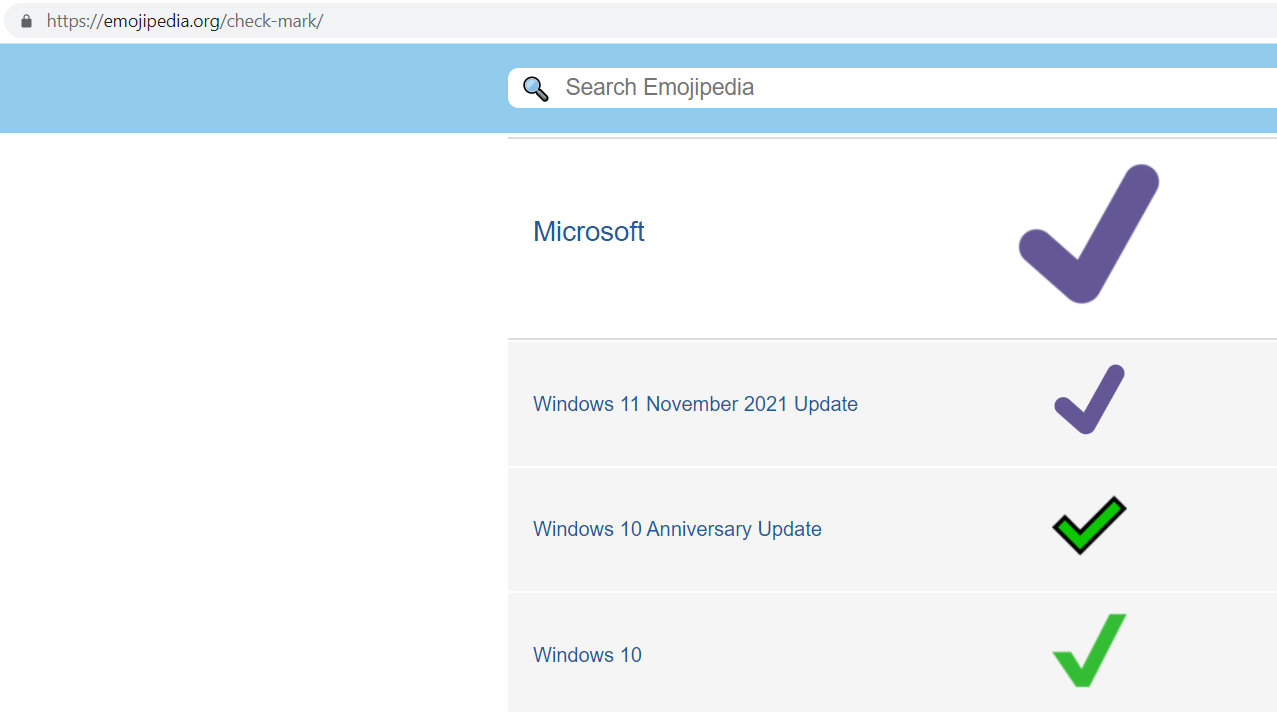
Funny you mention that, because it's complicated as (raw) Emoji are different for everyone basically:
- https://emojipedia.org/check-mark/
- https://emojipedia.org/check-mark-button/
For example, for me ✔️ is still green, being mostly on Win10:
Also impulsively I didn't use Check Mark Button ✅, because Cross Mark ❌ isn't a box then, a bit mismatching. Cross Mark Button ❎ is a whole other mess…
But I'm open to the discussion, maybe you or anybody has anything to swing me to one pattern? Maybe adding plain old Englisch "Yes" and "No" before whatever icon is useful anyway for accessibility reason and ease of understanding? Making the icon less important? Or other symbols outside of Unicode Emoji? E.g. ☒ (https://unicode-table.com/en/2612/).
✅👍 any one of these for YES
❌👎⛔ any one of these for NO
also see this Specify theme context for images in Markdown GA
sparked by the close I've been thinking about this:
- https://img.shields.io/badge/-%E2%9C%94-yellow?style=flat-square&color=brightgreen
- https://img.shields.io/badge/-%E2%9C%96-yellow?style=flat-square&color=red
=>
&
using
- https://unicode-table.com/en/2714/
- https://unicode-table.com/en/2716/
via https://shields.io/.