track-and-graph
 track-and-graph copied to clipboard
Plot counts per time period
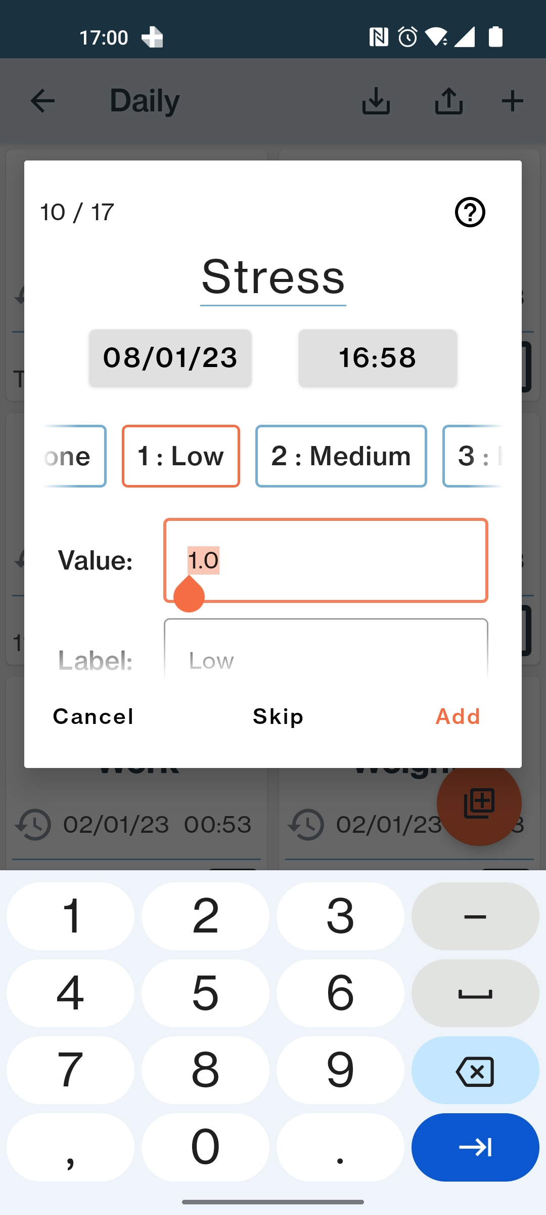
We need an ability to plot counts per time period. Let's say I have Stress level tracker like this
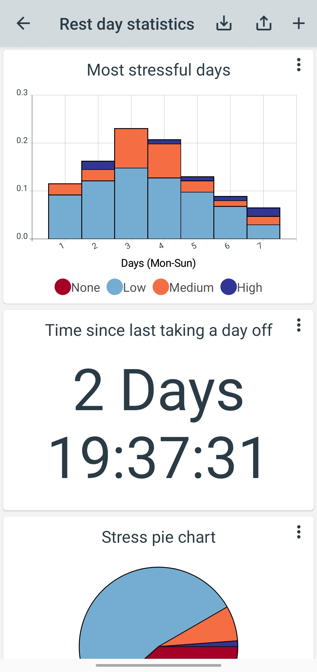
Right now we have an ability to plot most stressful periods, for example stressful days of the week, or month.
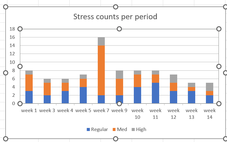
What seems to be missing is an ability to track counts per time period. For example,, you have a table like this
| Regular (count per week) | Med (count per week) | High (count per week) | |
|---|---|---|---|
| week 1 | 3 | 4 | 1 |
| week 3 | 2 | 3 | 1 |
| week 4 | 3 | 2 | 1 |
| week 5 | 4 | 2 | 1 |
| week 7 | 2 | 12 | 2 |
| week 9 | 2 | 4 | 2 |
| week 10 | 4 | 3 | 1 |
| week 11 | 5 | 2 | 1 |
| week 12 | 3 | 2 | 2 |
| week 13 | 3 | 1 | 1 |
| week 14 | 2 | 1 | 2 |
(Notice missing weeks (comming back to issue #66 we need to be able to not plot missing data points and not show holes in the chart)
in the columns basically you don't care about values of those buttons for Reg, Med, High stress you just count how many time it was logged.
And as a result it would be cool to plot something like this:
Bar charts that show how ratios change over time are a good idea and something that's been on my todo list for a long time. There are a few related issues e.g. #7
I will try to implement this at some point, progress is a bit slow right now though, apologies.