cloud-sdk-ios-fiori
 cloud-sdk-ios-fiori copied to clipboard
 SAP
SAP
SwiftUI implementation of the SAP Fiori for iOS Design Language.
 SwiftUI implementation of the SAP Fiori for iOS Design Language
This project is the SwiftUI implementation of the SAP Fiori for iOS Design Language, and is meant to augment and in some cases replace the UIKit-based implementation contained in the SAPFiori framework of the SAP BTP SDK for iOS.
This project currently contains four modules: FioriThemeManager, FioriSwiftUICore, FioriCharts, and FioriIntegrationCards.
FioriThemeManager
This module provides a color palette and a new font family SAP 72 that conform to Fiori Design Language. It is adopted by all the Fiori components in both this package and SAPFiori.
All Fiori Colors are dynamic colors, which means they will adjust based on iOS Appearance settings (Light/Dark). Accessing Fiori Color using Color.preferredFioriColor(forStyle:).
72 is a SAP patent typeface that delivers great reading experience to our users. You can get these fonts using Font.fiori(forTextStyle:) or Font.fioriCondensed(forTextStyle:). Note that these fonts support Dynamic Type out of the box. If you want the fonts with fixed size, use Font.fiori(fixedSize:) or Font.fioriCondensed(fixedSize:) instead.
Custom fonts need to be loaded and registered during App's runtime. Make sure you call
Font.registerFioriFonts()insideapplication(_:didFinishLaunchingWithOptions:)of yourAppDelegate.
FioriSwiftUICore
This module contains SwiftUI implementation for those UIKit-based components existing in SAPFiori. It provides you with an easy way to migrate your UIKit project to SwiftUI while delivering the same experience as before.
We plan to progressively bring more Fiori UI components into this module in the future releases. Check the table below for the components that are currectly available and those in the roadmap.
Refer to this document for different ways of initializing the component.
| FioriSwiftUICore | |
|---|---|
| ObjectItem | :white_check_mark: |
| ObjectHeader | :white_check_mark: |
| KPIItem | :white_check_mark: |
| FioriButton | :white_check_mark: |
| ListPickerItem | :white_check_mark: |
| DimensionSelector | :white_check_mark: |
| SideBar | :white_check_mark: |
| DataTable | :white_check_mark: |
| WelcomeScreen | :white_check_mark: |
| ActivationScreen | :white_check_mark: |
| InfoView | :white_check_mark: |
| User Consent Form | :white_check_mark: |
| KPIProgressItem | :white_check_mark: |
| EULAView | :white_check_mark: |
| ContactItem | :white_check_mark: |
| KeyValueItem | :x: |
| TimelineItem | :x: |
| TimelinePreviewItem | :x: |
| ChartFloorplan | :x: |
| ProfileHeader | :x: |
| CollectionItem | :x: |
| KPIHeader | :x: |
| BarcodeScanner | :x: |
| PasscodeView | :x: |
| MultiUserPasscodeView | :x: |
| TouchIDErrorView | :x: |
FioriCharts
The FioriCharts module replaces the RoambiChartKit charting library which was already embedded in SAPFiori. Migrating to SwiftUI gives the ability to easily add new chart components (donut, bullet, stocks, etc.) while modernizing the existing supported charts with pinch-to-zoom, pan, and new design features.
| SAPFiori 4.0.x, 5.0.x | FioriCharts | |
|---|---|---|
| Area | :white_check_mark: | :white_check_mark: |
| Line | :white_check_mark: | :white_check_mark: |
| Column | :white_check_mark: | :white_check_mark: |
| Stacked Column | :white_check_mark: | :white_check_mark: |
| Bar | :white_check_mark: | :white_check_mark: |
| Stacked Bar | :x: | :white_check_mark: |
| Bubble | :white_check_mark: | :white_check_mark: |
| Scatter | :white_check_mark: | :white_check_mark: |
| Waterfall | :white_check_mark: | :white_check_mark: |
| Combo | :white_check_mark: | :white_check_mark: |
| Donut | :x: | :white_check_mark: |
| Bullet | :x: | :white_check_mark: |
| Stacked Bullet | :x: | :soon: |
| Harvey Ball | :x: | :white_check_mark: |
| Radial | :x: | :white_check_mark: |
| Stocks (line) | :x: | :white_check_mark: |
The API is designed for backwards compatibility to the existing SAPFiori charting APIs, but is optimized for SwiftUI.
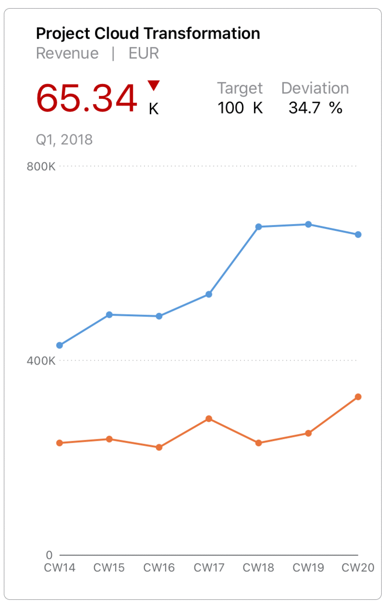
Fiori Integration Cards
Deprecated: will be removed in a future major version
The FioriIntegrationCards module is a native SwiftUI renderer for the UI5 Integration Cards. These types of cards are common in UI5 dashboard and overview page user contexts. In native iOS apps, we are focusing initially on the dashboard use case, and also considering Cards as ideal for Annotation-style views--in maps, or AR experiences.
| FioriIntegrationCards | |
|---|---|
| Object Card | :white_check_mark: |
| List Card | :white_check_mark: |
| Timeline Card | :white_check_mark: |
| Analytic Card | :white_check_mark: |
| Table Card | :white_check_mark: |
| Calendar Card | :soon: |
| Adaptive Card | tbd |
| Component Card | :x: |
Requirements
- iOS 13 or higher, macOS 10.15.4 or higher
- Xcode 12 or higher
- Swift Package Manager
Download and Installation
The package is intended for consumption via Swift Package Manager.
- To add to your application target, navigate to the
File > Swift Packages > Add Package Dependency...tab, then add the repository URL. - To add to your framework target, add the repository URL to your Package.swift manifest.
In both cases, xcodebuild tooling will manage cloning and updating the repository to your app or framework project.
Configuration
Three products are exposed by the Package.swift manifest.
FioriSwiftUI as umbrella product will contain everything the package has to offer in the future.
If you are concerned about bundle size you can use either one of the individual products FioriCharts or FioriIntegrationCards
Limitations
FioriIntegrationCards is still in experimental stage, and should not yet be used productively.
Several functional limitations exist at present, which are planned for resolution in future releases. Please check the Issues tab for an up-to-date view of the backlog and issue status.
Key gaps which are present at time of open-source project launch:
-
FioriIntegrationCards networking shall support injection of
SAPURLSessionhttp client - FioriIntegrationCards currently handles only data which is in-line json; must be augmented to support resolving relative data files, and remote URIs
- FioriIntegrationCards and FioriCharts requires design specifications to improve UI
- FioriIntegrationCards and FioriCharts must support theming with NUI nss stylesheets, as currently supported by SAPFiori.
Known Issues
See Limitations.
How to obtain support
Support for the modules is provided through this open-source repository. Please file Github Issues for any issues experienced, or questions.
When SAPFiori integrates FioriCharts productively, customers should continue to report issues through OSS for SLA tracking. However, developers may also report chart-related issues directly into the Github Issues; SAP will mirror FioriCharts-related issues reported through OSS into Github Issues.
Contributing
If you want to contribute, please check the Contribution Guidelines
To-Do (upcoming changes)
See Limitations.
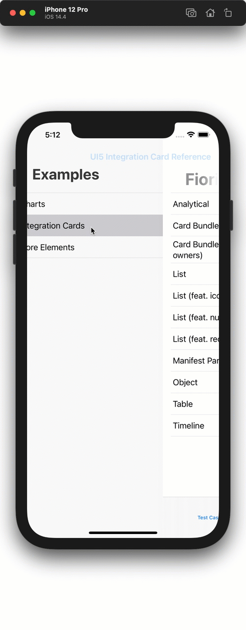
Examples
Functionality can be further explored with a demo app which is already part of this package (Apps/Examples/Examples.xcodeproj).

 SAP
SAP