feature-requests
 feature-requests copied to clipboard
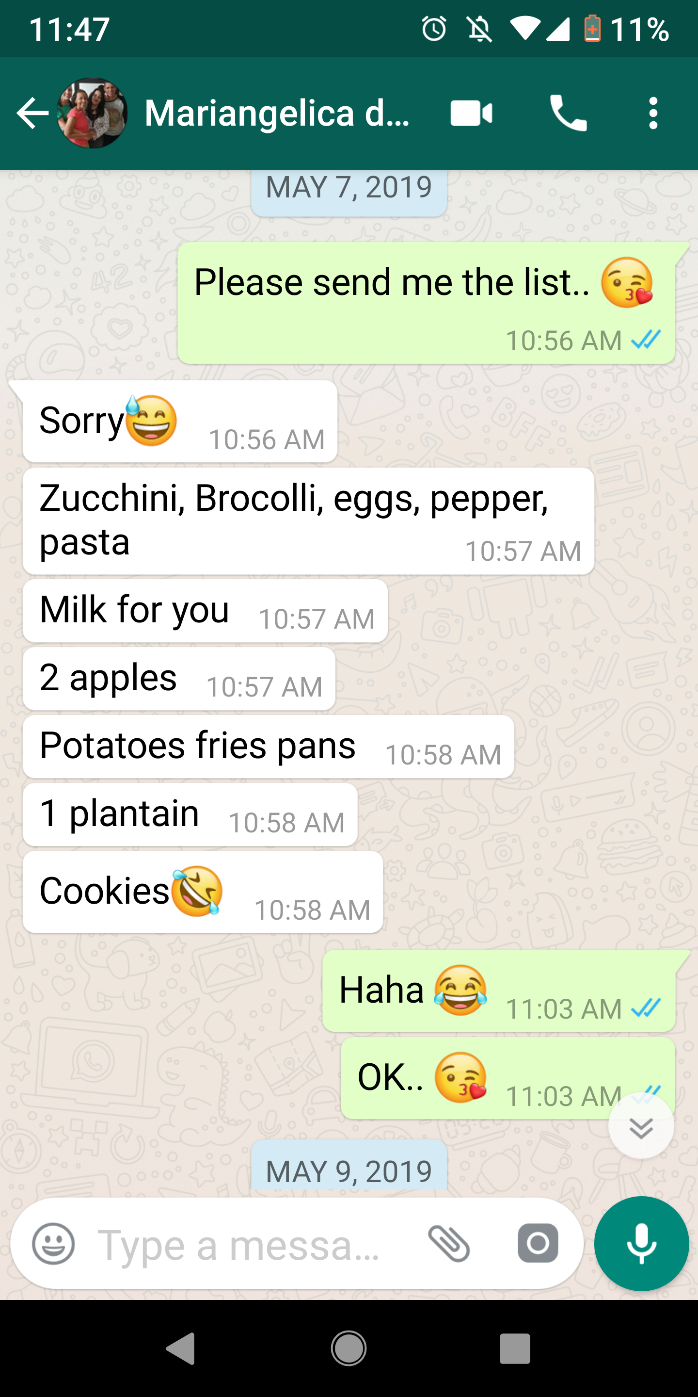
Different color and alignment for sent versus received messages (Chat Bubbles UX)
Problem: A sent versus received message is not delineated clearly enough in UI
Describe the solution you'd like Different coloring for a sent versus received message. Also, sent messages are aligned right in the chat window, received messages aligned left. This is similar to the UX of whatsapp and fb messenger.
Describe alternatives you've considered Alternative is current user interface.
Additional context
This capability received 10 votes in the now deprecated rocket.chat #features list.
There are a number of Issues on this type of subject.
eg https://github.com/RocketChat/Rocket.Chat/issues/10863 https://github.com/RocketChat/Rocket.Chat/issues/10308 https://github.com/RocketChat/Rocket.Chat/issues/9681
Please have a good search and read to understand some of the background to the UI
I hope this can be helpful for the web ui
https://gist.github.com/ice6/b1977b11e68686974d737ea082ec278b
@ice6 it no longer works in 6.2.* new css is needed. I wish I can develop one someday in the furture.