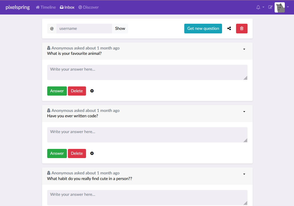
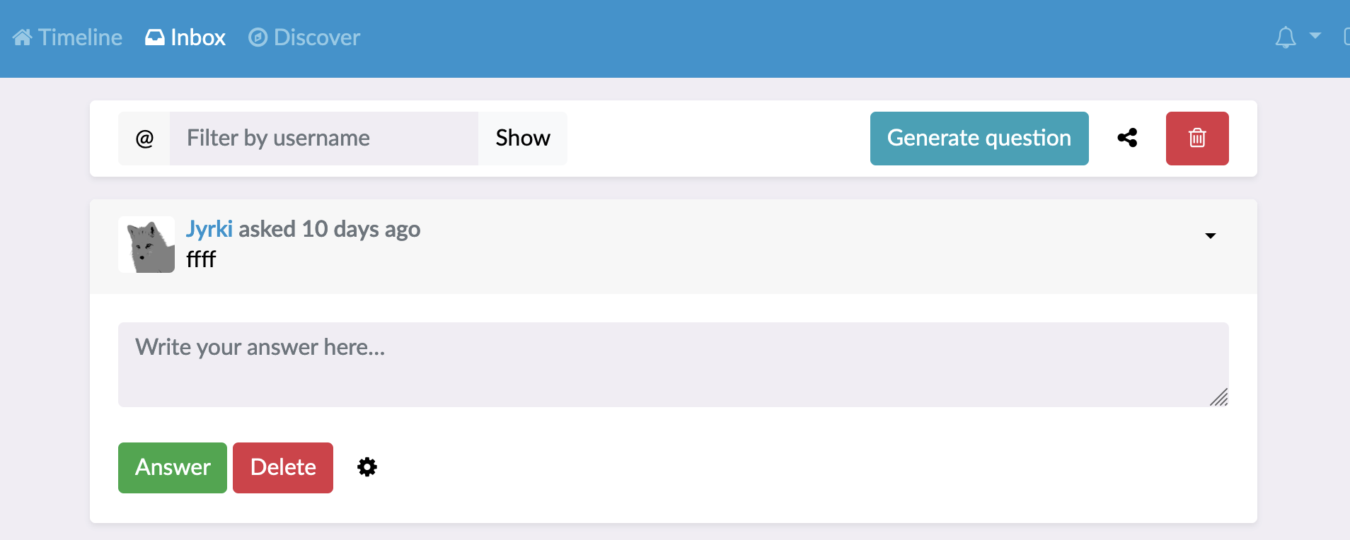
Replace inbox sidebar with action bar
The sidebar layout isn't particularly great, especially because it doesn't contain that much info or actions for the size it takes.
The action bar at the top uses way less space, and is in front of the inbox content on mobile, compared to at the bottom with the sidebar. A lot of people might have missed some inbox functionality through this.
| Before | After | |
|---|---|---|
| Mobile | 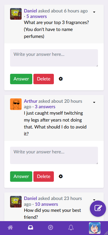 |
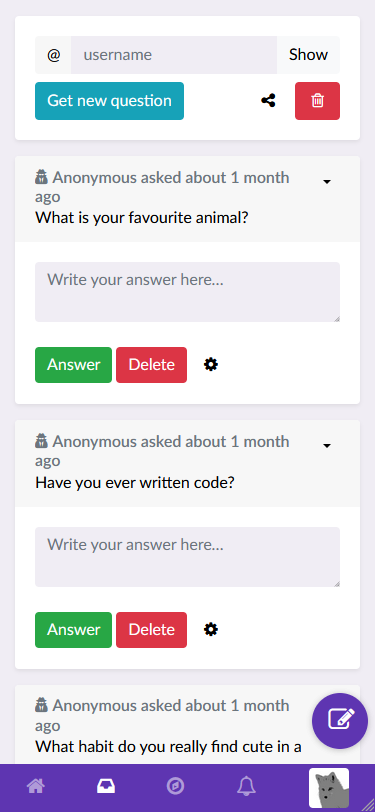 |
| Desktop | 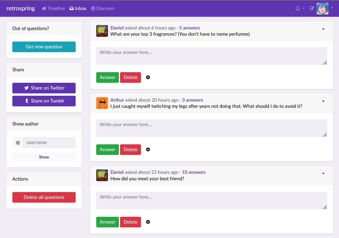 |
 |
Codecov Report
Base: 88.07% // Head: 88.07% // No change to project coverage :thumbsup:
Coverage data is based on head (
42c7852) compared to base (d2394f6). Patch has no changes to coverable lines.
Additional details and impacted files
@@           Coverage Diff           @@
##             main     #738   +/-   ##
=======================================
  Coverage   88.07%   88.07%
=======================================
  Files         131      131
  Lines        2289     2289
=======================================
  Hits         2016     2016
  Misses        273      273
Help us with your feedback. Take ten seconds to tell us how you rate us. Have a feature suggestion? Share it here.
:umbrella: View full report at Codecov.
:loudspeaker: Do you have feedback about the report comment? Let us know in this issue.
I like the general idea of this, but I feel like it's taking up a bit too much space. Adding padding: .5rem 1.25rem; to the .card-body styling of the toolbar makes it a bit more comfy I think:
@nilsding I have made a compromise, I decreased the vertical spacing, but not as much as you suggested.

This adjustment is padding: .75rem 1.25rem; so the spacing matches Bootstraps card-header which we also use in answerboxes and inbox entries.
Jo passt.
side note: I don't like how the share button looks more like just an icon than a button, but this is a general bootstrap thingy and out of scope for this PR
Hmm, I just didn't want to give it any actionable button color that gives it some sort of urgency
I could reorder it to share, generate, delete so it doesn't look that much out of place.
all I'm missing is some borders :D but for me the order is good as it is now