qiskit
 qiskit copied to clipboard
pulse amplitudes not show in schedule.draw()
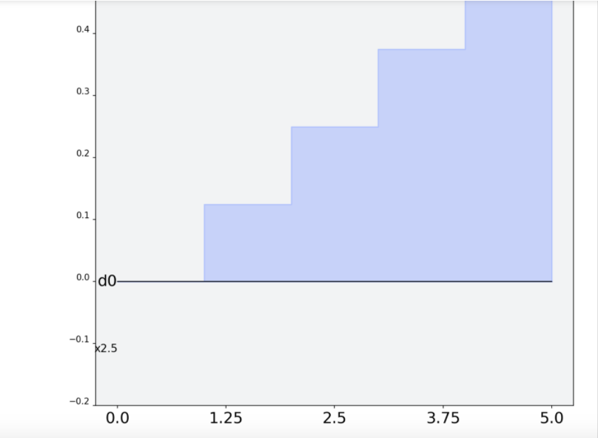
the amplitudes of pulses are not shown in a schedule and it's hard to know the scale.
single pulse visualizations (commands) have this information
Hello @pushpulldecoder, this is still open. Do you wish me to assign this issue to you? If so I believe we should make this an option show_yaxis.
@pushpulldecoder, sorry about the delay in my response. I believe we need to add amplitude values only the y-axis like @ajavadia's second image shows
@coder-mtv - This is currently assigned to @pushpulldecoder. If for some reason they cannot undertake the issue I can reassign to you.
@coder-mtv, it seems little progress has been made by @pushpulldecoder. I can reassign to you if you would like?
Hi @coder-mtv are you still working on this? I want to give it a try!
I have tried to gain some knowledge from online resource regarding Pulse Programming Model, Pulse Schedule and Instructions. I don't think I understood them completely but if someone can tell me how(the code) to replicate this issue. Then I think I can further use my Python knowledge to debug it. @taalexander @ajavadia
Hello @vishalg2235, I have assigned.
Something like:
from qiskit import pulse

waveform = pulse.Waveform([0.0, 0.1, 0.2, 0.3, 0.4])
waveform.draw()
Should allow you to generate the plot with an axis and for without an axis add:
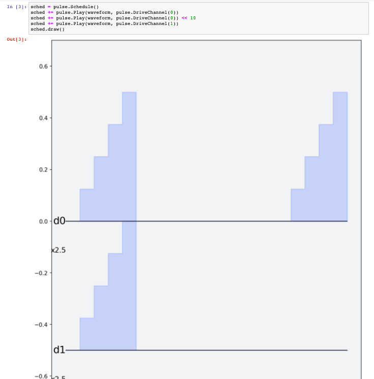
sched = pulse.Schedule()
sched += pulse.Play(waveform, pulse.DriveChannel(0))
sched.draw()
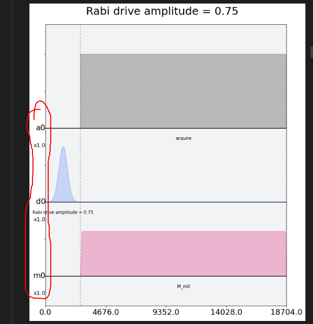
Hi @taalexander @ajavadia I found the line of code responsible for the issue here After commenting out that line I found following plot. Have a look at the yellow circled zone where labels overlap each other.
When I removed X-axis limit then it somewhat adjusts itself to display without overlap.
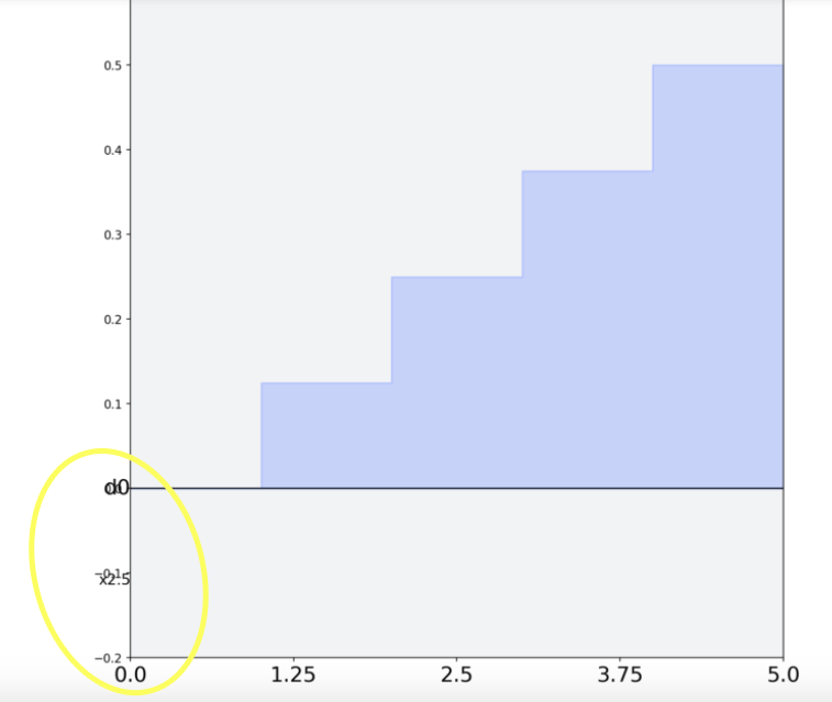
@taalexander in multiple channels the Y-axis labels can be misleading/wrong as you can see in pic below that for 'd0' channel labeled amplitude is correct but for channel 'd1' its wrong:
I believe the values for the y-axis would need to be manually added. I see the problem now, @nkanazawa1989 may know how to better resolve this.
Ok meanwhile I'm also getting an idea of filling Yaxis values based on the pulses and making a list of them and finally using that list in the graph. I will show it here once done with it.
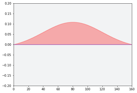
I don't think we updated this. In v2 still yaxis value is missing, but with debugging stylesheet we can show max/min amplitude for each pulse.
Hi @vishalg2235 are you still working on this? Let us know if you have any further questions 😄
Yes @javabster I was hoping for a better explanation. I will look deeply into this again and comment here all my doubts shortly.
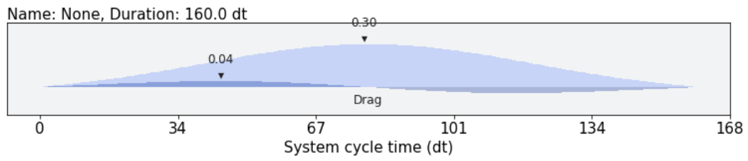
@nkanazawa1989 can you paste an example picture from the v2 debugging stylesheet? maybe we just go with that
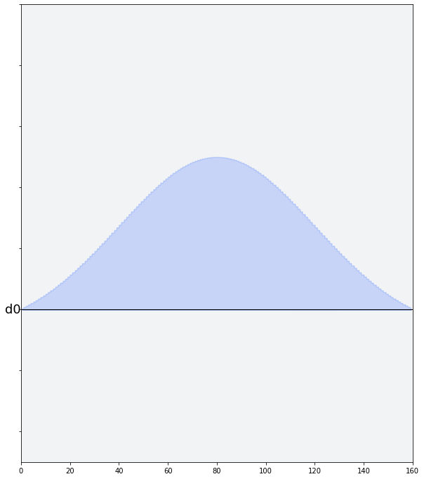
Sorry about slow response. It looks like this with the stylesheet.
from qiskit import pulse
from qiskit.visualization.pulse_v2 import IQXDebugging

p = pulse.Drag(160, 0.3, 40, 10)
p.draw(style=IQXDebugging())
Update for Santa- QGoGP
✅ Issue reproducible! Y-axis ticks are not implemented in v2 version of pulse visualization (but min-max vals can be plotted out with debugging stylesheet which can help a bit) and older issues of v1 still exist as discussed above.
Will update comment/add more comments if cause is found/fixed!
Python version 3.9.7 qiskit-terra version: 0.19.1
@vishalg2235 Hey, just want to check in to see if you are still working on this issue. Please let us know if you need any help!
as there is no response from the original assignee I am un-assigning so this issue is now open for others to pick up 😄
Hi, I am looking for a first issue to work on, could this be assigned to me if no one is currently working on it?
Thanks for volunteering @A-Tessier01, I'll assing to you :) Please make sure to read the contributing guidelines, and take a look at this youtube series for github support