 PrestaShop
Improve color items UX in faceted search
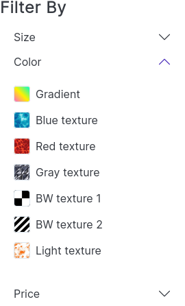
Faceted search template setting: Colors > Checkbox
Current design:

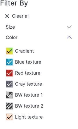
Expected:

@mparvazi

FYI, there are mockups that you can find here https://www.figma.com/file/LfVl5leeSKcVUhSaYwhbtM/New-Theme?node-id=154%3A11172
It's obvious that input checkbox shouldn't be alongside of color-box, as current theming (it's boring!)
So IF we remove input checkbox for colors: When a color is selected in faceted search, we should somehow show to user that color is selected now
There is some options:
- A check icon before or after of label (as i did)
- Bolding or Coloring the font of color-label.
- Boxing the color-label with border or background color.
I wanted to use check-icon inside the color-box, but problem is that color-box uses dynamic color code, and we have to use invert() color for check-icon. I tested but I didn't like it.

Hey everyone,
Thanks @mparvazi for your request!
Among your 3 options, I would choose the check icon when the color is selected. And I would also add the color inside the checkbox (even if it isn't checked).
The problem here is that we're currently using Material icons checkboxes everywhere in the theme so It will be inconsistent if the border size isn't the same for colors, right?
According to the WCAG, the non-text contrast ratio must at least be 3:1. So to ensure this minimum contrast ratio requirement, here is what I suggest about the check icon colors:
- When the checkbox background color is considered as light, use
#363A41for the check icon - When the checkbox background color is considered as dark, use
#FFFFFFfor the check icon
And here are my 3 design propositions:
First proposition
- Each checkbox has a border to cover issues identifying the white color checkbox
- Reduced checkbox border size to 1 px
- These changes allow the theme to be consistent on every page

Second proposition
- Each checkbox has a border for the same reason as the first proposition
- Reduced checkbox border size to 1 px
- The shape of the checkbox used for colors is a circle so it's easier to identify

Last proposition
- Only unselected checkbox has a border (like the current)

Tell me wdyt?
No. This is all wrong! What if you have colorful texture instead of simple color? How are you going to set the color for the checkmark on a black and white texture?
IMO best way to do that is:
- Add label wherever possible.
- If checkmark will be added, then it has to be OUTSIDE color box.
I agree with @SharakPL on this, @prestascott it's impossible to calculate which color you should use for the checkmark icon, because if you have something else than a simple color, you won't be able to calculate it
@SharakPL If you have a black and white texture then you will select 2 checkboxes: the black and the white. This is what e-commerce websites do today. Don't worry, there will always be a label. Please see my mockups just above.
I agree with @SharakPL on this, @prestascott it's impossible to calculate which color you should use for the checkmark icon, because if you have something else than a simple color, you won't be able to calculate it
For textures we can use a shadow or border for check mark. Check mark for textures is always white with black border or shadow.


Yep we can use gradients like Adidas, but you don't have the latest version I think because they added the label:

Nike has a contrast ratio issue, see the yellow. You can't put a white check on yellow background 😅
@prestascott
I used black check-mark for yellow in my code: This code is smart. We should find a threshold value by trial and error. Currently I used "25" for threshold (blackness value).

@SharakPL
Please don't tell me Adidas has got wrong!
Of course they have. I can't even tell what these last 2 colors represent unless I check it and see what it will return. That's bad UX!
It should have been a simple list with color boxes and labels... or a grid like Nike has but with labels.
@SharakPL
I prefer to wait for @prestascott new mockups for textures and possibly the final design. You can create a sample for your ideas (as I did), it's easier for @prestascott to make a decision.
@SharakPL If you have a black and white texture then you will select 2 checkboxes: the black and the white. This is what e-commerce websites do today. Don't worry, there will always be a label. Please see my mockups just above.
@prestascott I'm not sure I follow. Which 2 checkboxes? There's gonna be 1 checkbox marked with a texture (can be anything). Are you saying you'll have to set a list of colors for any given texture in BO?
Nike has a contrast ratio issue, see the yellow. You can't put a white check on yellow background 😅
There's always going to be a problem with this, because there's no way to have a distinguishable checkmark on every texture. IMO active color filter should be accented differently.
Let me check to find a solution for textures.
I'm sure you will but that's not the point. Any additional script is bad for performance and scripts for this are simply unnecessary, when all you need is just add an active class to checked attribute and let css do the work.
@SharakPL Can you please explain to us what is your definition of texture? Because to me, it doesn't mean color. You can have a plain color: black, white, blue, red, etc. And you can use gradient color for the multicolor option, but this still isn't a texture.
You can add a new attribute for patterns such as: polka dot, camo, etc. But we can use simple checkboxes for these.
If you have an attribute of type color or texture then you either set a color from color pallette or upload a texture file. Either of it will be visible on the filters, right?
First of all what about unused checkboxes on the left? Will there be 2 checkboxes for colors? What's the point?

Of course you can hide it but can you tell if color is checked without it? Not always:

@NeOMakinG @prestascott
Texture test
- Using svg icon (equal to icon-font used in theme) I used this icon for check-mark (google material icons)
<svg xmlns="http://www.w3.org/2000/svg" height="24" viewBox="0 0 24 24" width="24" class="check-mark">
  <path d="M0 0h24v24H0z" fill="none" class="check-mark-background"/>
  <path d="M9 16.2L4.8 12l-1.4 1.4L9 19 21 7l-1.4-1.4L9 16.2z" class="check-mark-icon"/>
</svg>
- Getting the
average-colorof texture image This can be implement by JavaScript
const boxTexture = filter.dataset.boxTexture;

let textureImg = new Image();
textureImg.src = boxTexture;
const checkMarkBaseColor = averageColor(textureImg);
- Calculating check-mark color based on average-color blackness
const blackness = 100 - Math.max(Math.max(checkMarkBaseColor.r, checkMarkBaseColor.g), checkMarkBaseColor.b) / 255 * 100;
const checkMarkColor = (blackness > 25) ? 'white' : 'black';
checkMarkIcon.setAttribute('fill', checkMarkColor);
- Using average-color for check-mark icon background with opacity 50%
.texture {
  svg {
    .check-mark-background {
      fill-opacity: 50%;
    }
  }
}
Result
| Default | Filtered |
|---|---|
 |
 |
https://user-images.githubusercontent.com/85633460/151038373-b8c1de14-a801-4845-bc84-71313d0a350f.mp4
Yep, the opacity that you added @mparvazi is working because there is a better contrast ratio with the check icon. Thanks!
Good morning, I would need to use the tick/icon inside the variant colors which are handled by the product-variants.tpl file, but I can't figure out how to do it. Is there anyone who could help me? Thank you